
Last updated August 27, 2026
Key Takeaways
- A long hallway fails because it has no destination. Fix the far end first and most of the problem goes with it.
- Do not decorate both walls equally. Give one wall the art and keep the other quiet, or the corridor feels like a squeeze.
- Light in pools rather than a single line of downlights. An even line of ceiling lights is what makes a hall feel like an airport.
- A runner should leave an equal margin of floor on each side. Too narrow and it makes the hall look narrower still.
- Hang art lower than you think. In a corridor you see it from close range and at an angle, not from across a room.
- Doors are the pattern in a hallway whether you like it or not. Painting them out or picking them out is a real decision.
The way to decorate a long hallway is to give it a destination, treat the two walls differently, and light it in pools rather than a continuous line. Put something worth walking toward at the far end, hang art on one wall and keep the other quiet, use a runner wide enough to leave an even margin of floor, and hang pictures lower than you would in a room.
Most long hallways feel wrong for one reason: they read as a route rather than a place. Everything below is a way of making the corridor feel like part of the house instead of the gap between its rooms.
Terminate the view
This is the single most effective thing you can do, and it costs less effort than any of the others.
Stand at one end and look down. Whatever is at the far end is what the hallway is about, and in most houses that is a blank wall, a radiator or a bathroom door. The eye travels the whole length, arrives at nothing, and the corridor reads as pure distance.
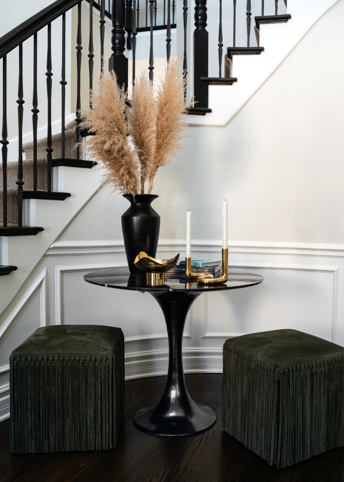
Give the end something: a piece of art large enough to hold the view, a console with a lamp on it, a mirror, a chair nobody will sit in, a strong colour. It does not have to be elaborate. It has to be worth arriving at. Once the end of the hall is a destination, the length becomes an approach rather than a trudge.
If the hallway has ends worth looking at in both directions, do it twice. If one end is a blank wall you cannot touch, that is where the colour change or the largest piece goes.
The two walls should not match
The instinct in a narrow space is symmetry: art on both sides, evenly spaced. It is the reliable way to make a corridor feel tighter than it is.
Two loaded walls close together push at each other visually, and because you cannot stand far enough back to see either properly, you experience both as clutter at the edge of your vision. Give one wall the work, the gallery, the panelling, the colour, and let the other stay quiet. You will be walking along looking at the busy wall rather than being squeezed between two.
Which wall gets the work depends on light and on doors. Choose the longer uninterrupted run, and if one wall has all the doorways, that is the quiet one by default.
Decorating a hallway, compared
These are the usual moves. They vary a lot in how much they actually change the experience of walking through.
Read the effect column first, because several of the popular options do very little and one unpopular one does a great deal.
| Move | What it actually does | Best when | Watch for |
|---|---|---|---|
| Something at the far end A destination for the eye at the end of the run. |
Converts the hall from a route into an approach. The biggest single change available | Always. Do this before anything else | Too small a piece reads as an afterthought and makes it worse |
| Gallery wall on one side Gives the walk something to look at, sequentially. |
Works well, and better than a single large piece in a long run | There is an uninterrupted wall of decent length | Spacing it too evenly turns it into wallpaper |
| Art on both walls Symmetrical hanging down both sides. |
Makes the corridor feel narrower and busier | Rarely, and only in a genuinely wide hall | The most common mistake in a narrow hallway |
| Runner Softens sound and gives the floor direction. |
Considerable, and it is the thing most people get wrong by sizing it too small | Almost always, on a hard floor | Leave an even margin each side. A narrow runner makes the hall look narrower |
| Mirror Bounces light and doubles a view. |
Useful at the end or on the quiet wall, poor along the busy one | The hall is dark, or the end wall needs something | Facing a mirror straight down the hall doubles the length you are trying to shorten |
| Painting the hall darker than the rooms Makes the corridor recede and the rooms feel brighter on arrival. |
Surprisingly effective, and the option people are most reluctant to take | There is decent artificial light and the rooms either side are lighter | Needs proper lighting or it becomes a tunnel |
| Line of ceiling downlights Even illumination along the length. |
Flattens everything and emphasises how long the hall is | Rarely on its own | This is what makes hallways feel institutional |
A long hallway usually needs three of these together: an end destination, one worked wall and layered light. Runners and colour follow from those.
Light it in pools
Lighting decides whether a hallway feels like part of the house or part of a building.
A continuous row of identical downlights spaced evenly along the ceiling produces flat, even light and, worse, draws a dotted line down the length of the corridor that your eye follows straight to the far end. It emphasises exactly the thing you are trying to play down.
What works is pools of light with darker gaps between them: sconces on the worked wall, a pendant where the hall widens or turns, a lamp on a console at the end. Walking through a sequence of lit and unlit stretches makes the hall feel like a series of moments rather than one long tube. It is the same principle as a well-lit street compared with a lit tunnel.
Sconces need care in a narrow hall. Anything projecting more than about four inches becomes something people catch their shoulder on, so look for flush or shallow fittings.
Hang art lower than feels right
The standard advice puts the centre of a picture at eye level, around fifty-seven inches. In a corridor that is usually too high.
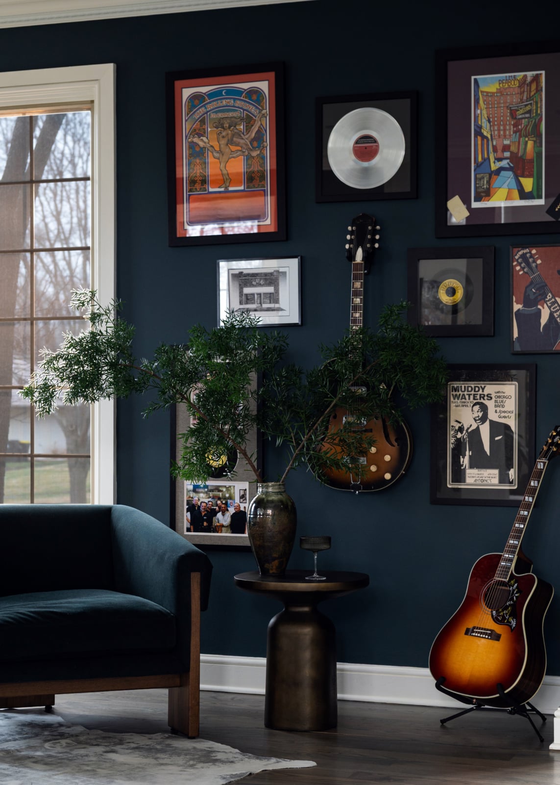
In a room you view art from eight or ten feet away, standing still. In a hallway you pass within two or three feet of it, moving, and often glancing sideways rather than looking straight on. Art hung at gallery height in a narrow hall ends up above your natural sightline as you walk, and you never really see it.
Dropping the centre line by a few inches makes a noticeable difference. So does hanging in tight groups rather than spacing pieces out: a dense cluster reads as one composition you can take in at a glance, which is all the attention a corridor gets.
The runner, and why yours is probably too narrow
Runners are the most commonly mis-sized item in the house, and in a hallway the error is very visible.
The rule is an equal margin of floor showing on each side, usually somewhere between four and eight inches depending on the width of the hall. What people buy instead is a standard-width runner regardless of the corridor, which leaves a wide band of bare floor on either side. That band draws two lines down the length of the hall and makes it read as narrower and longer, which is the opposite of what you wanted.
Length matters too. A runner should get most of the way down the hall rather than sitting like a mat in the middle. Two runners with a gap is better than one that is obviously too short.
Doors are the pattern whether you like it or not
In most long hallways the dominant visual feature is not the walls. It is a row of doors, and nobody decides what to do about them.
Left as they are, usually white against a coloured wall, the doors become a rhythm of bright rectangles marching down the corridor. That can be handsome if it is deliberate and the doors are good. It is not handsome when the doors are hollow-core builder standard with mismatched handles.
The two coherent choices are to paint the doors out, in the same colour as the walls including the architrave, so they recede and the hall reads as one continuous surface, or to pick them out properly with a colour and hardware worth noticing. What does not work is leaving them accidentally.
Painting doors and trim the same colour as the walls is the single most transformative thing you can do to a corridor full of doors, and it costs nothing but the decision.
Give it a reason to exist
A hallway that is only circulation will always feel like circulation. Where the width allows, giving it a second function changes how it reads entirely.
Shallow bookshelves along the worked wall, ten or twelve inches deep, turn a corridor into a library you walk through. A narrow console with a lamp makes a place to put things down. A single chair in a wider stretch, even one nobody sits in, tells you this is a room rather than a passage.
The constraint is clearance. You need a comfortable clear width for two people to pass, and anything that reduces the hall below that will annoy everyone daily regardless of how good it looks. Measure before committing to depth.
Ceilings, and the tunnel problem
Long hallways are usually narrow and often lower than the rooms they connect, which is the recipe for a tunnel.
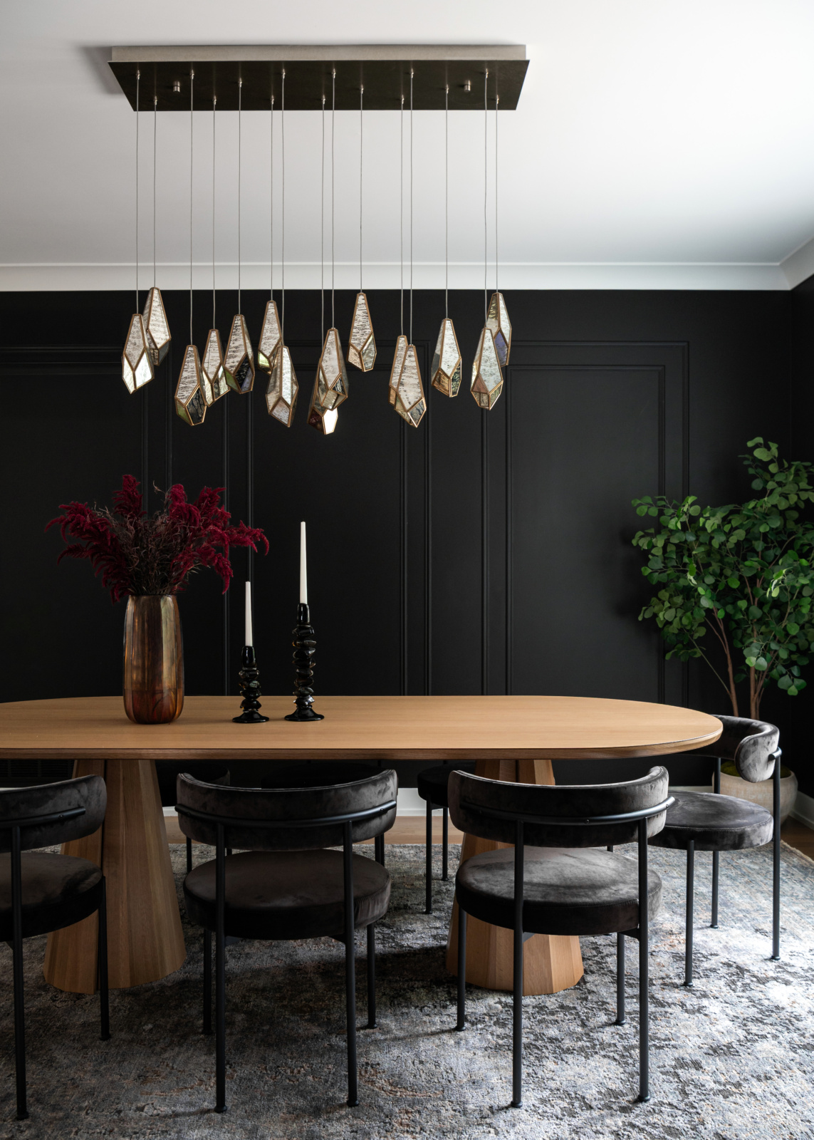
A ceiling painted the same white as every other ceiling in the house will look grey in a corridor, because there is no daylight to lift it. Bringing a colour onto the hall ceiling, either the wall colour or something warmer than white, removes the hard bright line overhead and makes the space feel more considered.
Where there is height to spare, a run of moulding or panelling on the walls does more than any decoration hung on them, because it gives the eye something to read as it moves. In an older house with existing millwork this is usually already there and worth restoring rather than replacing.
Chicago hallways specifically
Two local patterns, with opposite problems.
Vintage city apartments and greystones have long central corridors serving every room, often with original millwork, high ceilings and no natural light at all. These are the ones that benefit most from going darker rather than lighter, because they are never going to be bright and a pale corridor between lit rooms just looks drained. The existing trim usually deserves keeping.
Western suburb houses tend to have shorter but wider upstairs halls, frequently with a railing open to a stair or a double-height space. There the problem is not tunnel but drift: a wide hall with nothing in it reads as leftover space. That is the case for the console, the shallow shelving or the single chair, and it is where scale most often goes wrong, because a piece sized for a corridor looks lost in a hall that is really a landing.
Working through it with us
Hallways are usually the last thing anyone budgets attention for and the space everybody passes through twenty times a day, which is a poor trade. They are also quick to resolve once the decisions are made in the right order. You can see how we work on our design process page, look through recent projects, or get in touch about your own home.
Related reading: filling a blank wall, when the front door opens into the living room, choosing a rug material, planning a lighting layout, decorating a room without windows and high contrast rooms. We work across Chicago, Hinsdale and Elmhurst.
Frequently asked questions
How do you decorate a long hallway?
Give it a destination at the far end, treat the two walls differently rather than decorating both, and light it in pools instead of a continuous line of downlights. Add a runner wide enough to leave an even margin of floor, and hang art lower than you would in a room.
What should go at the end of a long hallway?
Something worth walking toward: a large piece of art, a console with a lamp, a mirror, or a change of colour. The eye travels the whole length and arrives somewhere, which turns the corridor from a route into an approach. A piece that is too small reads as an afterthought and makes it worse.
Should you put art on both walls of a hallway?
Usually not. Two loaded walls close together push at each other visually, and you cannot stand back far enough to see either properly, so both read as clutter. Give one wall the art or panelling and keep the other quiet. If one wall carries all the doorways, that is the quiet one.
How wide should a hallway runner be?
Wide enough to leave an even margin of floor on each side, usually four to eight inches depending on the corridor. A standard-width runner in a wider hall leaves two broad bands of bare floor that draw lines down the length and make the space read narrower and longer.
How high should art be hung in a hallway?
Lower than the usual fifty-seven inch centre line. In a corridor you pass within two or three feet of the art while moving, rather than viewing it from across a room, so gallery height sits above your natural sightline. Hanging in tight clusters also works better than evenly spaced pieces.
Should a hallway be painted a dark color?
Often yes, and it is the option people are most reluctant to take. A darker corridor recedes and makes the rooms either side feel brighter on arrival, whereas a pale hallway with no daylight simply looks drained. It does need properly layered lighting or it becomes a tunnel.
What should I do about all the doors in a hallway?
Decide about them rather than leaving them. Either paint them out in the wall colour, architrave included, so they recede and the hall reads as one surface, or pick them out deliberately with colour and hardware worth noticing. Painting doors and trim to match the walls is the most transformative change available in a corridor full of doors.
How should a long hallway be lit?
In pools with darker stretches between them: sconces along the worked wall, a pendant where the hall turns or widens, a lamp at the end. An evenly spaced line of ceiling downlights flattens everything and draws a dotted line to the far end, which emphasises exactly the length you are trying to play down.