
Last updated August 27, 2026
Key Takeaways
- Blue is a cool colour and most rooms need warmth, so choose a blue with red, brown or green in it rather than a clean primary.
- Depth does the work. A deep navy or ink reads as considered; a pale mid-blue is the version that dates.
- Pair it with warm materials. Brass, walnut, leather and plaster stop blue reading as cold. Grey and chrome make it colder.
- In a north-facing room, blue compounds light that is already blue. It can still work, but it needs the warmest blue you can find.
- Blue is one of the few colours that takes full saturation on joinery without looking overbearing.
- One blue, used properly, beats three blues used cautiously.
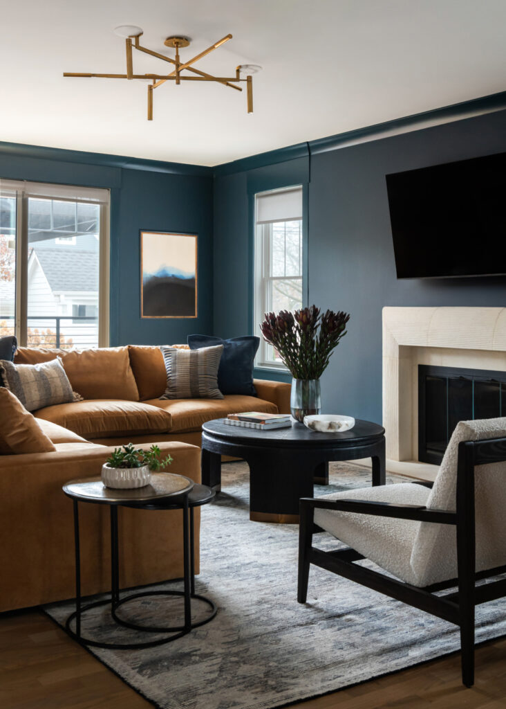
Blue works in a living room when it has some warmth in it and enough depth to read as a decision. A navy with a red or brown base, an ink blue, a deep teal with green in it: all of these behave well and pair naturally with timber, brass and leather. A clean primary blue or a pale mid-blue is where these rooms most often go wrong.
The reason is straightforward. Blue is the coolest colour available, and most rooms are trying to feel warm. Everything below is about resolving that tension rather than ignoring it.
The problem blue has to overcome
Worth naming, because it explains every recommendation that follows.
Warmth in a room comes from the red end of the spectrum. Blue sits at the other end, which means a blue room starts at a disadvantage on the quality people most often say they want. A room can be beautiful and blue and still feel unwelcoming if nothing is pulling the other way.
This is why so much blue-and-grey decorating from the last decade feels chilly. Blue walls, grey upholstery, chrome fittings and a cool white ceiling give you four cool elements and nothing warm at all.
The fix is not to avoid blue. It is to choose a blue that carries some warmth of its own, and then to surround it with materials that supply the rest.
Which blue
The undertone question, which matters more than the name on the tin.
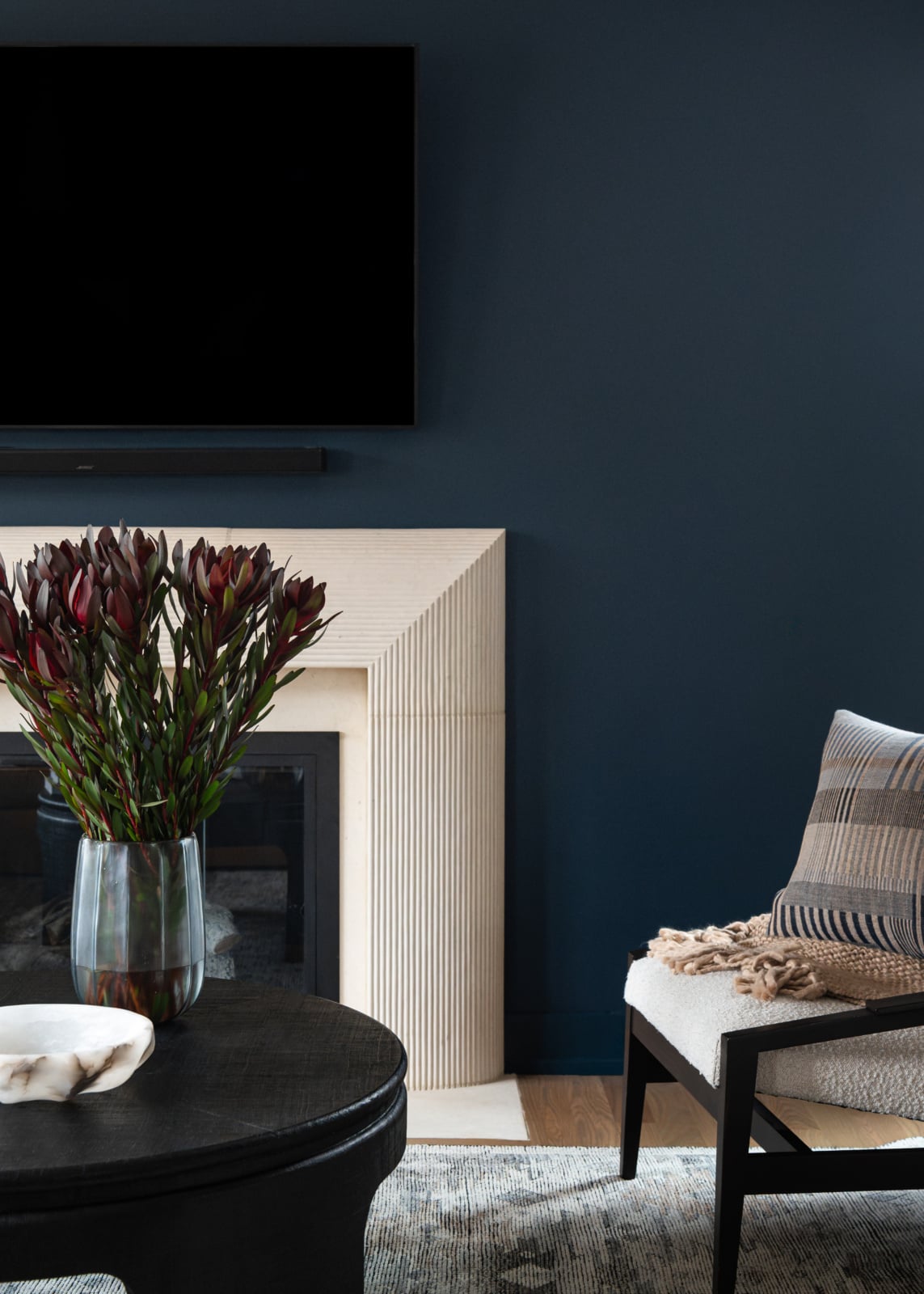
Blues with red or violet in them, the navies that lean slightly purple, read as rich rather than cold. Blues with green in them, teals and petrol shades, feel earthy and sit naturally beside timber. Blues with black in them, ink and midnight, are enveloping and behave more like a dark neutral than a colour.
Blues with nothing else in them, the clean primaries and the pale mid-blues, are the difficult ones. They have no warmth to draw on, they read as slightly institutional, and they are the shades most likely to look dated in a few years.
The practical test: hold the sample beside a piece of warm timber and a piece of brass. A blue that looks good against both has enough warmth in it. A blue that looks stark next to them will look stark in the room.
How blues behave
What each family does in a living room.
| Blue | Character | Pairs with | Watch for |
|---|---|---|---|
| Navy with a red base Deep, slightly purple. |
Rich and enveloping. Reads as a decision | Brass, walnut, tan leather, cream | Very little. The most reliable blue there is |
| Ink and midnight Blue with black in it. |
Behaves like a dark neutral rather than a colour | Almost anything. Excellent on joinery | Needs proper lighting or the room closes down |
| Teal and petrol Blue with green in it. |
Earthy and warm for a blue | Timber, rattan, aged brass, terracotta | Can tip toward the nineties if it goes too bright |
| Slate and grey-blue Muted and cool. |
Quiet and restrained | Warm whites, timber, plenty of texture | Needs real warmth around it or the room goes cold |
| Pale mid-blue The traditional light blue. |
Sweet, and the shade most likely to date | Difficult. It resists most warm pairings | Reads as juvenile in a living room |
| Clean primary blue Blue with no other colour in it. |
Bright and slightly institutional | Rarely successful across a whole room | Better as a small accent than a wall colour |
The top three carry warmth of their own. The bottom two need the rest of the room to supply all of it, which is a harder scheme to bring off.
What to put with it
The pairings decide whether a blue room reads as rich or as cold, and they matter more than the exact shade.
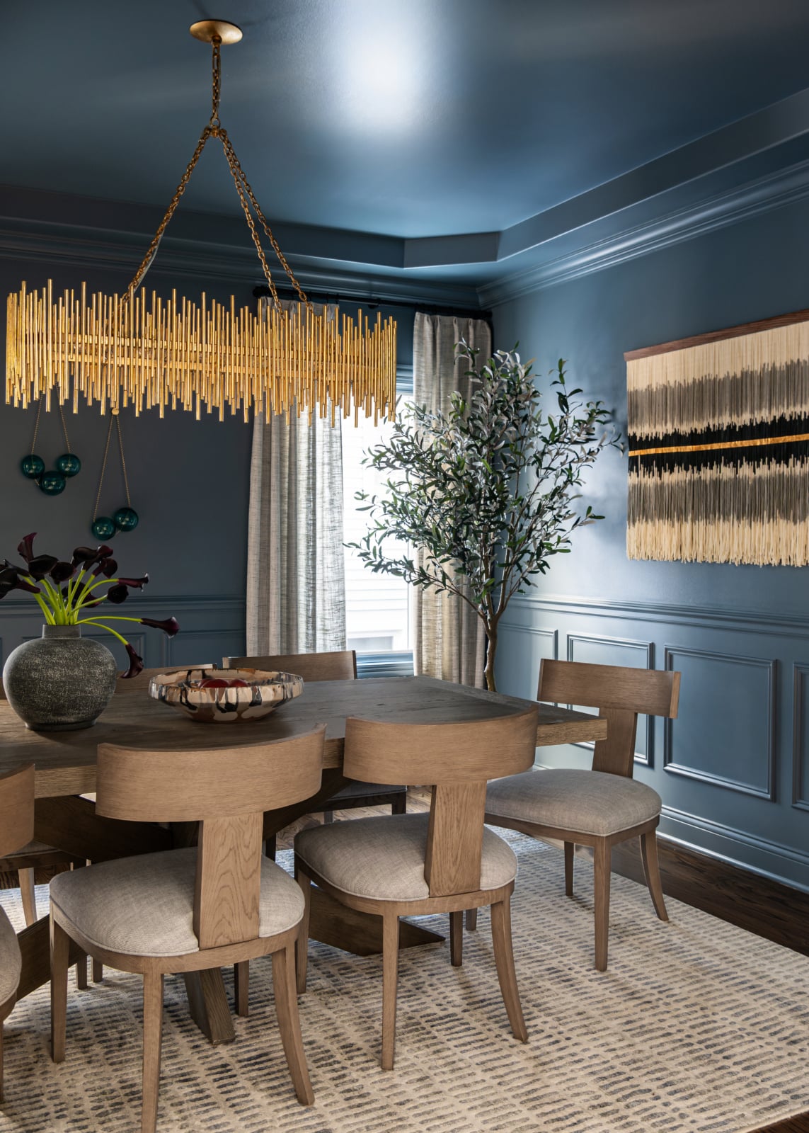
Timber is the most reliable partner, particularly walnut and warm oak. The orange in the grain is the direct complement to blue, which is why the combination looks correct without anybody having to think about it.
Brass and aged bronze do the same job in metal, where chrome and polished nickel push the room further toward cold.
Leather, especially tan and cognac, is the single most effective warming element in a blue room. A tan leather chair against a navy wall is one of the more dependable combinations in decorating.
Cream and warm white rather than a bright cool white on trim and ceilings. A crisp white against navy is a sharp, nautical look and it is colder than most people want to live in.
And texture, since a blue room with only smooth surfaces has nothing to soften it: wool, boucle, linen, plaster, unlacquered metal.
Go deeper than feels comfortable
The most common regret with blue is choosing a shade too pale.
Pale blue on four walls reads as tentative. It is light enough that it does not commit to being a colour, and dark enough that the room does not read as neutral, so it lands in an awkward middle. It also carries associations, nurseries and coastal themes, that are hard to shake in a living room.
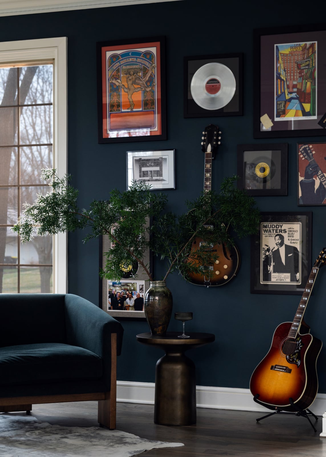
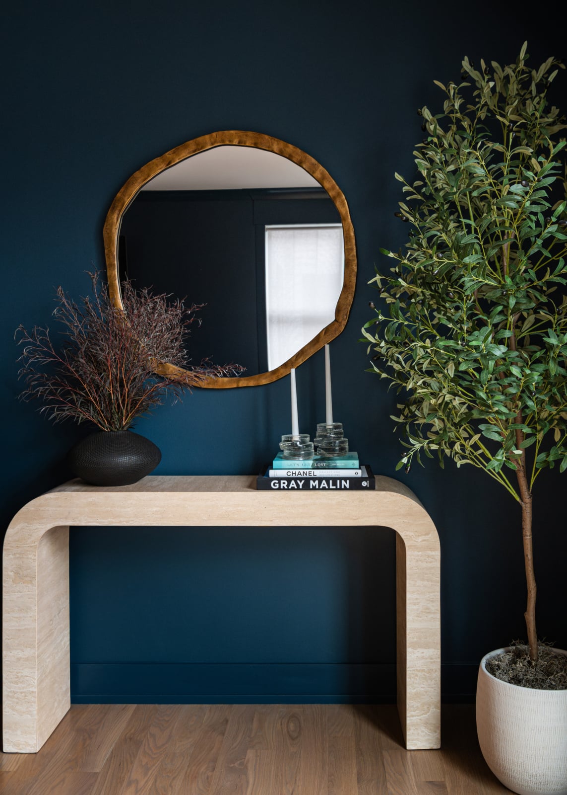
A properly deep blue does the opposite. It reads as deliberate, it behaves like a dark neutral, and it makes everything placed against it look better. Timber looks warmer, brass looks brighter, art stands out.
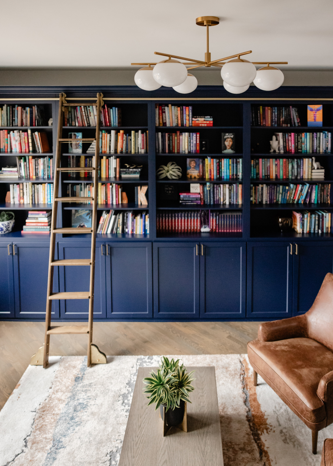
Blue is unusually good at full saturation. Where a deep red or green can feel oppressive across a whole room, a deep blue tends to feel calm, which is why it works so well on joinery, in libraries and in rooms used at night.
Blue and the light in the room
Orientation matters more with blue than with almost any other colour.
North-facing rooms receive cool light with more blue in it already. A blue wall in that light compounds the effect and the room can feel genuinely cold. It is not impossible, but it requires the warmest blue available, a red-based navy or a green-leaning teal, and it needs warmth from every other element in the room.
South and west-facing rooms take blue easily, since strong warm light offsets it through much of the day.
Artificial light is the other half. Warm lamps at 2700K make a blue room considerably more comfortable in the evening, and since living rooms here are used after dark for much of the year, that reading matters more than the daytime one.
Where to put the blue
Four approaches, in rough order of how confident they read.
All four walls, deep. The strongest and the most enveloping. Best in rooms used in the evening, and it needs layered lighting.
Joinery only. Blue bookcases or a blue fireplace wall against neutral walls. This is the most flattering use of blue in a living room, because it gives the colour a defined shape and lets the rest of the room stay light.
Blue upholstery against neutral walls. A navy sofa is effectively a large blue object in a warm room, and it is the most reversible version of the idea.
One wall. The weakest, and it usually reads as a compromise rather than a choice. If a whole room in blue is too much, joinery is a better answer than a single wall.
Chicago living rooms specifically
Two local factors that affect blue more than other colours.
The winters are long and heavily overcast, and for months the natural light is flat and grey. Blue under that light reads considerably colder than it does in July, which is the strongest argument here for choosing a warm blue and for getting the artificial lighting right. Judge a blue in February conditions rather than in summer sun, or judge it after dark.
City rooms in greystones and vintage walk-ups frequently face a neighbouring wall and get very little direct light at all. Those rooms actually take deep blue well, because they were never going to be bright and a saturated colour suits them better than a pale one that will only look drained. The blue library or blue sitting room in a dark city apartment is a genuinely good use of a difficult room.
Working through it with us
Blue is one of the colours clients most often want and most often get slightly wrong, almost always by choosing a shade with no warmth in it. Testing it against the timber and metal that will actually be in the room settles it quickly. You can see how we work on our design process page, look through recent projects, or get in touch.
Related reading: building a decorating palette, paint colors for north facing rooms, high contrast rooms, choosing a white that works and warm metals and wood finishes. We work across Chicago, Hinsdale and Elmhurst.
Frequently asked questions
What is the best blue for a living room?
One with warmth in it: a navy with a red or violet base, an ink blue, or a teal with green in it. Blue is the coolest colour available and most rooms are trying to feel warm, so a blue carrying some warmth of its own does most of the work for you.
Why does my blue living room feel cold?
Usually because everything else in it is cool too. Blue walls with grey upholstery, chrome fittings and a bright white ceiling gives you four cool elements and nothing pulling the other way. Warm timber, brass, leather and a cream white on the trim change it completely.
What colours go with blue in a living room?
Warm timber, particularly walnut and warm oak, since the orange in the grain is blue’s direct complement. Brass and aged bronze rather than chrome. Tan or cognac leather, which is the single most effective warming element. Cream rather than bright white on trim.
Should a blue living room be dark or light?
Deeper than most people choose. Pale blue on four walls reads as tentative and carries nursery and coastal associations that are hard to shake. A deep blue behaves like a dark neutral, reads as deliberate, and makes timber, brass and art look better against it.
Does blue work in a north-facing room?
It is the hardest case, because north light already carries more blue and a blue wall compounds it. It can work with the warmest blue you can find, a red-based navy or a green-leaning teal, and with warmth from every other element. A yellow-based scheme is not the answer either.
Is one blue accent wall a good idea?
It is the weakest of the options and usually reads as a compromise. If a whole room in blue feels like too much, painting the joinery instead gives the colour a defined shape and lets the walls stay light, which is more flattering than a single wall.
Can blue be used at full saturation?
Yes, more comfortably than most colours. Where a deep red or green can feel oppressive across a room, a deep blue tends to read as calm, which is why it suits joinery, libraries and rooms used in the evening particularly well.
How should a blue room be lit?
With warm lamps around 2700K and light at more than one height. Blue rooms are noticeably more comfortable in the evening under warm light, and since living rooms here are used after dark for much of the year, that is the reading that matters most.