
Last updated August 27, 2026
Key Takeaways
- North light is the most consistent light in the house. It barely shifts through the day, which is why artists have always wanted it.
- It is also cool and blue. Every color you put in the room will read a shade cooler and a shade darker than it does on the card.
- Do not reach for yellow to compensate. Yellow-based paint under cool light goes green and muddy, which is the single most common failure in these rooms.
- The two approaches that actually work are opposites: commit to depth and saturation, or go genuinely warm-white with a pink base rather than a yellow one.
- Fix the artificial light before you repaint. Most north rooms that feel cold are underlit at night, and no wall color solves that.
- Test on the north wall itself, at three in the afternoon and again after dark.
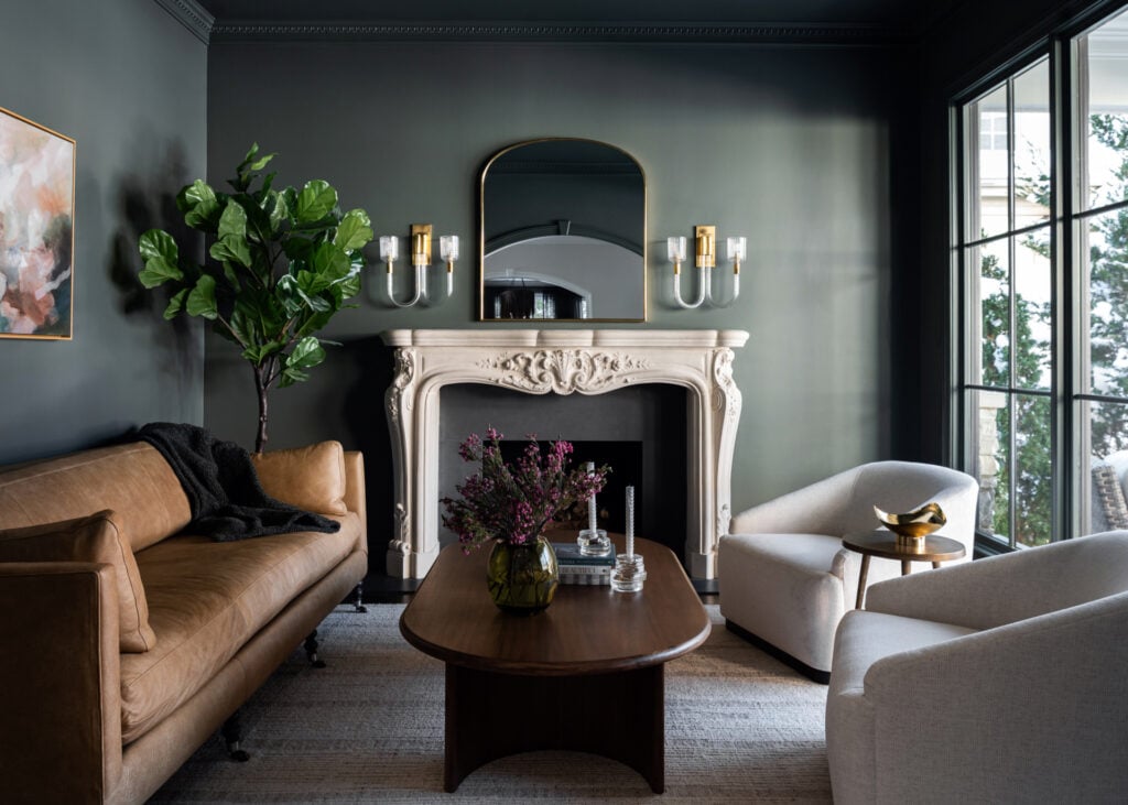
The paint colors that work in a north facing room are deep saturated shades that use the cool light rather than fighting it, and warm whites built on a pink or red base instead of a yellow one. Deep greens, warm charcoals, plaster pinks, clay and terracotta and true off-whites all hold their character under north light. Yellow-based creams, buttery neutrals and cool grays do not.
The instinct in a north facing room is to make it brighter and warmer, so people reach for a sunny yellow-toned cream and are disappointed. Understanding why that fails is most of the job.
North light is the best light in the house
A north facing room never gets direct sun. What it gets instead is light reflected off the whole sky, which arrives soft, diffuse and, crucially, almost unchanged from morning to evening. A south facing room swings from cool morning light to hot orange afternoon light and back. A north facing room looks essentially the same at nine as it does at four.
Painters and photographers have chased north light for centuries for exactly that reason. It is even, it has no glare, and it renders form and texture honestly. The problem is not that north light is bad. It is that it is cool, and most paint is sold and chosen under showroom light that is nothing like it.
What cool light does to color
North light has a higher proportion of blue in it. Put any color under it and three things happen. It reads cooler than the card suggested. It reads a little darker, because there is less light overall. And any yellow in the mix gets pushed toward green.
That last one is the killer. A cream that looked warm and inviting in the shop becomes a flat, slightly sour green-beige on a north wall. A greige with a yellow base turns to putty. It is not that the color changed, it is that you only ever saw it under light that flattered it.
The yellow trap
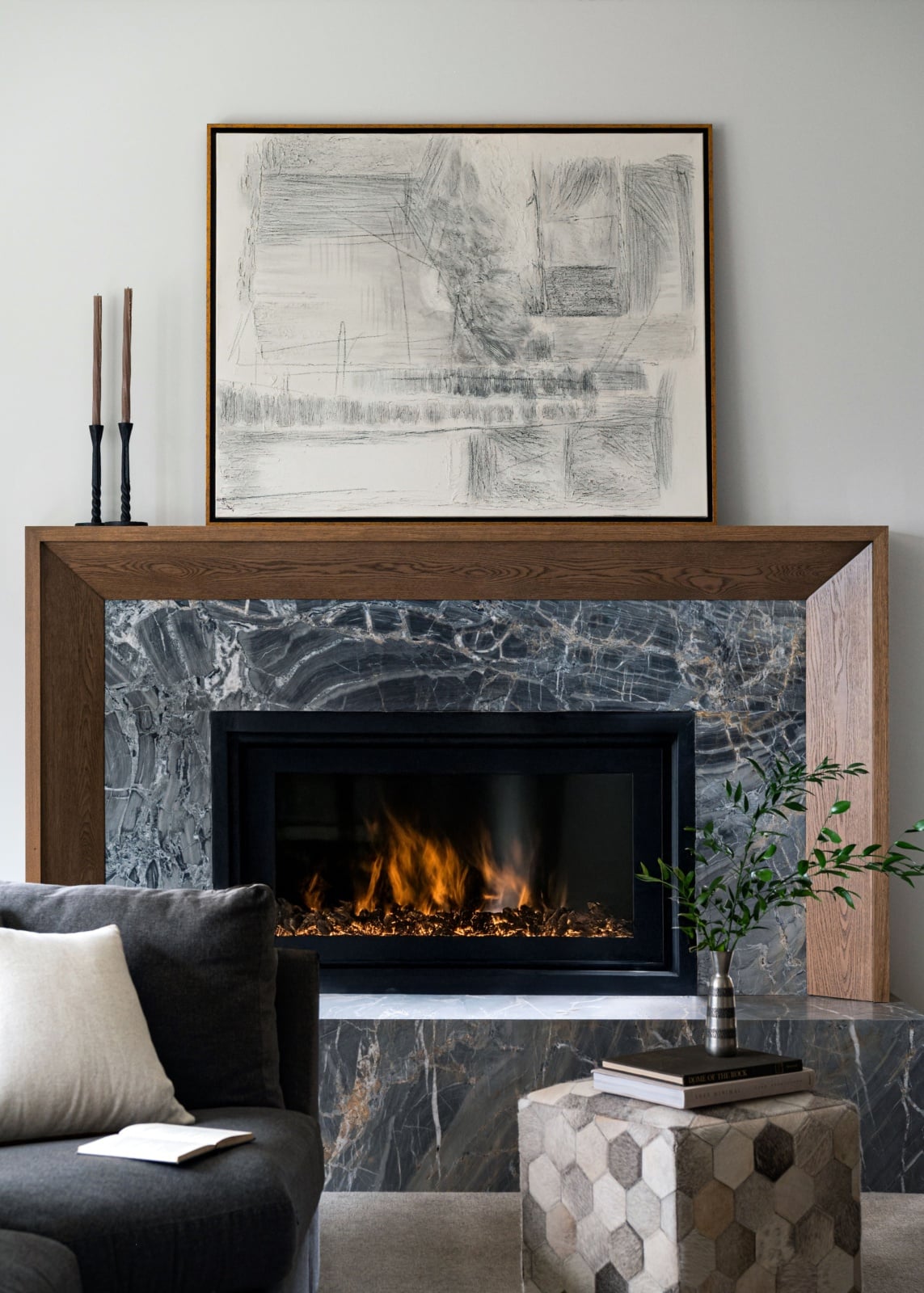
The standard advice for north facing rooms is to warm them up with yellow-based colors, and it is the most reliably wrong advice in decorating. It comes from a sensible instinct applied backwards: the room feels cold, yellow feels warm, therefore paint it yellow.
Under cool light, yellow does not read as warmth. It reads as dirt. The pigment that made it feel sunny in the showroom is the exact pigment that goes green when the blue in north light hits it. You end up with a room that is no warmer and now also looks slightly grubby.
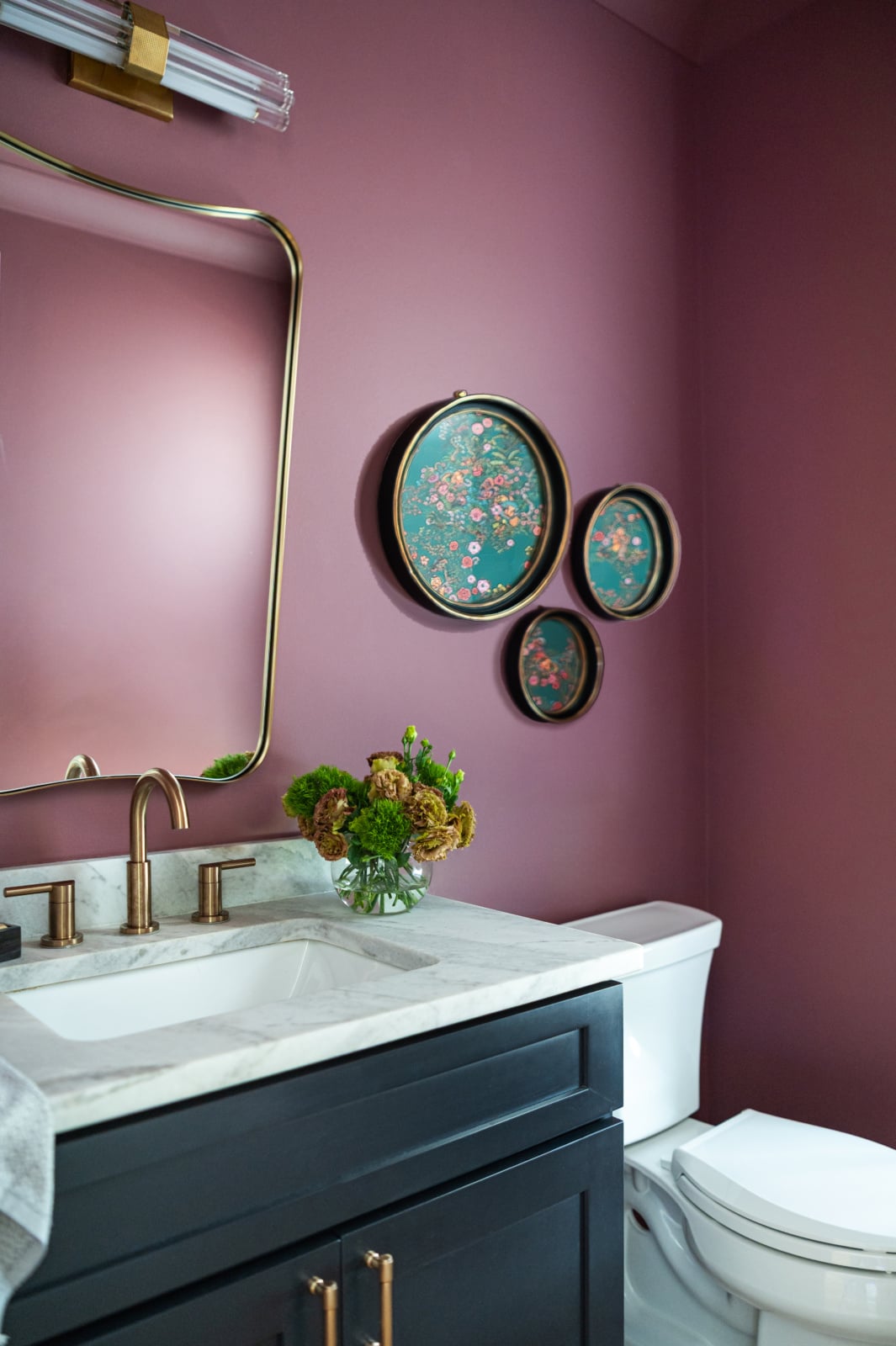
If you want warmth in a north room, the pigment to reach for is red, not yellow. Plaster pink, clay, terracotta, a warm charcoal with brown in it, a red-based off-white. These stay warm under cool light because there is no yellow in them to turn.
The two strategies that work
There are only really two coherent answers, and they point in opposite directions. What does not work is the middle, which is where most north facing rooms end up: a pale, cautious, slightly cool neutral that neither embraces the light nor counters it.
| Approach | What it does | Best in | The risk |
|---|---|---|---|
| Commit to depth Deep green, warm charcoal, oxblood, ink blue. Saturated enough that the light level stops being the point. |
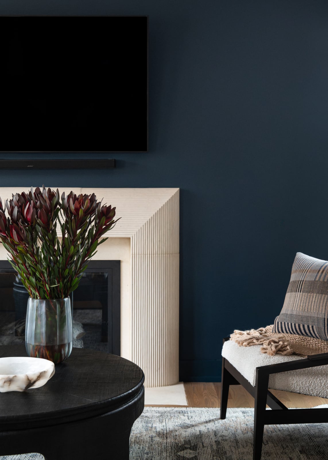
The even light renders a deep color beautifully and evenly, with none of the patchiness direct sun causes | Studies, dining rooms, bedrooms, north rooms used mostly in the evening | Needs real lamplight. A dark north room with one ceiling fixture is genuinely gloomy |
| Genuinely warm white A white or off-white built on a pink or red base. Never a yellow-based cream. |
Holds its warmth under cool light instead of turning green, and keeps the room bright | Kitchens, family rooms, anywhere you need the light level up | Get the undertone wrong and you land straight in the yellow trap |
| Clay, terracotta, plaster pink The middle path that does work, because the warmth is red-based. |
Reads warm and enveloping without going dark, and flatters skin tones under cool light | Bedrooms, powder rooms, north facing sitting rooms | Needs gray in it or it goes sweet |
| Cool gray and greige The default, and the one we talk clients out of most often. |
Compounds the coolness already in the room. The blue in the light and the blue in the paint stack up | Rarely, and only with strong artificial light | The room reads colder after painting than before |
| Yellow-based cream The advice everyone gives. |
Turns green and muddy under cool light | Almost never in a north room | The most common failure we are called in to fix |
North light varies with what is outside the window. A north room facing a brick wall behaves differently from one facing an open garden, where the light picks up green from the foliage.
Fix the lighting before you repaint
A large share of north facing rooms that feel cold are not suffering from a paint problem at all. They are underlit after dark, and the owner has been blaming the walls.
North rooms lose their light early, so they spend more of their useful life under artificial light than any other room in the house. If that artificial light is a single fixture in the middle of the ceiling, the room will feel flat and cold no matter what color it is. Layered light at different heights, table lamps, a floor lamp, something at eye level rather than overhead, will change the feeling of a north room more than a repaint will.
Get the lighting right first. Then choose the color under the light the room will actually have.
When a client says the room feels cold
Warm is a feeling, and it means different things to different people. When somebody says a north facing room feels cold, the useful first move is to work out what they mean, because there are several different problems wearing the same word.
Sometimes they mean color, and a deeper, redder wall is the answer. Sometimes they mean light, and the answer is lamps. Sometimes they mean texture, and the room is full of hard flat surfaces with nothing soft to absorb sound and light. And sometimes they mean the room does not work: the seating faces away from the window, or the layout has no natural place to settle. No paint color fixes that last one.
Anyone who answers the question with a color name before asking what you mean is guessing.
Material does more than paint here
Because north light is even and shadowless, it is unusually good at showing texture. That cuts both ways. A flat expanse of painted plasterboard looks flatter under north light than it would anywhere else, and a room with real texture in it looks considerably better.
This is where the money should go in a north facing room. Wool rather than a flat synthetic. A textured weave on the upholstery instead of a smooth cotton. Timber with visible grain. Unlacquered brass that shifts as it ages. Every one of those reads richer under diffuse light than it does under direct sun, and together they do more for the warmth of a room than any wall color.
Upholstery is the single thing worth spending more on, and a north facing room is where that decision shows most clearly.
Ceilings and trim
Two details that decide whether the scheme resolves.
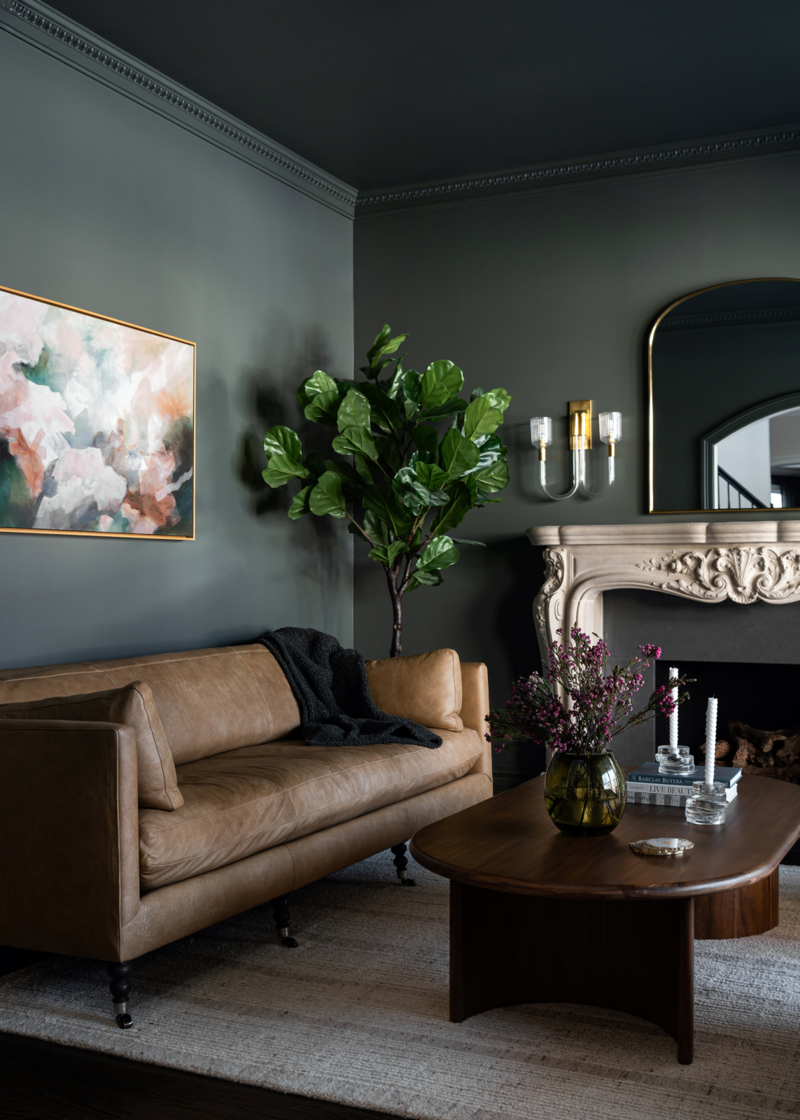
A stark white ceiling above a colored north wall creates a hard cold edge exactly where you least want one, and it makes the walls look darker by contrast. Bringing the wall color onto the ceiling, or using a paler version of it, softens that line and usually makes the room feel taller rather than lower, which surprises people.
Trim is the same argument at smaller scale. Bright white trim against a warm north wall pulls cool. A trim tone that shares a base with the wall, whether that is a soft off-white or the wall color in a different sheen, keeps the room reading as one thing.
Do not default to pale just to be safe
The most common outcome in a north facing room is a compromise: something pale and quiet, chosen because it seems less risky than committing. It is worth saying plainly that this is usually the worst option available.
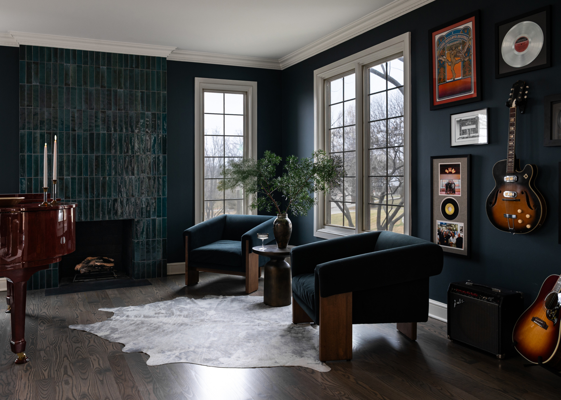
If you try to make every room safe, everything ends up neutral and boring. North rooms punish that more than most, because a pale cool neutral under pale cool light gives you nothing at all to look at. The rooms that work are the ones where somebody decided: a deep green library that feels like an event, a clay-colored bedroom that is genuinely enveloping. Life is short, and you should like the room.
How to test a color in a north room
Sample cards will mislead you here more than in any other orientation, because you almost certainly looked at them somewhere better lit.
Paint a large sample directly onto the north facing wall, the one that gets the least light, rather than a wall opposite it. Then look at it at three points: mid-morning, mid-afternoon and after dark with the lamps on. Because north light is so consistent, the daytime readings will be close to each other, and that is the point. The gap that matters is between daylight and lamplight, and it is often dramatic. A color that looks resolved at three can turn muddy or pink at eight.
Whatever the room looks like at eight in the evening is what you will live with, because that is when most north facing rooms are actually used.
Chicago rooms specifically
Two local factors change the answer. Chicago winters are long and heavily overcast, which means a north facing room here spends months on end at a lower light level than the same room would in a sunnier climate. That argues for taking the depth strategy seriously rather than chasing brightness you are not going to get anyway.
The second is proximity. City rooms, particularly in vintage walk-ups and greystones, often face a neighbouring brick wall a few feet away. That is not really north light any more, it is light bounced off warm masonry, and it arrives with an orange cast that changes everything. In the western suburbs, where north facing rooms usually look onto open garden, the light picks up green from planting in summer and goes noticeably colder once the leaves drop.
Look at what is actually outside the window before choosing anything.
Working through it with us
North facing rooms reward getting the decisions in the right order: what is outside the window, then the artificial light, then the materials, then the color. Done backwards, you repaint twice. You can see how we work on our design process page, look through recent projects, or get in touch about your own home.
Related reading: choosing a white that works, warm neutrals in a living space, decorating a room without windows, brightening a living room and building a palette from scratch. We work across Chicago, Hinsdale and Naperville.
Frequently asked questions
What are the best paint colors for a north facing room?
Deep saturated colors that use the cool light rather than fighting it, and warm whites built on a pink or red base. Deep green, warm charcoal, oxblood, ink blue, clay, terracotta and plaster pink all hold their character under north light. Avoid yellow-based creams and cool grays.
Why do north facing rooms feel cold?
North facing rooms never receive direct sun, so they get soft light reflected off the whole sky, which carries more blue in it. Every color reads cooler and slightly darker as a result. Many north rooms also feel cold because they are underlit after dark rather than because of their wall color.
Should I use warm yellow paint in a north facing room?
No. This is the most common advice for north facing rooms and the most reliably wrong. Yellow pigment under cool blue light shifts toward green, so a cream that looked warm in the shop turns muddy on the wall. Reach for red-based warmth instead, such as plaster pink, clay or a warm charcoal.
Do dark colors work in a north facing room?
Yes, often better than pale ones. North light is even and shadowless, so it renders a deep color consistently across the wall with none of the patchiness direct sun creates. A dark north room does need properly layered lamplight, because it will be used under artificial light for much of its life.
Does gray work in a north facing room?
Rarely. Gray has a blue base and north light is already blue, so the two stack up and the room reads colder after painting than it did before. A warm charcoal with brown in it works. A cool mid-gray almost never does.
What sheen should I use in a north facing room?
A slightly higher sheen than you might use elsewhere is worth considering, because it bounces the limited light rather than absorbing it. The tradeoff is that sheen shows wall imperfections, and north light is unusually good at revealing them, so the wall surface needs to be sound.
Should the ceiling be white in a north facing room?
Usually not a stark white. A bright white ceiling above a colored wall creates a hard cold edge and makes the walls look darker by contrast. Carrying the wall color onto the ceiling, or using a paler version of it, softens the transition and often makes the room feel taller.
How do I test paint colors in a north facing room?
Paint a large sample onto the north facing wall itself, not a wall opposite it, and look at it mid-morning, mid-afternoon and after dark with the lamps on. The daytime readings will be similar because north light is consistent. The gap that matters is between daylight and lamplight.