
Last updated August 27, 2026
Key Takeaways
- Almost all bookshelf advice is written for shelves holding a dozen books as props. If you own hundreds, you are solving a different problem.
- A real library has to stay findable. Any arrangement that looks good but means you cannot locate a book has failed.
- Do not color sort a working collection. It looks striking in a photograph and makes the shelves unusable within a week.
- Turning books backwards to hide the spines removes the only thing that tells you what the book is. Do not do it.
- Let the books be the pattern. With a full wall of them, the texture comes from the books themselves, so the styling job is controlling the edges.
- Leave roughly one shelf in eight partly empty. Not for looks, but because a collection that is completely full has nowhere to grow.
To style bookshelves that hold a lot of books, organise them so you can still find things, keep the spines facing out, and treat the books themselves as the visual texture rather than something to be hidden or arranged by colour. Group by subject first and size second, vary horizontal and vertical stacks to break up long runs, and place a small number of objects at the ends of runs rather than scattered through.
Most advice on this topic is written for a shelf with fifteen books on it, where the books are decoration. If you have several hundred, that advice will actively make your life worse.
A library is not a display
The distinction matters, and it decides almost everything that follows.
A styled shelf in a magazine holds a handful of books chosen for the colour of their spines, stacked in threes, interspersed with pottery. It is a still life. Nobody takes anything off it.
A library is storage for things you use. Books come out and go back, new ones arrive, and the arrangement has to survive that. The moment styling advice conflicts with retrieval, retrieval wins, because a beautiful shelf you cannot use stops being beautiful the first time you take it apart looking for something.
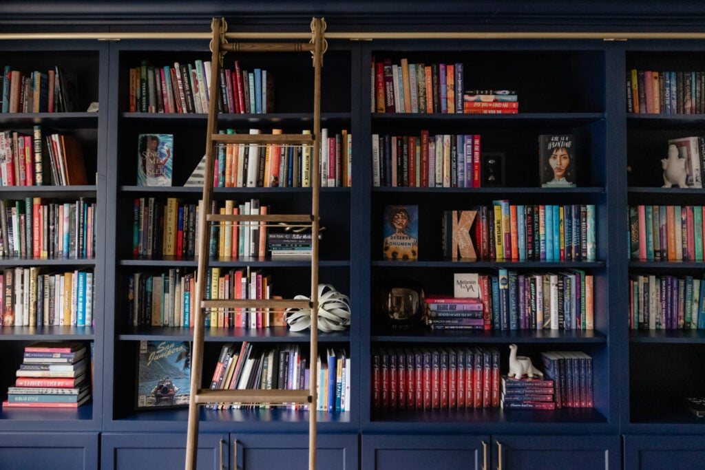
The good news is that a full wall of books is genuinely handsome on its own. Spines have colour, texture and rhythm already. You are not decorating an empty shelf. You are editing something that already has visual interest.
Organise for retrieval first
Start with how you actually look for a book, because that is the system that will hold.
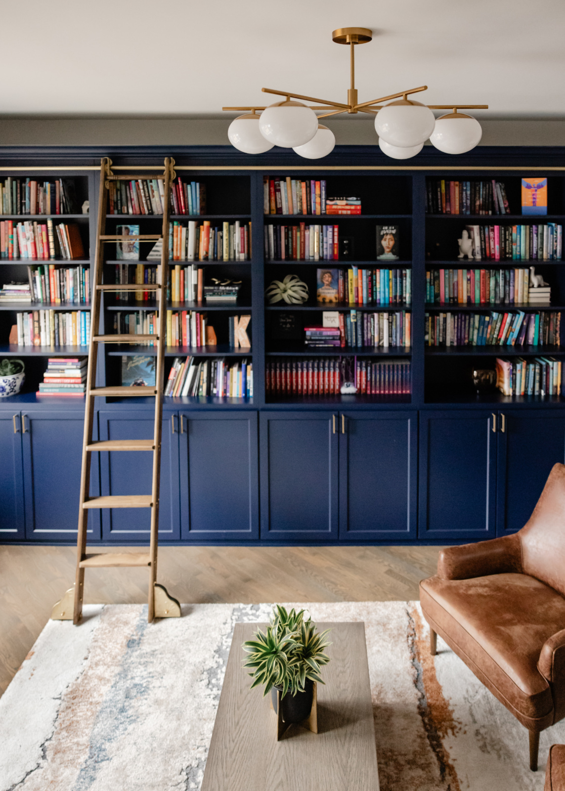
For most people that means subject. Fiction together, cookery together, art and design together, work-related material together. Within a subject, roughly by size, because it looks tidier and because tall books need the tall shelves anyway. That is it. It is not a sophisticated system and it does not need to be.
Alphabetical works if you own a great many books and genuinely search by author. It fails for everyone else, because most people remember what a book is about long before they remember who wrote it.
Whatever the system, it has to be obvious enough that other people in the house can put a book back correctly. A system only you understand degrades into no system.
Approaches compared
These are the arrangements people consider. They differ enormously in how well they survive contact with an actual collection.
Read the findability column first. It is the one that determines whether the arrangement still exists in six months.
| Approach | Still findable? | How it looks | Verdict |
|---|---|---|---|
| By subject, then size The way most people actually search. |
Yes, and other people can reshelve correctly | Ordered without looking regimented. Spine colours fall naturally | What we specify almost every time |
| Alphabetical by author Works only if you genuinely think in authors. |
Yes for the owner, rarely for anyone else | Neat, slightly institutional | Good for very large collections, poor for most |
| By colour The photogenic one. |
No. You must remember the jacket of every book you own | Striking in a photograph, and the reason people try it | Avoid on a working collection. Fine on a shelf of twenty |
| Spines turned inward Books reversed to show the pages. |
No. You have removed the only label | Uniform and beige, like a hotel | Never. It discards the books as books |
| Books removed to make room for objects Shelves mostly styled, books thinned out. |
Not applicable, the books went elsewhere | Looks like a showroom | Only if you did not want a library |
| Grouped in stacks of three with gaps The magazine formula. |
Fine at small scale, unworkable at large | Good on two or three shelves, absurd across a wall | Borrow the rhythm, not the ratio |
The right answer depends on how many books you own. Under about fifty, styling rules apply. Over a few hundred, storage logic has to lead.
Let the books be the pattern
With a full wall, the books already supply the visual interest. Recognising that changes the job from decorating to editing.
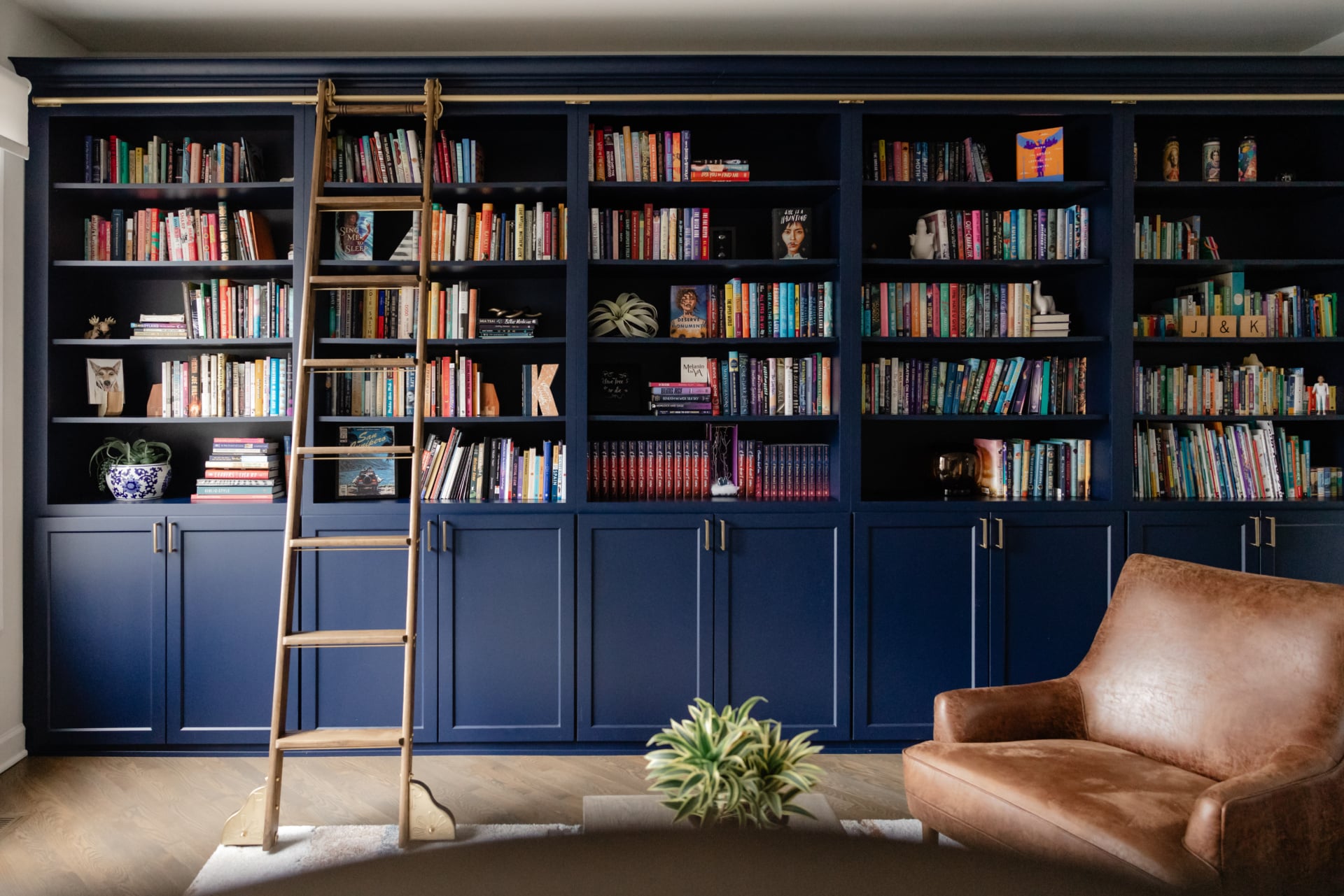
A run of spines has natural variation, different heights, different colours, cloth against paper against foil. Across a whole wall this reads as texture, in the same way a tweed reads as texture rather than as individual threads. Adding a lot of decorative objects into it does not enhance the pattern, it interrupts it.
So the objects go at the ends of runs, at the corners of the composition, or on one or two shelves that act as a pause. Not sprinkled evenly through, which is the instinct and which produces visual noise.
Control the edges, not the contents
This is the technique that makes a heavily filled shelf look composed rather than crammed, and it is almost never described.
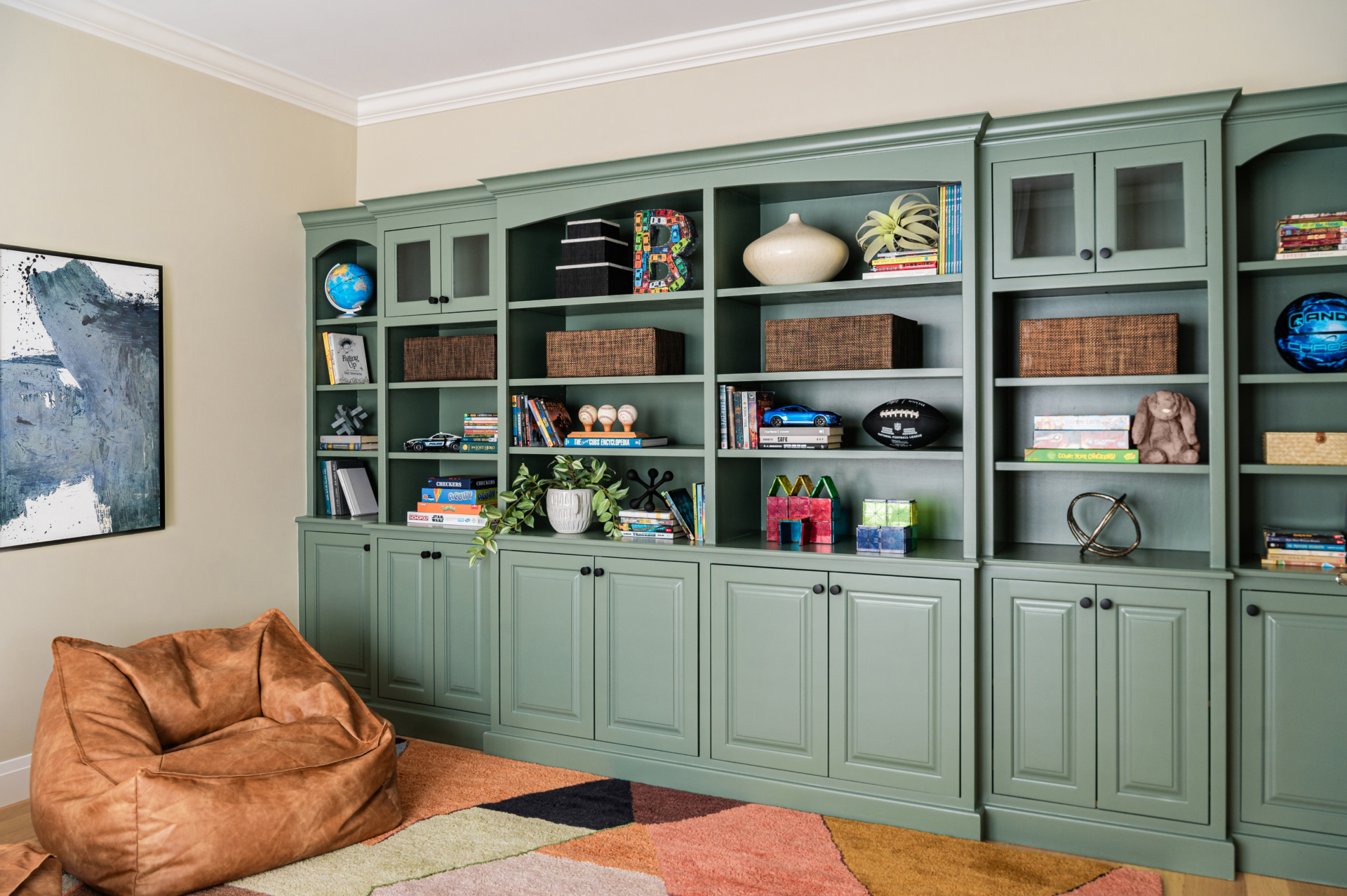
What reads as untidy is rarely the books. It is the ragged front edge, where some books sit flush with the shelf front and others are pushed back three inches. Pull every book forward so the spines line up with the front of the shelf and the whole wall resolves instantly. It takes twenty minutes and does more than any amount of rearranging.
The top edge matters too, but in the opposite direction. A completely even top line across every shelf looks mechanical. Some variation in book height is what stops a library looking like a shop. You want a level front edge and a varied top edge.
Horizontal stacks earn their place
Laying some books flat is the one piece of standard advice that works at scale, provided you understand what it is for.
A horizontal stack does three things. It breaks a long run of vertical spines so the eye has somewhere to rest. It creates a surface, so a small object has somewhere to sit that is not the shelf itself. And practically, it holds the vertical books upright at the end of a run, which is what a bookend would otherwise be doing.
Keep stacks low, three or four books, and do not put one on every shelf. If every shelf has the same arrangement the wall becomes a grid, and the whole point was to break the rhythm.
Objects, and what they are actually for
A room is not finished until it is styled, and on a bookshelf the objects are doing something specific: they tell you who lives here.
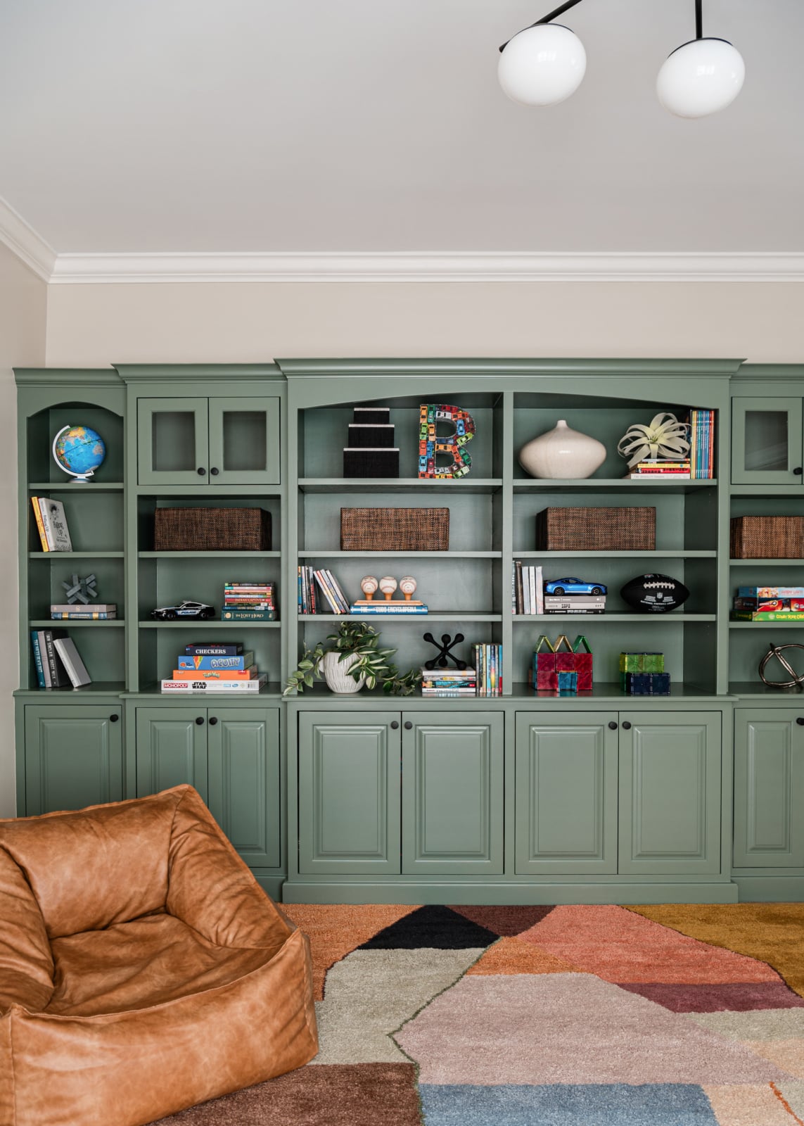
A coffee table book says something about someone’s interests. A piece of art says what they find beautiful. The small things collected on a shelf say where they have been. That is the reason to include them, and it is a much better guide than any rule about the ratio of books to objects.
Which means the objects should be yours. Things brought back from somewhere, inherited, made, or genuinely collected. A shelf filled with decorative items bought to fill a shelf reads exactly as what it is, and it is the fastest way to make an expensive room feel anonymous.
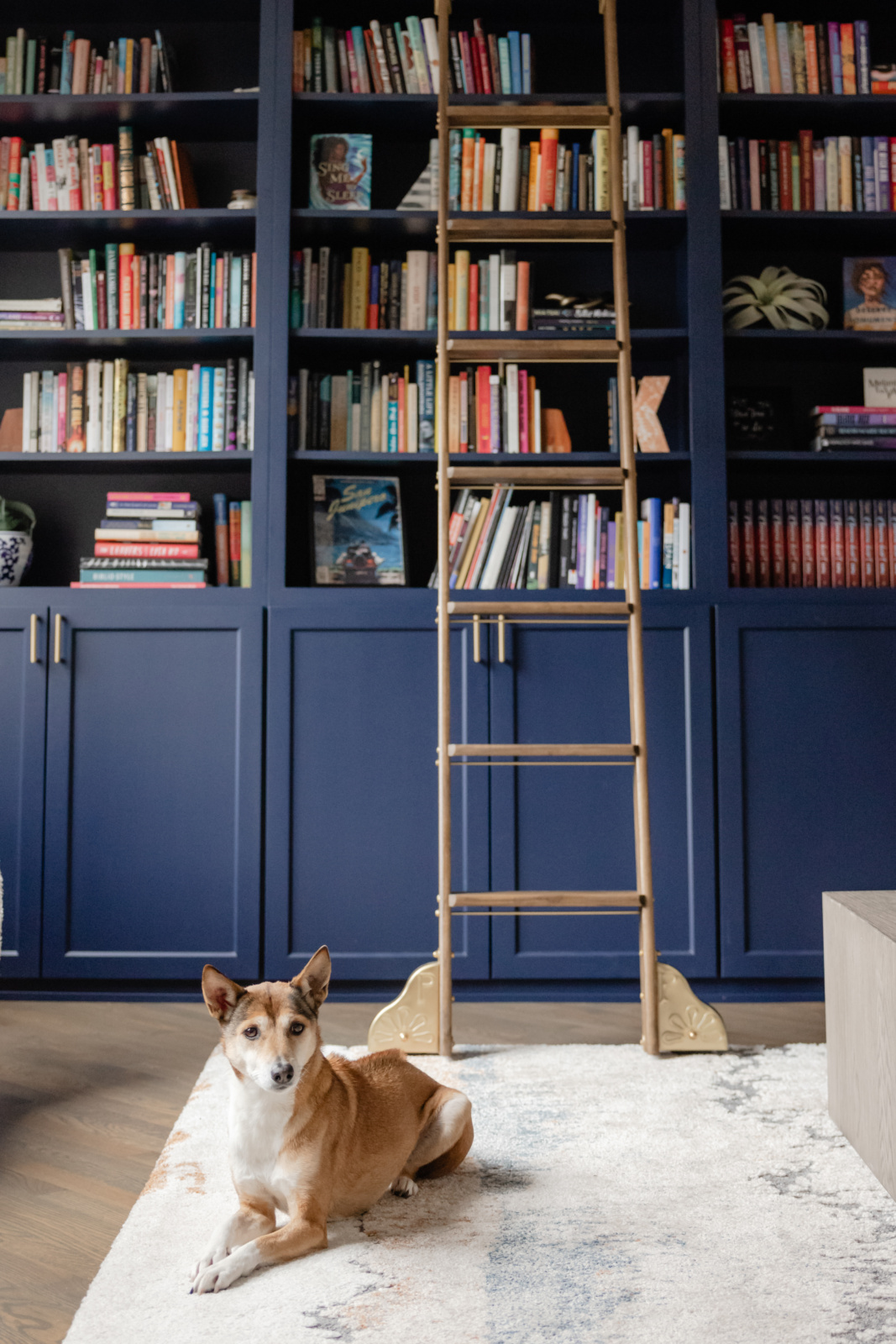
Scale is where this most often goes wrong. Small objects scattered across a big wall of books simply disappear. Fewer, larger pieces read properly from across the room.
Leave room to grow
A practical point that gets missed and then causes trouble for years.
People who own a lot of books buy more books. A library filled edge to edge on the day it is finished has nowhere to put next year’s, and what happens next is predictable: books get stacked horizontally on top of the vertical ones, then piled on the floor in front, and the careful arrangement disappears.
Plan for roughly one shelf in eight to be partly empty, spread through rather than left as one obvious gap. It looks intentional, it gives the eye somewhere to rest, and it means the collection can expand without the whole thing collapsing.
Light the shelves properly
A deep bookcase puts its own contents in shadow, and unlit shelves are the reason a library can look gloomy in a well-lit room.
Picture lights or a slim linear fitting mounted at the front of each shelf throw light onto the spines rather than into the room, which is what you want: it makes the books legible and turns the wall into something that glows in the evening. Lighting inside the cabinet, at the back, does the opposite and silhouettes everything.
This is a decision to make before the joinery is built, because the wiring has to be in the carcass. Retrofitting it afterwards is possible and always looks like a retrofit.
Built-in or freestanding
Worth settling early, because it changes the whole character of the room.
Built-in joinery reads as architecture. It takes the full height, the proportions can be drawn to suit the room, and the shelf depths can be varied so that art books and paperbacks each get what they need. It is also the only version that looks deliberate in a room with awkward walls, chimney breasts or sloped ceilings, which describes most older Chicago houses.
Freestanding bookcases read as furniture. They can move with you and they suit a rented flat or a room whose use is not settled. The compromise is that they rarely fill a wall properly, and the gap at the top collects dust and looks unresolved.
If the collection is permanent and the house is permanent, build it in. Joinery is one of the places where quality is most visible and lasts longest.
Chicago rooms specifically
Local housing stock shapes this more than people expect.
Vintage city apartments and greystones tend to have chimney breasts with alcoves either side, which are the natural home for built-in shelving and one of the few places where the awkward geometry of an old room becomes an advantage. Ceiling heights are usually generous enough to run shelves right up, and a rolling ladder stops being an affectation and becomes the only way to reach the top.
Western suburb houses more often have long uninterrupted walls and double-height rooms. The risk there is a shelf wall that is too shallow and too low for the space, so it reads as a strip of clutter rather than as architecture. Scale is the thing that goes wrong most often in a big room, and a bookcase is no exception.
Working through it with us
Bookcases are one of the few things in a house that are simultaneously storage, architecture and a portrait of the people who live there, which is why they are worth drawing properly rather than buying off a shelf. You can see how we work on our design process page, look through recent projects, or get in touch about your own home.
Related reading: filling a blank wall, choosing a statement piece, planning a lighting layout, decorating a room without windows and high contrast rooms. We work across Chicago, Hinsdale and Elmhurst.
Frequently asked questions
How do you style bookshelves when you have a lot of books?
Organise by subject first and size second so the shelves stay findable, keep every spine facing out, and treat the books themselves as the visual texture. Add a small number of objects at the ends of runs rather than scattered through, and pull all the books forward so the front edge lines up.
Should you organise books by colour?
Not on a working collection. Colour sorting photographs beautifully and means you have to remember the jacket of every book you own in order to find anything. On a shelf of twenty display books it is fine. On several hundred it stops being usable within a week.
Is it acceptable to turn books backwards to hide the spines?
No. The spine is the only thing that tells you what the book is, so reversing them removes the sole means of finding anything, and the result is a uniform beige wall that could belong to anyone. It treats a library as raw material for a colour scheme.
How many objects should go on a bookshelf?
Fewer than most advice suggests, and larger than you expect. A full wall of books already supplies the pattern, so objects scattered evenly through it read as noise. Place a few at the ends of runs or on one or two shelves that act as a pause, and choose things with personal meaning.
Why do my bookshelves look messy even after tidying?
Almost always the front edge. Some books sit flush with the shelf front and others are pushed back, which reads as untidy no matter how well organised the contents are. Pull every book forward so the spines align with the shelf front. It takes about twenty minutes and transforms the wall.
Should bookshelves be completely full?
No. Leave roughly one shelf in eight partly empty, spread through rather than as one large gap. People who own a lot of books keep buying books, and a library with no room to grow ends up with horizontal piles on top and stacks on the floor within a year.
How should bookshelves be lit?
With picture lights or slim linear fittings at the front of each shelf, throwing light onto the spines. Lighting placed at the back of the cabinet silhouettes everything and makes the books harder to read. Plan it before the joinery is built, because the wiring has to run inside the carcass.
Are built-in bookshelves better than freestanding ones?
For a permanent collection in a permanent home, yes. Built-in joinery reads as architecture, uses the full height, and can be drawn around chimney breasts and awkward walls, which suits older Chicago houses. Freestanding bookcases suit a rented flat or a room whose use is not yet settled.