
Last updated August 27, 2026
Key Takeaways
- There is no white that works everywhere. A white is defined by its undertone and its light reflectance value, and the room decides which one is right.
- Every white has an undertone. Yellow, pink, green, grey or blue. It is invisible on a card and unmistakable across four walls.
- Light reflectance value is the number to ask for. Above 80 reads as white. Between 70 and 80 will read as a soft colour, whatever the name says.
- Do not compare whites against each other. Side by side the warmer one looks cream and the cooler one looks grey. Compare each against a sheet of printer paper instead.
- The orientation of the room matters more than the fashion. A north-facing room needs a different white from a south-facing one.
- Standard ceiling white is a cool bright white and it fights a warm wall. Use a paler version of the wall colour instead.
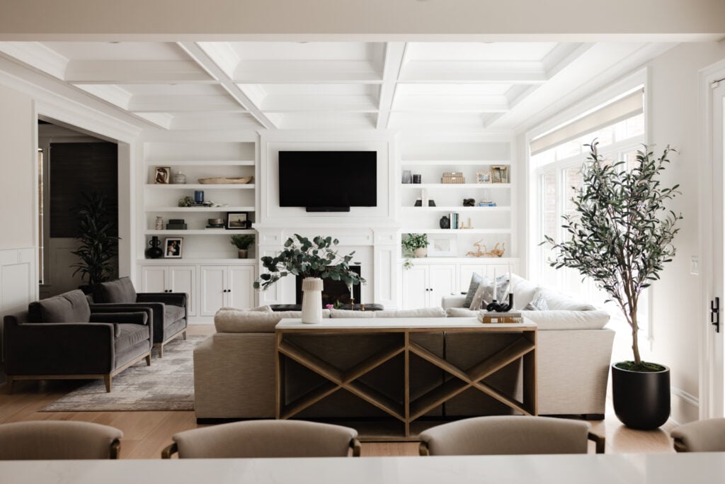
The best white interior paint is the one whose undertone suits your room’s light and whose light reflectance value suits the job. Warm whites with a touch of grey suit most living spaces and stay off yellow. Whites with a pink or red base hold their warmth in north-facing rooms. Cooler, brighter whites belong in rooms with strong direct sun or where you genuinely want a crisp gallery effect.
Asking which white is best in the abstract is the wrong question, and it is why people repaint. The useful question is which undertone your room can take.
Every white has an undertone
This is the whole subject in one idea, and it is the thing a paint card cannot show you.
A white paint is never pure white pigment. It contains a small quantity of something else, and that something is the undertone: yellow, pink, red, green, grey or blue. On a two-inch chip against dozens of other chips, all of them look white. Applied to four walls and a ceiling, that trace of colour is multiplied across a huge surface and becomes the colour of the room.
This is why people say a white “went yellow” or “looks grey” after painting. It did not change. There was simply not enough of it on the card to see what it actually was.
Naming the undertone before anything else turns an impossible choice among fifty whites into a manageable choice among five.
Light reflectance value is the number to ask for
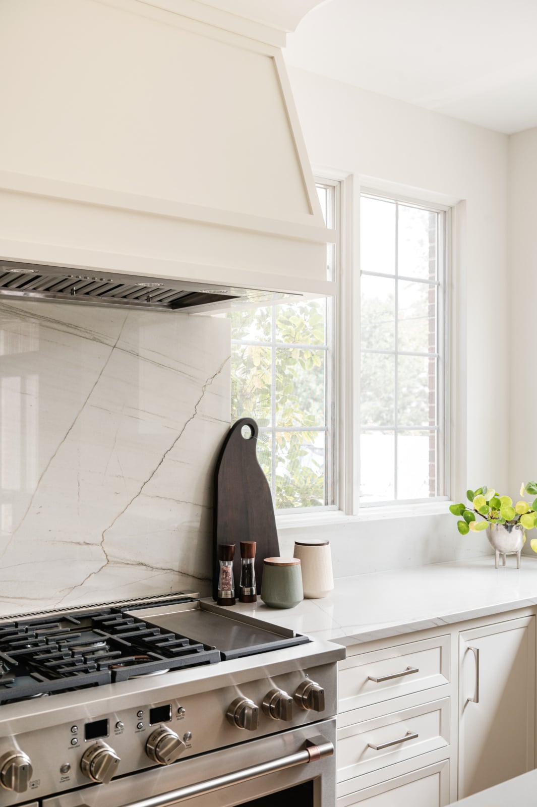
Light reflectance value, usually written LRV, measures how much light a colour returns, on a scale where black is zero and pure white is one hundred. It is published for almost every paint and almost nobody uses it.
Above about 80 a colour reads as white. Between 70 and 80 it reads as a very pale colour, whatever the name on the tin suggests, and a lot of the fashionable “whites” of the last decade sit here. Below 70 you are choosing a soft neutral and should treat it as one.
The number is useful because it is objective in a subject full of adjectives. Two whites described identically in a brochure can be ten points apart in LRV, which is the difference between a room that feels bright and one that feels soft. If you are choosing between two candidates and cannot articulate the difference, look up both numbers and the difference will usually be obvious.
Whites compared by undertone
Grouping by undertone rather than by brand is what makes the choice tractable. Every manufacturer has a version of each of these.
| Undertone | How it behaves | Suits | Avoid in |
|---|---|---|---|
| Warm white with grey The most versatile group. Warm enough not to feel clinical, grey enough not to go yellow. |
Reads as a clean, quiet white in most light | Living rooms, bedrooms, whole-house schemes, trim | Rarely wrong. Can feel flat in a very dark room |
| Red or pink based Warmth without any yellow in it. |
Holds its warmth under cool light instead of turning green | North-facing rooms, city apartments facing a wall | Strong afternoon sun, where it can read distinctly pink |
| Yellow based, cream The traditional warm white. |
Sunny and welcoming in warm light, muddy in cool light | South and west-facing rooms with good daylight | North-facing rooms, where it goes green and dull |
| Green based Quiet, slightly earthy, reads as almost-not-white. |
Very restful, and flattering to timber and stone | Rooms with garden views, rooms with a lot of wood | Rooms with cool artificial light, where it goes grey |
| Blue or cool grey based Crisp and gallery-like. |
Sharp and modern, and cold if the light is not strong | Rooms with direct sun, contemporary schemes, art walls | North-facing rooms, which are already blue |
| Pure bright white Very high LRV, minimal undertone. |
Stark. Shows every flaw in the wall surface | Gallery walls, ceilings in modern rooms, exterior trim | Older houses, where it makes the millwork look plastic |
Undertone is only half the answer. Check the LRV as well, because two whites with the same undertone can behave very differently depending on how much light they return.
Do not compare whites against each other
The standard way people choose a white is the one guaranteed to mislead them.
Put five white samples side by side and your eye stops judging them against white and starts judging them against each other. The warmest one now looks like cream. The coolest looks like grey. The one in the middle looks correct, and it looks correct only because of its neighbours. Change the group and a different sample becomes the obvious choice.
Compare each candidate against a sheet of ordinary printer paper instead. Paper is close enough to neutral to act as a reference, and against it you will see immediately that a white you thought was neutral is in fact distinctly pink or green. That is the information you need, because on the wall the room will be judging your paint against the daylight, not against four other samples.
The room’s orientation chooses the undertone
Which undertone works is largely settled by where the light comes from, and this is where most repainting starts.
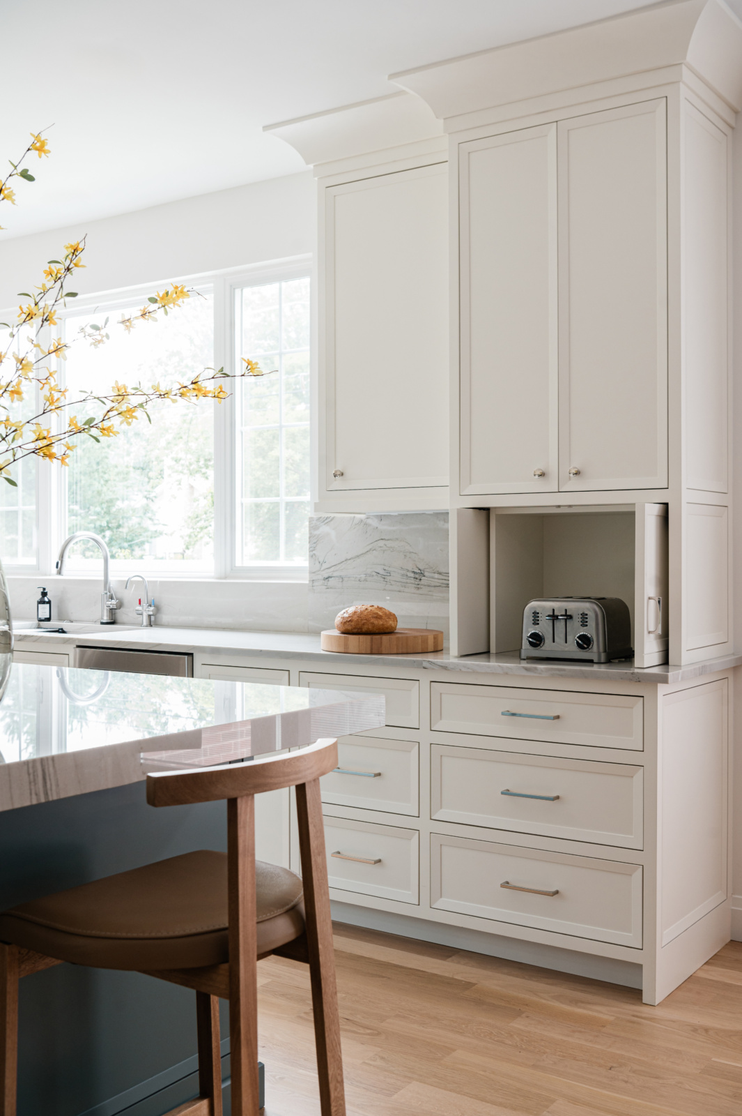
North-facing rooms get cool, indirect light with more blue in it. That light pushes yellow toward green, so a cream that looked warm in the shop goes muddy on the wall. In these rooms a white with a red or pink base holds its warmth, because there is no yellow in it to shift.
South-facing rooms get strong warm light for much of the day and can carry a yellow-based cream comfortably. They can also take a cooler white without it feeling cold, because there is plenty of light to warm it up.
East and west rooms change character through the day, warm at one end and cool at the other, which argues for a white with a grey base as the most stable choice across both.
Walls, trim and ceiling
Three surfaces, and the relationship between them matters as much as the individual choices.
Using the same white on walls and trim, in different sheens, is quieter and more sophisticated than contrasting them, and it is what most well-resolved rooms actually do. A flat or matte finish on the wall and an eggshell or satin on the woodwork gives you a subtle shift in light rather than a hard line, and it lets the architecture read as one thing.
Contrasting trim in a brighter white against a softer wall is the traditional approach and works well in a period house with substantial millwork worth pointing out. It works less well in a room with minimal modern trim, where it just draws attention to a plain skirting.
Ceilings are where the standard advice goes wrong. Off-the-shelf ceiling white is a cool, high-LRV white, and above a warm wall it reads as a bright cold plane that makes the walls look dirty by comparison. A ceiling in a paler version of the wall colour, or the wall colour thinned, resolves the room far better.
Sheen, and what it does to a white
Sheen changes the perceived colour of a white as much as some undertone differences do, which surprises people.
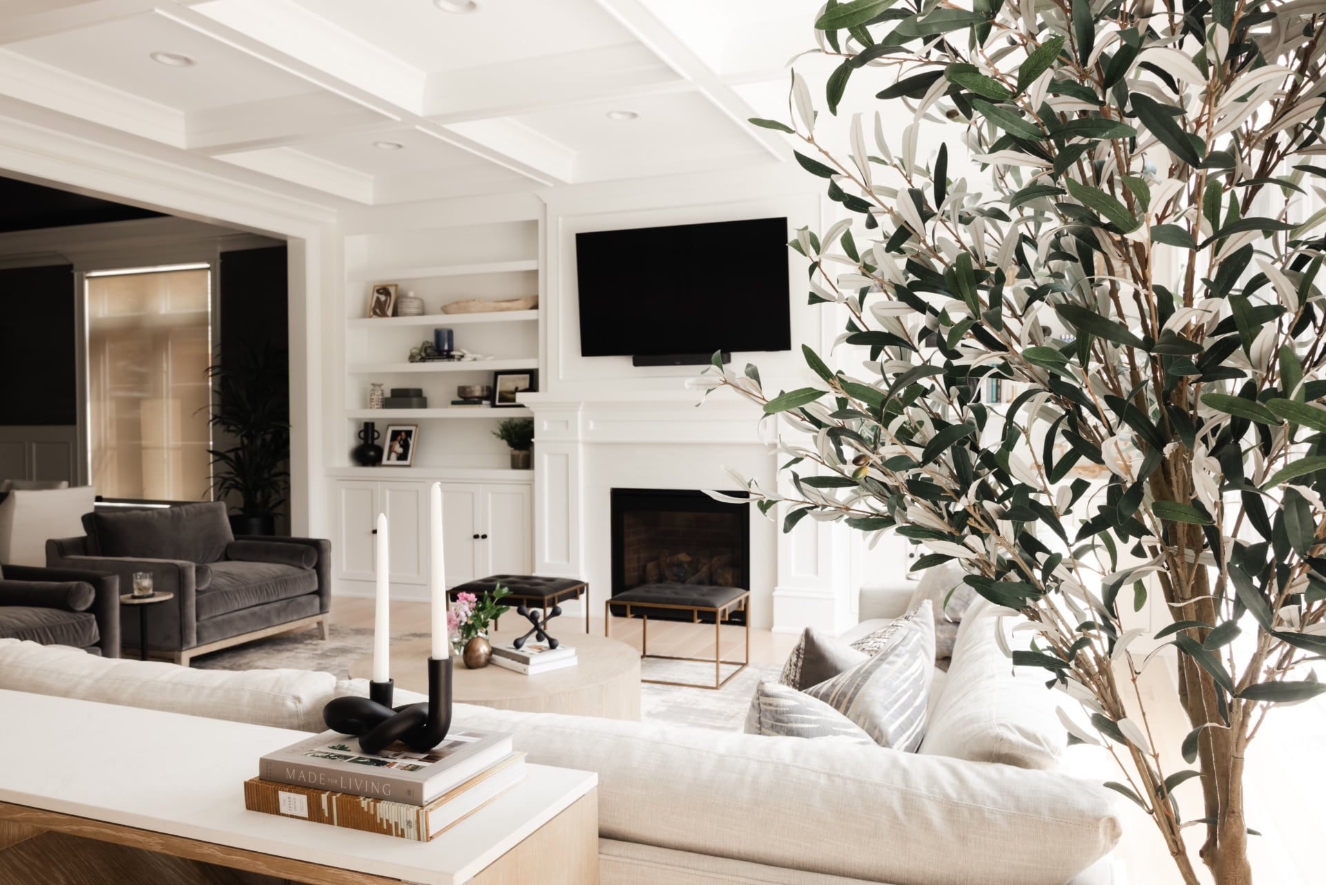
A flat white absorbs light and reads softer and slightly deeper. The same white in satin reflects light and reads brighter and cooler. Paint a wall flat and a door satin in the identical colour and most people will tell you they are different colours.
Flat and matte are the right choice for walls in most rooms: they conceal imperfections, they read as expensive, and they sit well beside natural materials. The exception is anywhere that gets wiped, where a washable matte or an eggshell earns its place.
Higher sheens on woodwork are traditional and hard-wearing, though a full gloss is unforgiving and will show every ripple in an old door.
When a client says they want it to feel warmer
Warm is a feeling, and it means different things to different people. When somebody asks for a warmer white, the useful move is to find out what they mean before naming a colour.
Sometimes they mean the undertone, and a red-based white is the answer. Sometimes they mean the light level, and the real problem is a single cool ceiling fitting rather than the paint. Sometimes they mean the room has nothing soft in it, no textile, no timber, nothing that absorbs sound, and no white on earth will fix that. And occasionally they mean the room does not work, and no colour is going to help.
Anyone who answers with a paint name before asking what you mean is guessing.
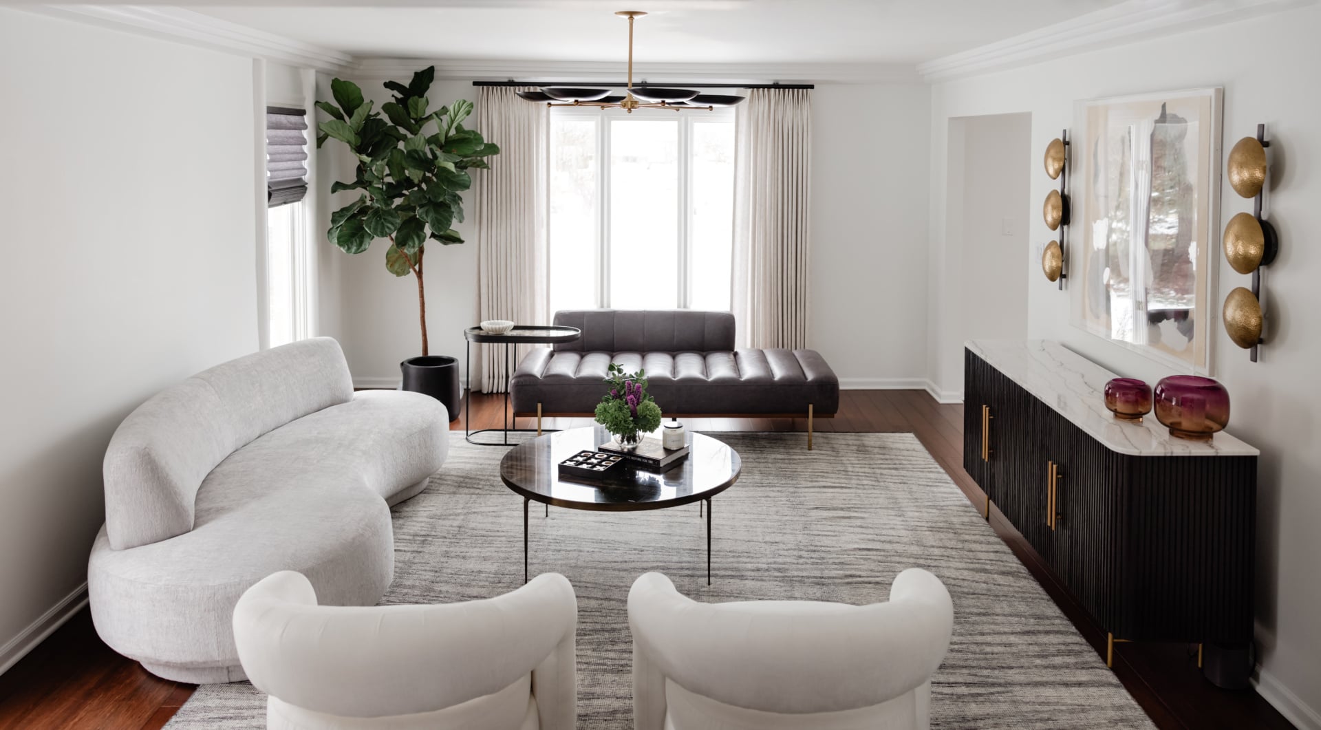
How to test a white properly
Whites punish poor sampling more than any other colour, because the differences are small until they are everywhere.
Paint large samples, at least a couple of feet square, directly onto the wall rather than onto a card propped against it. Do it on more than one wall, because a white on the wall facing the window and the same white on the wall beside it will look like two different colours, and you need to be happy with both.
Then look at them at three times: mid-morning, late afternoon, and after dark with the lamps on. Whites shift more between daylight and lamplight than mid-tone colours do, and a white that looked crisp at two in the afternoon can turn distinctly yellow under warm bulbs at nine.
Leave the samples up for a few days. First impressions of a white are unreliable, and the one you stop noticing is usually the right one.
Chicago rooms specifically
Two local conditions worth designing around.
The winter is long and heavily overcast, so for months the light in a Chicago house is flat, grey and low. A white chosen in July under strong sun can feel bleak in February. Testing in the dullest light you get is more useful than testing on a bright day, and it argues for warmer undertones than the same room would need in a sunnier climate.
The second is the housing stock. City greystones and vintage walk-ups have deep original millwork, and a stark modern white on that trim makes it look like plastic. Those rooms almost always want a softer, warmer white with some grey in it, which lets the profile of the moulding read through shadow rather than glare. Newer suburban construction with simple trim can take a cleaner, brighter white comfortably.
Working through it with us
Whites are the colours clients most often repaint, almost always because the undertone was chosen from a card rather than tested in the room. It is an avoidable expense of time and disruption. You can see how we work on our design process page, look through recent projects, or get in touch about your own home.
Related reading: paint colors for north facing rooms, warm neutrals in a living space, building a palette from scratch, decorating a room without windows and high contrast rooms. We work across Chicago, Hinsdale and Elmhurst.
Frequently asked questions
What is the best white paint for interior walls?
There is no single answer, because a white is defined by its undertone and the room’s light decides which undertone works. A warm white with a grey base is the most versatile starting point. North-facing rooms want a red or pink based white, and rooms with strong sun can take a cooler one.
What is LRV and why does it matter when choosing white paint?
Light reflectance value measures how much light a colour returns, from zero for black to one hundred for pure white. Above about 80 reads as white; between 70 and 80 reads as a very pale colour whatever the name suggests. It is an objective number in a subject otherwise full of adjectives.
Why does my white paint look yellow or grey on the wall?
Because every white contains a trace of another colour, and across four walls that trace is multiplied until it becomes the colour of the room. The paint did not change. There was not enough of it on the sample card to see what its undertone actually was.
How should I compare white paint samples?
Against a sheet of ordinary printer paper rather than against each other. Placed side by side, whites are judged relative to their neighbours, so the warmest looks like cream and the coolest looks grey. Paper is close enough to neutral to reveal the true undertone.
Should trim be a different white from the walls?
Often not. The same white on walls and woodwork in different sheens is quieter and more sophisticated, and lets the architecture read as one thing. Contrasting trim suits a period house with substantial millwork worth pointing out, and works less well with plain modern skirting.
What white should I use on the ceiling?
Usually not standard ceiling white, which is cool and high in reflectance and reads as a cold bright plane above a warm wall, making the walls look dirty by comparison. A paler version of the wall colour resolves the room far better.
Does paint sheen change how white looks?
Considerably. Flat white absorbs light and reads softer and deeper; the same white in satin reflects light and reads brighter and cooler. Painted side by side in one colour, most people will say they are two different colours.
How long should I leave white paint samples up before deciding?
A few days at least, painted large and directly on more than one wall, and looked at in mid-morning, late afternoon and after dark under lamplight. Whites shift more between daylight and artificial light than mid-tones do, and first impressions of a white are unreliable.