
Last updated August 27, 2026
Key Takeaways
- Beige fails when it is flat, not when it is bland. The cure is contrast in depth, from pale to genuinely dark, rather than adding an accent colour.
- One beige everywhere is what gave beige its reputation. A room needs three or four, at clearly different depths.
- Decide the undertone first. Yellow-based reads traditional and can go dull, pink-based stays warm in cool light, grey-based is the modern default.
- A neutral room needs more textural variety than a colourful one, because texture is doing the work colour would otherwise do.
- Do not choose beige because it is safe. A room chosen to offend nobody is the one you tire of first.
- Upholstery carries most of a neutral scheme, so it is the place where quality shows and where it is worth spending more.
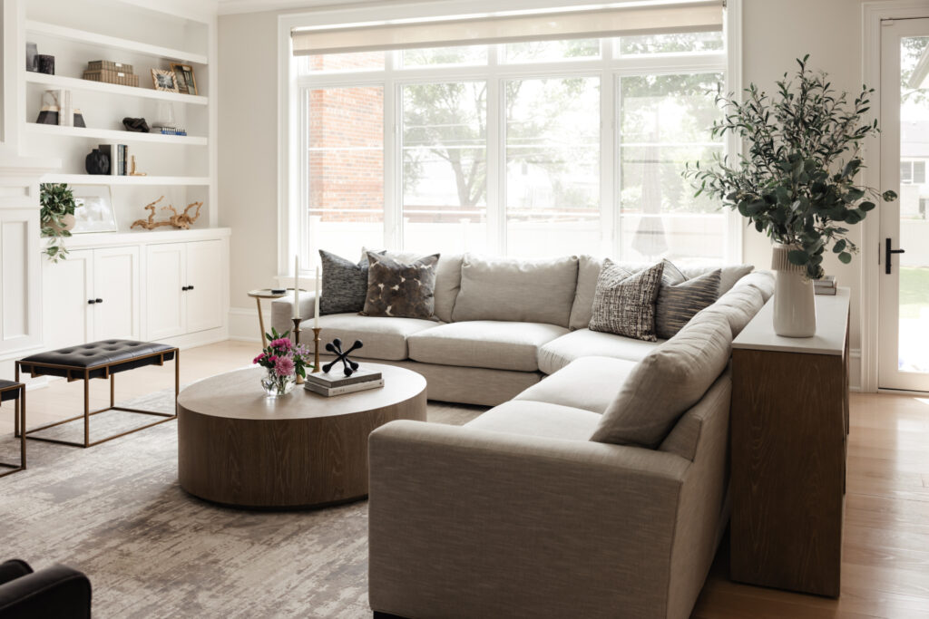
Beige works in a living space when you use several of them at clearly different depths, choose the undertone deliberately, and let texture rather than colour supply the interest. It fails when a single mid-beige is applied to walls, carpet and upholstery alike, which is the version most people are picturing when they say they dislike beige.
The problem was never the colour. It was using one of it, everywhere, with nothing to push against.
What actually went wrong with beige
Beige earned its reputation honestly, and understanding the specific failure is what lets you avoid it.
The version people remember is a single yellow-based mid-beige on every wall, with a carpet a shade away from it and a sofa a shade away from that. Everything in the room sat within a narrow band of both colour and depth. There was nothing light and nothing dark, so the eye had nowhere to travel and the room read as a fog.
It was also usually chosen not because anybody loved it but because it seemed like the option nobody could object to. Rooms chosen that way tend to look like it.
None of that is an argument against warm neutrals. It is an argument against monotony, which would ruin a scheme in any colour.
Value contrast is the fix
Value means how light or dark something is, independent of its colour. It is the most useful concept in neutral schemes and the most commonly missing one.
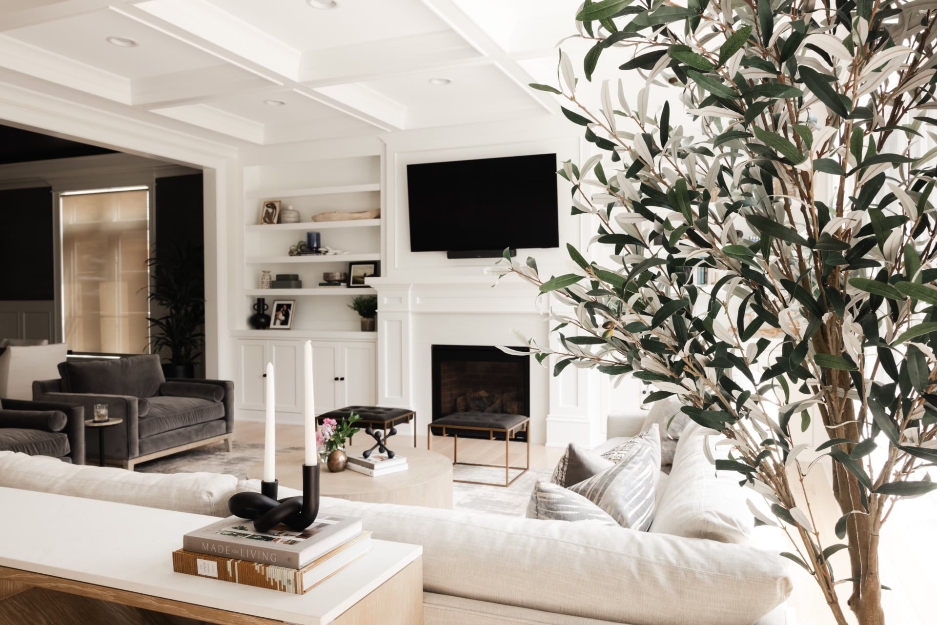
Photograph a room that is not working and look at the image in black and white. If everything turns to a similar grey, you have found the problem. A room needs range: something genuinely pale, something in the middle, and something properly dark. Without the dark end especially, a neutral room looks unfinished no matter how good the individual pieces are.
The dark element does not have to be large. A near-black fireplace surround, a dark timber console, black window frames, an ebonised coffee table, even the legs on a chair. It anchors everything else and makes the pale tones look intentional rather than washed out.
The instinct when a beige room feels dull is to add a colourful accent. It rarely helps, because the problem is not an absence of colour. Add depth first.
How many beiges, and which
A working neutral scheme uses three or four related tones rather than one, and the relationships between them are what make it read as deliberate.
| Undertone | How it reads | Pairs with | Watch for |
|---|---|---|---|
| Grey-based, often called greige The modern default. Beige with grey in it. |
Cool, calm and current | Black metal, pale oak, cool whites, charcoal | Can go cold in a north-facing room |
| Pink or red based Warmth with no yellow in it. |
Flattering, soft, and stays warm under cool light | Warm woods, brass, plaster finishes, cream | Reads distinctly pink under strong afternoon sun |
| Yellow based, traditional beige The classic warm beige. |
Sunny in good light, dull and dated in poor light | Warm oak, gold, traditional millwork | This is the one that produced the reputation |
| Green based, mushroom Beige with a trace of green. |
Earthy, quiet, very restful | Timber, stone, linen, garden views | Goes grey under cool artificial light |
| Deep taupe and mole The dark end of the same family. |
Rich and enveloping, and the anchor most schemes lack | Everything above. This is the contrast partner | Needs decent light or it flattens |
| A single beige throughout One tone on walls, floor and furniture. |
Flat. The failure the whole reputation rests on | Nothing. That is the problem | Avoid, in any undertone |
Keep all the neutrals in a room on the same side of warm or cool. Mixing a pink-based beige with a green-based one is what makes a scheme look accidental.
Texture is doing the work
This is the rule that separates a neutral room that looks rich from one that looks empty, and it asks more of you than a colourful scheme does.
In a room with colour, colour supplies the variety. Remove it and something has to take over, and that something is texture. A neutral room therefore needs noticeably more material variation than a colourful one to reach the same level of interest.
That means a boucle against a flat weave, a heavy wool rug against a smooth timber floor, linen against leather, matte plaster against polished stone, a rough ceramic beside brushed brass. Each pair is doing what a contrasting colour would do elsewhere.
It also means neutral rooms punish poor materials. A flat synthetic that would pass unnoticed in a busy colourful room is very obvious when it is one of only four things the eye has to look at. Upholstery is the number one thing worth spending more on, and a neutral scheme is where that shows most plainly.
Where the dark end comes from
Since the anchor is the piece most often missing, it is worth being specific about where it can come from.
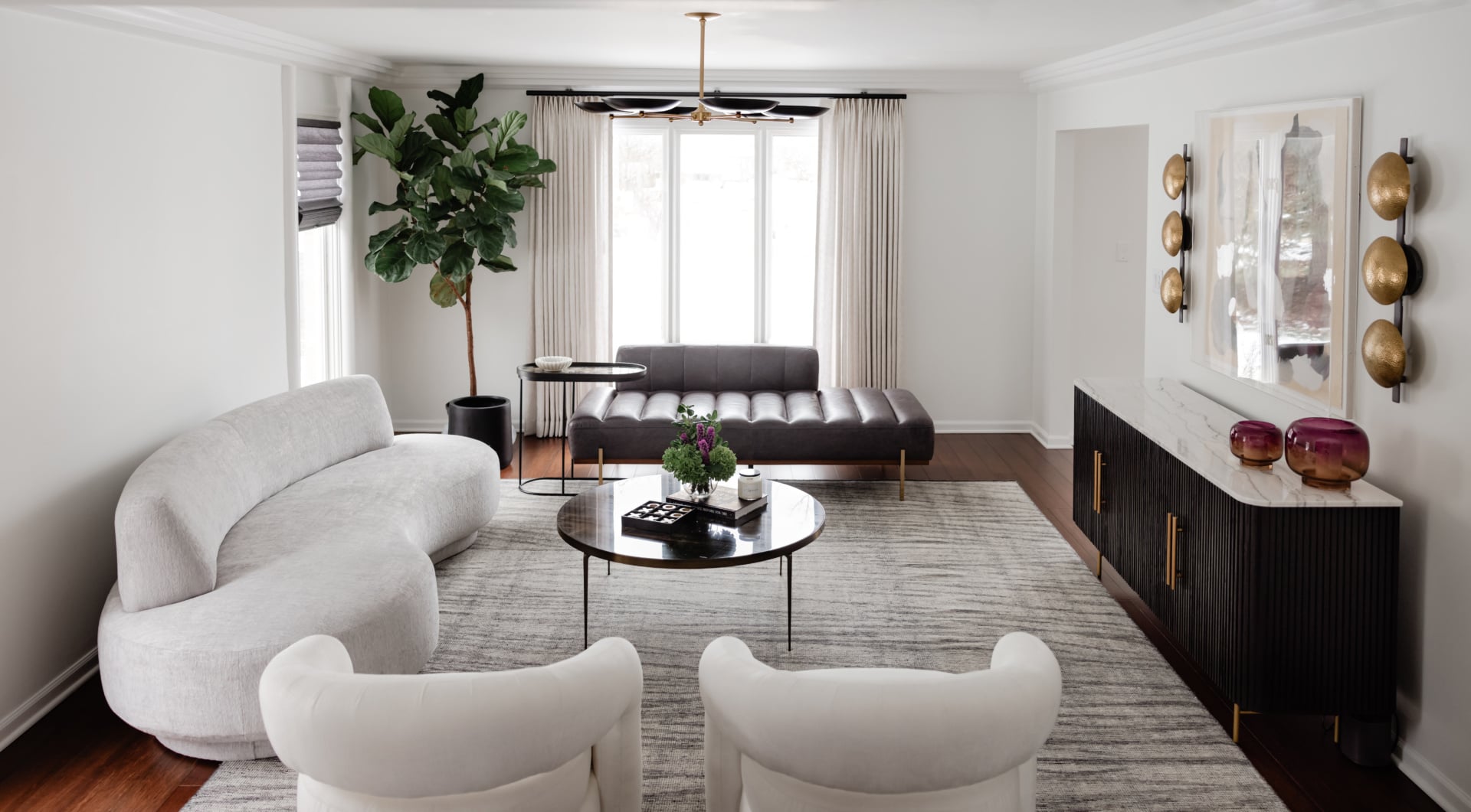
Architecture is the most durable option: a dark fireplace surround, black window frames, stained rather than painted joinery, a dark floor. These do not date the way a dark accessory can, and they hold the room together permanently.
Furniture is the next: an ebonised or walnut coffee table, a dark timber console, black metal legs, a leather chair that has gone properly dark with age.
Then the small things, which are the easiest to change and the least effective on their own: a black lamp base, dark ceramics, the frames on the art. Useful as reinforcement, not enough by themselves.
If a neutral room feels weak, the fix is almost always higher up that list than people want it to be.
Beige and the light in the room
Neutrals are more sensitive to light than saturated colours, because there is less pigment to hold them steady.
In a north-facing room the cool light pushes yellow toward green, so a yellow-based beige goes distinctly muddy. Pink and red-based neutrals hold their warmth there. In a south-facing room with strong sun, a warm beige can turn almost orange in the afternoon, and a grey-based one is steadier.
Artificial light matters as much. Warm bulbs make every beige warmer, sometimes considerably, so a scheme chosen at midday can look completely different in the evening. Since living rooms are used mostly after dark for half the year here, that evening reading is the one that counts.
Do not choose it because it is safe
Worth saying directly, because it is the most common reason people land on beige and the worst one.
Nothing is ever completely timeless. There is always something about a choice that shows when it was made, and neutrals are no exception: every decade has its own beige and they are not interchangeable. Choosing a colour specifically so that it cannot date does not work, and it produces rooms that are neutral and, honestly, boring.
The other cost is anonymity. A home should tell you about the people in it. If a room could have been ordered whole from a page in a catalogue, the design has fallen flat regardless of how expensive the individual pieces were. Beige rooms are especially prone to this because the palette itself will not identify anybody.
Use what you love. If what you love is a warm neutral room, that is a good reason to do it. Choosing it to avoid a decision is not.
Making it personal
Which leads to the part that actually finishes these rooms.
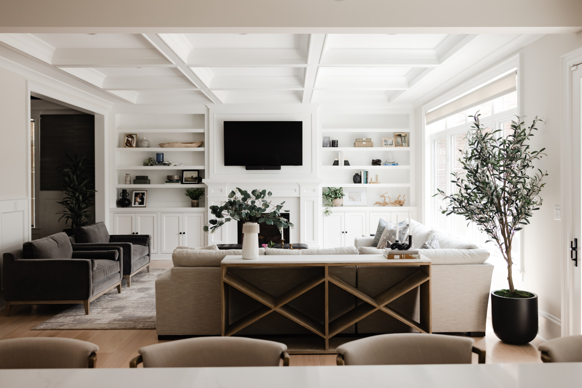
A room is not finished until it is styled, and accessories are what give it the feeling of being complete. In a neutral scheme they carry even more weight, because they are supplying most of the specificity in the room.
They should be yours. A coffee table book says something about someone’s interests, their art says what they find beautiful, the objects they have collected say where they have been or where they come from. A shelf of decorative items bought to fill a shelf says nothing at all, and in a beige room that silence is very audible.
This is also where colour can enter honestly: through a painting somebody chose, books, flowers, a rug brought back from somewhere. That reads as a person rather than as an accent scheme.
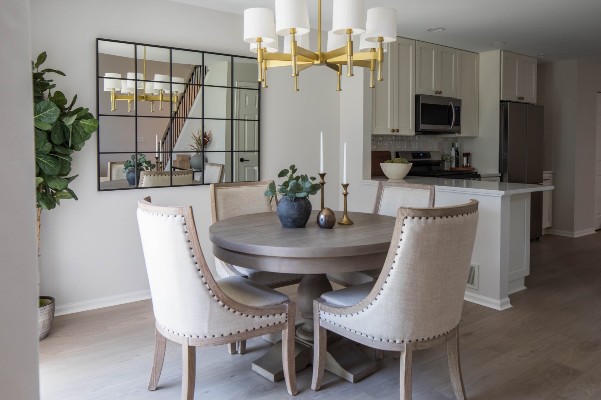
Chicago living rooms specifically
Two local factors worth designing around.
The winter is long and overcast, which means a neutral living room here spends months in flat grey light. Beiges chosen in summer sun can look drained in February, and this is the strongest argument for keeping the undertones warm and for making sure the dark anchor is present, because in low light a room without contrast collapses into a single tone.
The second is the housing stock. City greystones and vintage walk-ups have deep original millwork, and a warm neutral scheme is genuinely flattering to it, letting the profiles read through shadow rather than fighting them with colour. In newer suburban rooms with large wall planes and simple trim, the risk is scale: a big room in one gentle neutral needs its contrast and its texture even more, because there is a great deal of surface and nothing architectural to break it up.
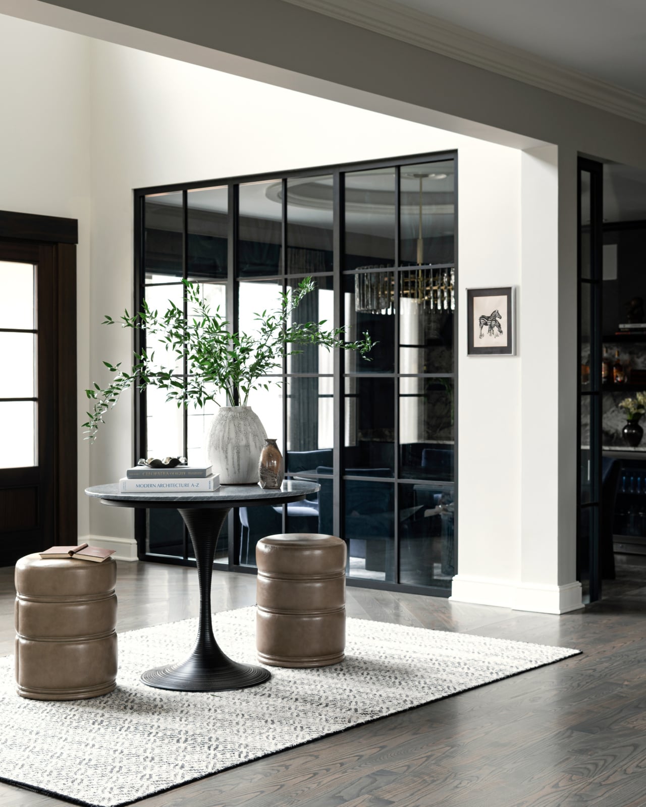
Working through it with us
Neutral rooms look effortless and are among the harder schemes to get right, because there is nowhere for a weak material or a missing contrast to hide. You can see how we work on our design process page, look through recent projects, or get in touch about your own home.
Related reading: choosing a white that works, high contrast rooms, building a palette from scratch, paint colors for north facing rooms and choosing a statement piece. We work across Chicago, Hinsdale and Elmhurst.
Frequently asked questions
How do you use beige in a living room without it looking flat?
Use three or four beiges at clearly different depths rather than one throughout, and make sure something in the room is genuinely dark. Flatness rather than blandness is what makes beige rooms fail, so the answer is contrast in depth rather than adding an accent colour.
What is the difference between beige and greige?
Greige is beige with grey in it, which cools it and makes it read as more contemporary. Traditional beige is yellow-based and reads warmer but can look dull in cool light. Pink-based neutrals hold their warmth in north-facing rooms without going muddy.
How many different beiges should a room have?
Three or four, at clearly different values from pale through mid to genuinely dark. A useful test is to photograph the room and look at it in black and white: if everything turns a similar grey, the scheme has no range and will read as a fog.
Why does my beige room feel boring?
Almost always a missing dark anchor and not enough textural variety. Neutral rooms need more material contrast than colourful ones because texture is doing the job colour would otherwise do. Adding a bright accent rarely fixes it, because the problem is not an absence of colour.
What colours go with beige in a living space?
Other neutrals at different depths first, particularly deep taupe and near-black, which supply the contrast most beige rooms lack. Keep every neutral on the same side of warm or cool, since mixing a pink-based beige with a green-based one is what makes a scheme look accidental.
Is beige a safe choice that will not date?
No colour is. Every decade has its own beige and they are not interchangeable, so choosing a neutral specifically to avoid dating does not work and tends to produce a room you tire of sooner. Choose a warm neutral because you like it, not to avoid making a decision.
Does beige work in a north-facing room?
It depends entirely on the undertone. Cool north light pushes yellow toward green, so a traditional yellow-based beige goes muddy. A pink or red-based neutral keeps its warmth in that light, because there is no yellow in it to shift.
How do you make a neutral room feel personal?
Through the things in it rather than the palette, which will not identify anybody. Books, art somebody actually chose, objects collected over time. A room is not finished until it is styled, and in a neutral scheme those objects are carrying most of the specificity in the room.