
Last updated August 27, 2026
Key Takeaways
- Benjamin Moore chose Silhouette AF-655, a deep espresso brown with charcoal undertones. Behr chose Hidden Gem N430-6A, a smoky jade sitting between blue and green.
- Both are dark. Silhouette has a light reflectance value of around ten, which puts it near the bottom of the scale and changes where it can sensibly go.
- A colour of the year is a forecast and a marketing exercise. Its real usefulness is that the shade and its companions will be easy to find.
- Undertone causes more regret than colour. Silhouette carries charcoal and a violet note, and Hidden Gem shifts between blue and green depending on what sits beside it.
- Naperville winters are long and grey, so any deep colour has to be judged in the room in February light rather than under showroom lighting.
- Use a very dark colour where you do not linger, or on joinery, before committing a main room to it.
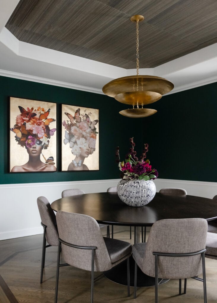
Two of the 2026 announcements are worth knowing about, and they point in opposite directions. Benjamin Moore chose Silhouette AF-655, a deep espresso brown carrying charcoal undertones. Behr chose Hidden Gem N430-6A, a smoky jade that sits between blue and green.
What they have in common is that both are dark, and dark colours behave in ways that light ones do not. That, rather than the shade itself, is what decides whether either works in your house.
What a colour of the year actually is
Worth being clear about before styling anything around one.
A colour of the year is a forecast published by a paint manufacturer. It reflects genuine observation of where taste is heading, and it is also a marketing exercise, and both of those things are true at once. It is not a recommendation for your particular room, because nobody making the announcement has seen your room.
What makes it genuinely useful is availability. When a manufacturer names a colour, it releases a co-ordinating palette alongside it, retailers stock it, and the wider market moves in that direction for a season. Fabrics, tiles and fittings that sit well with it become easy to find, which is a practical advantage when you are trying to put a scheme together.
So treat it as a starting point that happens to be well supplied, rather than as an instruction. If you like it, the timing is convenient. If you do not, nothing has been lost.
Both picks are dark, and that is the important part
The characteristic that determines how either behaves.
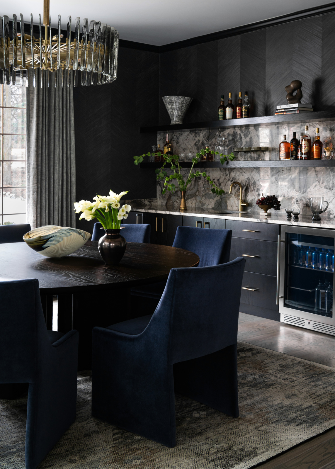
Light reflectance value describes how much light a colour returns, on a scale from black at zero to white at one hundred. Silhouette sits at roughly ten, which is genuinely dark, close to the bottom of the range. A colour at that level absorbs most of the light falling on it.
That has consequences beyond how it looks. A room painted at that depth needs considerably more artificial light than the same room in a mid tone, and it needs that light to be layered rather than a single source, because one bright fitting in a dark room produces glare and leaves the corners black.
It also changes how the room reads at different times. A deep colour is dramatic in the evening under lamplight and can feel heavy at three on a February afternoon. Both of those are the same paint doing what dark paint does.
Undertone is what people actually regret
Rarely the colour itself.
Silhouette is a brown, but it is not a warm chocolate. It carries charcoal, and several sources note a violet note in it, which is why it can read cooler than expected next to a warm timber floor and why it sits comfortably with grey rather than fighting it.
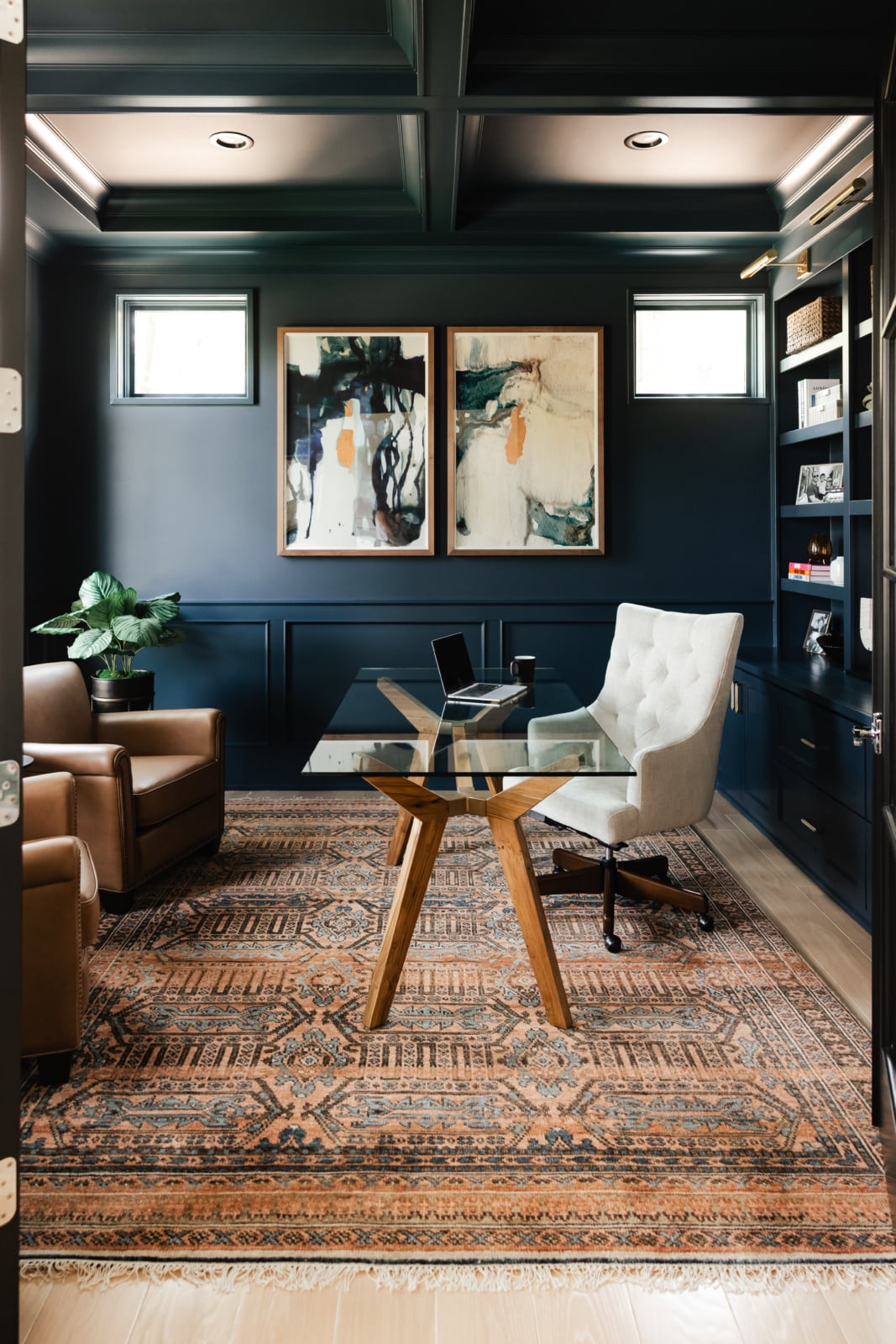
Hidden Gem is the more changeable of the two, because it sits between blue and green. Beside something blue it reads green. Beside something green it reads blue. In a north facing room it cools considerably. That flexibility is why it works in a lot of settings and also why it needs testing in the specific room rather than assessed from a chip.
The practical consequence is the same for both. Put the sample next to the things it will actually live with, the floor, the counter, the existing timber, and look at it there. A colour that disappoints almost always disappointed because of what it sat beside.
Where each one earns its place
The two colours are opposites, and they suit different jobs.
| Use | Silhouette AF-655 | Hidden Gem N430-6A |
|---|---|---|
| Character | Deep espresso brown with charcoal and a violet note | Smoky jade sitting between blue and green |
| Best room | A dining room, study or library used mostly in the evening | A powder room, a study, or joinery in a kitchen |
| On joinery | Excellent. Reads as a rich neutral rather than a colour | Excellent, and one of the easier ways to try it |
| In an open plan | Difficult. It absorbs too much light across a large volume | More forgiving, particularly on one defined wall |
| North facing room | Works, but needs generous layered lighting | Cools noticeably. Test before committing |
| Pairs with | Warm whites, brass, oak, cream, plaster tones | Warm neutrals, unlacquered brass, natural timber, off white |
| Struggles with | Cool grey trim, which makes the violet note obvious | Strong blues or greens nearby, which pull it one way |
| Easiest way to try it | A single piece of joinery or an interior door | A powder room, where a whole room commits at low exposure |
Both are easier on joinery than on four walls, which is the lowest risk way to find out whether you actually like living with a colour.
Naperville rooms specifically
Three local conditions that decide how a deep colour lands here.
Winter light is low, grey and long. A colour chosen in June under bright conditions can read as flat and cold from November through March, and this is the most common reason a paint decision disappoints in this climate. Any sample should be looked at in the room on an overcast day before it is signed off.
Newer houses across Naperville tend towards open plans with tall ceilings and large volumes, which is the hardest setting for a colour as dark as Silhouette. In a large open space it absorbs a great deal of light and can make the whole floor feel dim, whereas the same colour in a defined dining room is dramatic and works.
Older houses in the area have the opposite advantage: separate rooms with real trim, where a deep colour has an edge to stop at. A dark room reads as deliberate when it is contained and as a mistake when it bleeds into a bright one.
How to test it properly
Most colour disappointment traces back to how it was sampled.
A small chip held against a wall tells you very little, because the colour around it distorts what you see. Use a large sample, at least a couple of feet square, and put it on more than one wall, because a north wall and a south wall in the same room will not match.
Look at it at three different times: morning, evening under the lamps you actually own, and on a grey day. For a colour this dark the evening reading matters most, because that is when the room will mostly be used.
Leave it up for several days. First impressions of a strong colour are unreliable, and the question worth answering is not whether it is striking but whether you still want to be in the room on the fourth day.
Building a scheme around a dark colour
What has to change elsewhere once the walls go dark.
Lighting first. A deep room needs more sources at lower output rather than one bright fitting: table lamps, wall lights, something at low level, all on dimmers. This is not optional with a colour at this depth, and it is the difference between atmospheric and gloomy.
Trim next. Painting the trim the same colour as the walls makes a small dark room feel larger and more considered, because there is no bright line breaking it up. Contrasting white trim against a very dark wall is a strong graphic decision and worth making deliberately rather than by default.
Then texture, which does most of the work in a dark room. Motif disappears at low reflectance, so the interest has to come from surface: a wool, a boucle, an unlacquered metal, a matte and a gloss beside each other. A dark room with only flat surfaces reads as heavy, and the same room with three or four textures reads as rich.
The lowest risk way in
If you like one of these and are not sure about a whole room.
Start with joinery. A single run of cabinetry, a bookcase, an island, an interior door. Joinery gives a deep colour an edge and a shape, it is a contained decision, and both of these colours behave better on it than on four walls.
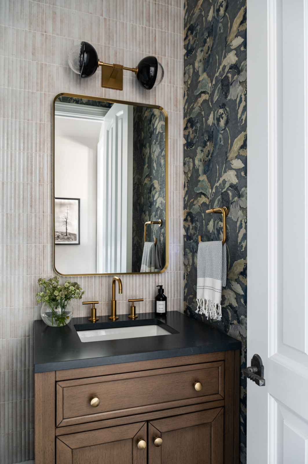
Or take a small room completely. A powder room, a back hall or a study in a strong colour is more satisfying than a large room done tentatively, and if you tire of it the exposure is a weekend.
What we would avoid is the middle path: a dark accent wall in an otherwise pale room. It rarely reads as a decision, and it is the arrangement people most often undo.
And whether to use it at all
Worth ending here, because a colour of the year is an invitation rather than an obligation.
If Silhouette or Hidden Gem is a colour you were already drawn to, the announcement is useful: the palette around it is easy to find this year, and that genuinely makes the work simpler. If neither appeals, the correct response is to ignore both.
Dara’s position on this is consistent, and it applies to colour more than to anything else: use what you love, because life is too short to live with a room chosen to be defensible. A colour you keep returning to over years is worth more than one you adopted because it was named, and it is the one you will still be happy with when the next announcement is made.
Working through it with us
Colour is the decision most worth resolving in the actual room, in the actual light, with the floor and the counter in front of you. You can read about our design process, look through recent projects, or get in touch about your home in Naperville.
Related reading: paint colours for north facing rooms, choosing a white, 2026 furnishing trends, rich woods and warm metals and interior design trends. We also work across Hinsdale and Elmhurst.
Frequently asked questions
What is the 2026 color of the year?
There is more than one, because each manufacturer names its own. Benjamin Moore chose Silhouette AF-655, a deep espresso brown with charcoal undertones. Behr chose Hidden Gem N430-6A, a smoky jade that sits between blue and green.
Are the 2026 colors dark?
Both are. Silhouette has a light reflectance value of around ten, which is close to the bottom of the scale and means it absorbs most of the light falling on it. That is the characteristic that decides where either colour can sensibly go.
Where should I use a very dark paint colour?
In a room that is contained and mostly used in the evening, such as a dining room, study or library, or on joinery. Deep colour reads as deliberate when it has an edge to stop at and as a mistake when it bleeds into a bright adjoining space.
Will a dark colour work in an open plan?
It is the hardest setting, particularly for something as deep as Silhouette. Across a large volume it absorbs enough light to make the whole floor feel dim. The same colour in a defined room with a door is dramatic and works.
What should I pair with Silhouette AF-655?
Warm whites, brass, oak, cream and plaster tones. Be careful with cool grey trim, which brings out the violet note in it. It reads as a rich neutral rather than as a colour, which is why it is so good on joinery.
Why does Hidden Gem look different in photographs?
Because it sits between blue and green, so it takes its cue from what is beside it. Next to blue it reads green, next to green it reads blue, and in a north facing room it cools noticeably. It has to be tested in the actual room.
How should I test a paint colour?
With a large sample, at least a couple of feet square, on more than one wall, looked at in the morning, in the evening under your own lamps, and on a grey day. Leave it up for several days, since the question is whether you still want to be in the room on the fourth.
Do I have to use the color of the year?
No. It is a forecast and a marketing exercise, and its real usefulness is that the shade and its companion palette are easy to find this year. If you were already drawn to it, the timing is convenient. If not, nothing is lost by ignoring it.