
Last updated August 27, 2026
Key Takeaways
- An evenly spaced grid is a builder’s default rather than a lighting design, and it is what makes rooms feel like offices.
- Light surfaces rather than floors. Washing a wall makes a room feel bright; aiming at the floor creates pools and shadows on faces.
- Place fixtures where they have a job: over a worktop, across a wall of art, above a seating group.
- For wall washing, set fixtures around 30 inches out from the wall rather than close to it or centred in the room.
- Fewer, better-placed fixtures beat more evenly spaced ones. Every downlight is a hole in the ceiling.
- Recessed light is one layer of three. On its own it will never make a room feel finished.
A good recessed lighting layout puts fixtures where they have something to light rather than spacing them evenly across the ceiling. Wash the walls, light the worktops, and pick out the things worth seeing. Then add wall lights and lamps, because recessed lighting alone will not make a room feel comfortable no matter how it is arranged.
The evenly spaced grid that most rooms end up with is not a design decision. It is what happens when nobody made one.
Why the grid fails
The default approach is to divide the ceiling into a regular pattern and place a downlight at each intersection. It looks orderly on a plan and produces a specific, recognisable result.
Everything is lit from directly above at the same angle. Faces get shadows under the eyes and nose, because the light is coming from overhead rather than in front. Surfaces are lit evenly, so nothing stands out and the room reads flat. And the walls, which are most of what you actually see, are the darkest part of the room, because light aimed at the floor never reaches them.
A room lit this way is technically bright and feels institutional. It is the lighting of an office, and it is the single most common reason a well-finished room feels wrong.
The grid also treats every part of the ceiling as equally important, which no room is. A downlight over the middle of a walkway is lighting a floor nobody looks at.
Light the walls
The principle that changes rooms, and the one that most contradicts the default.
What makes a room feel bright is not the light level at the floor. It is the brightness of the vertical surfaces, because walls occupy most of your field of view when you are standing or sitting in a room. A room with brightly lit walls and modest floor light feels considerably more generous than one with the reverse.
Wall washing means placing fixtures far enough out from the wall that the beam spreads down it evenly, rather than close in where it produces a row of hard scallops. Around 30 inches out is the usual starting point for a standard ceiling height, adjusted for the beam angle of the fitting.
The visual effect is disproportionate to the number of fittings. Four downlights washing one long wall will do more for a room than twelve spread evenly across the ceiling, and they leave the rest of the ceiling clear.
Give every fixture a job
The practical method: instead of a spacing rule, work through what actually needs lighting.
| Job | Where the fixture goes | Why | Common error |
|---|---|---|---|
| Wall washing Making the vertical surfaces bright. |
Around 30 inches out from the wall, evenly spaced along it | Walls are most of what you see, so lighting them lights the room | Fittings tight to the wall, producing hard scallops |
| Worktop and task Light where work happens. |
Directly over the front edge of the worktop, not the middle | Standing at the counter, you shadow anything lit from behind you | Centred on the cabinet run, so you work in your own shadow |
| Art and objects Picking out something worth seeing. |
Offset from the wall, aimed at the piece | A lit object gives the eye somewhere to rest | Aimed straight down, lighting the frame’s top edge only |
| General fill Modest ambient level. |
A small number, spread widely | Enough to move around safely without flattening the room | Treated as the whole scheme rather than one layer |
| Over a seating group Rarely wanted at all. |
Usually better handled by lamps | Downlight on somebody sitting is unflattering and warm on the head | A grid puts one directly over the sofa |
| Over a dining table Almost never recessed. |
A pendant or chandelier instead | The table wants light from a fitting you can see | Four downlights around a pendant, cancelling its effect |
Work through the jobs first and count the fittings afterwards. The number is an output rather than an input.
Spacing, honestly
People want a number, so here is the useful version of one.
The common rule of thumb is to divide the ceiling height by two and use that as the spacing, which on an eight foot ceiling gives four feet. It produces even coverage and it is a reasonable fallback for a corridor or a utility space where nothing else matters.
In a room anybody sits in, treat it as a maximum rather than a target. If a job-based layout leaves a gap larger than that, add a fitting. If it does not, do not add fittings to satisfy the rule.
Set fittings at least 18 to 24 inches out from a wall for general light, more for wall washing. Anything closer produces a bright band at the top of the wall and a dark room below it.
And keep the layout square to the room. Fittings that are almost but not quite aligned with a wall or with each other are noticeable in a way an obviously irregular layout is not.
The fitting matters as much as the position
Three specifications that change the result more than fixture count does.
Beam angle decides how the light spreads. A narrow beam picks out an object; a wide one fills. Using the same wide beam everywhere is why so many schemes feel undifferentiated.
Colour rendering index decides whether the colours in the room are visible. Below about 90, reds go brown and greens go grey, and a room can look drained despite being well lit. Ask for the figure in writing, because it is frequently omitted.
Colour temperature decides whether the room reads warm or clinical. Around 2700K for living spaces, and consistency matters as much as the number, since mixed temperatures look broken.
Trim style is worth a thought too. A recessed fitting with a deep baffle and a small aperture reads as a discreet hole; a large bright trim reads as a fixture. In a room with a low ceiling the difference is noticeable.
Recessed light is one layer of three
The most important thing to understand about a recessed layout is what it cannot do.
Light coming from the ceiling plane, however well arranged, is one direction. A room that feels comfortable has light at three heights: something overhead, something at eye level such as wall lights, and something low such as table lamps. The eye travels between them and reads depth.
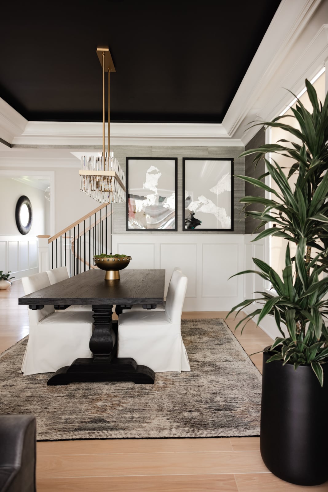
This is why rooms lit entirely by recessed fittings feel flat even when the layout is good. The recessed layer should be doing the least glamorous work, general fill and specific tasks, while the lamps and wall lights do the work that makes the room feel like somewhere you want to sit.
Which also means the recessed layout can be sparser than people expect. If lamps are carrying the evening, the ceiling does not need to.
Circuits and dimming
Decided at the same time as the positions, and just as consequential.
Every layer should be separately switched. Wall washing on one circuit, task lighting on another, feature lighting on a third. A room where everything comes on together has one setting, which is the same problem as having one fitting.
Everything dimmable, and the dimming has to be specified with the lamps rather than assumed. Some fittings dim poorly, flickering or cutting out at low levels, and the combination of driver and dimmer matters. This is a question to ask the supplier explicitly.
Think about how the room is used at different times. A kitchen wants bright task light in the morning and a low warm setting in the evening, and those are different circuits rather than the same one turned down.
When to decide all this
The uncomfortable part: this has to be settled before the walls close.
Recessed lighting is first fix work. Cable routes are run before plaster, so every decision about position, circuit and switching is made months before anyone sees the finished room. That is why it so often defaults to a grid: it is the one thing that must be chosen when the room is least possible to imagine.
The practical answer is to design the lighting alongside the space plan rather than after it. Once you know where the sofa goes, where the art will hang and which way people walk through, the layout follows. Doing it in the other order means guessing.
Retrofitting is possible and always looks like a retrofit, so it is worth the effort of deciding early.
Chicago rooms specifically
Two local conditions worth building into the plan.
Winters are long and heavily overcast, so rooms here run on artificial light for a much greater share of the year than in a sunnier climate. That raises the stakes on all of the above, and it is a strong argument for spending on colour rendering and on the layered scheme rather than on fixture count.
Older housing complicates the installation. Greystones and vintage walk-ups have plaster ceilings, structural joists that do not run where you would like, and sometimes decorative cornices worth preserving. Recessed fittings are not always possible or desirable in those ceilings, and surface-mounted or wall lighting frequently gives a better result in a room with real architectural character. In a room with a good cornice, cutting a grid of holes in the ceiling is a poor trade.
Working through it with us
Lighting is the decision that most determines how a finished room feels and the one that has to be made when the room is hardest to picture, which is exactly why it should not be left to a default. Holding it against the space plan is our job rather than yours. You can see how we work on our design process page, see what is included in our services, look through recent projects, or get in touch.
Related reading: decorating a room without windows, brightening a living room, what order to renovate a house, basement design ideas and paint colors for north facing rooms. We work across Chicago, Hinsdale and Naperville.
Frequently asked questions
How should recessed lights be laid out?
By job rather than by grid. Place fixtures where they have something to light: washing a wall, over a worktop, picking out art. Count the fittings afterwards. An evenly spaced grid is a builder’s default and it is what makes a room feel like an office.
How far from the wall should recessed lights be?
Around 30 inches out for wall washing, and at least 18 to 24 inches for general light. Fittings placed close to a wall produce a row of hard scallops and a bright band at the top with a dark room below it.
How many recessed lights does a room need?
Fewer than most layouts use. The common rule of dividing ceiling height by two gives a spacing, and it is better treated as a maximum than a target. If a job-based layout leaves a larger gap, add a fitting. If not, do not add fittings to satisfy a rule.
Why does my recessed lighting make the room feel flat?
Because all the light is coming from one direction. Ceiling light alone flattens everything and puts shadows on faces. A room needs light at three heights, with wall lights and table lamps doing the work that makes it feel comfortable.
Where should downlights go over a kitchen worktop?
Over the front edge of the worktop rather than centred on the cabinet run. Centred, you stand between the light and the surface and work in your own shadow, which is the most common lighting error in a kitchen.
Should there be recessed lights over a dining table?
Usually not. A dining table wants light from a fitting you can see, a pendant or chandelier, at a level that flatters people sitting around it. Downlights arranged around a pendant tend to cancel out its effect.
What should I specify besides the number of fittings?
Beam angle, colour rendering index and colour temperature. Beam angle decides whether a fitting picks out or fills, CRI decides whether colours are visible at all, and temperature decides whether the room reads warm or clinical. Ask for the CRI figure in writing.
When does the lighting layout need to be decided?
Before the walls close, because it is first fix work and cable routes run before plaster. That is why it so often defaults to a grid. Design it alongside the space plan, once you know where the furniture goes and which way people walk through.