
Last updated August 27, 2026
Key Takeaways
- Decide what the wall is for before deciding what goes on it. Not every wall wants art.
- Scale is why most walls look wrong. Whatever goes up should be roughly two thirds to three quarters the width of the furniture below.
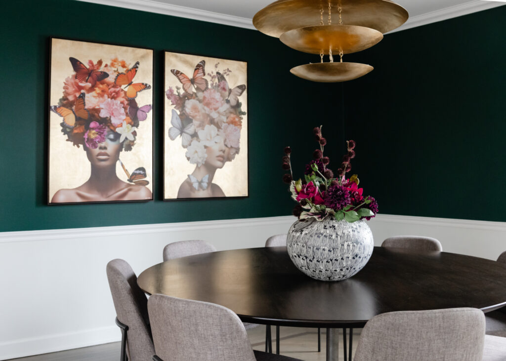
- One large piece almost always beats several small ones, and it is the quickest way to make a room look resolved.
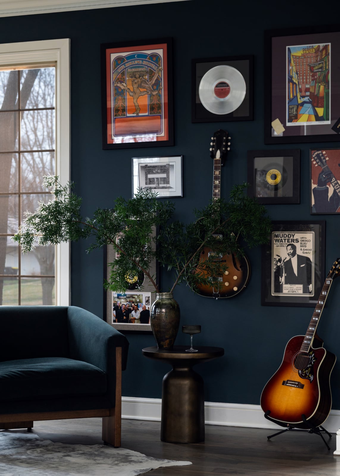
- A gallery wall is one shape rather than a collection. Plan the outline, then fill it, with tight consistent gaps.
- Leaving a wall empty is a legitimate decision rather than an unfinished one.
- Hang it for the room, not for the wall. Height relates to the furniture beneath, not the ceiling.
Before choosing what to hang, decide what the wall is doing. Some walls want a single large piece of art. Some want storage or joinery. Some want a mirror because of what it will reflect. Some want a piece of furniture and nothing above it. And some are better left empty, because a room needs somewhere for the eye to rest.
Once that is settled, the practical rules are about scale, and scale is where nearly all of these go wrong.
What is the wall for?
The question that prevents the most common outcome, which is a wall covered in something adequate.
A wall you see from the doorway is doing a different job from a wall behind the sofa. A wall opposite a window can carry a mirror that returns daylight into the room. A wall in a room short of storage might be better as joinery than as a picture. A wall at the end of a hallway needs to terminate the view.
Working out the job first narrows the options usefully, and it frequently produces an answer that is not art at all. It also prevents the situation where somebody buys a painting for a wall, then later needs storage and has nowhere to put it.
If the answer is genuinely that the wall needs something to look at, then it is an art question, and the rest of this applies.
Scale is the whole problem
Almost every blank wall that has been filled badly has been filled too small.
Art is bought at eye level in a gallery or on a screen, where a piece looks substantial. On a wall, at a distance, above a sofa, the same piece frequently reads as a postage stamp. The result is a wall that still looks empty and now has something on it.
The working rule: whatever goes above a piece of furniture should be roughly two thirds to three quarters of its width. Above a three-seat sofa that means something quite large, and larger than most people buy.
On a wall with no furniture beneath it, work from the wall instead: fill somewhere between half and two thirds of the available width, leaving clear margins at either side.
If you are choosing between two sizes, take the larger one. Almost nobody regrets art that is slightly too big, and the opposite mistake is visible from across the room.
The options, and what each asks for
Ranked roughly by how reliably they work.
| Option | Works when | Strength | Watch for |
|---|---|---|---|
| One large piece A single substantial work. |
Almost always. The most reliable answer | Immediate, calm, and reads as a decision | Buying too small, which is the usual error |
| Built-in joinery The room needs storage or display. |
The wall does two jobs at once | Adds capacity and reads as architecture | Needs to be drawn to the room rather than bought |
| Mirror There is something worth reflecting. |
Excellent opposite a window, useless facing a blank wall | Bounces light and extends the view | Position matters far more than size |
| Gallery wall Several pieces that belong together. |
Good if planned as one shape | Personal, and it absorbs a collection | Uneven gaps and a ragged outline |
| A textile or tapestry The room needs softness and sound absorption. |
Underused, and effective in echoing rooms | Adds texture that framed art cannot | Needs proper hanging to avoid sagging |
| Furniture with nothing above A console, a chest, a bench. |
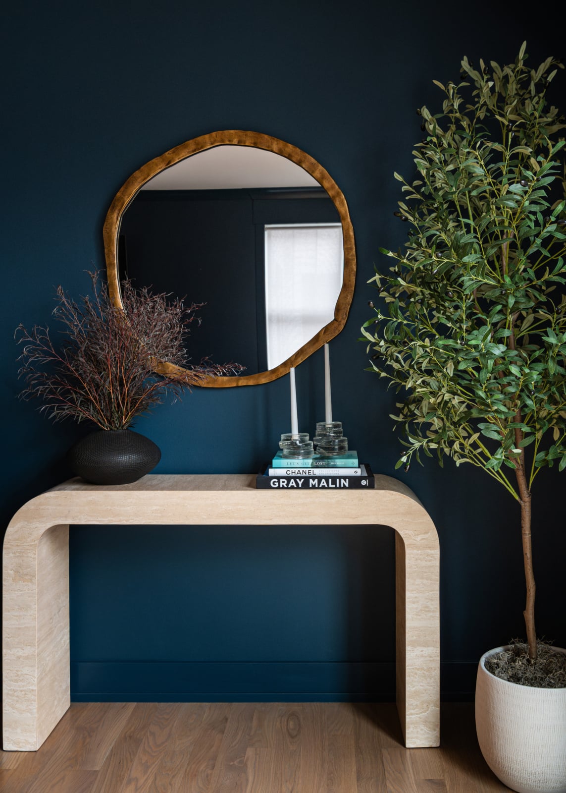
The furniture is the answer and the wall stays clear | Restful, and leaves options open | Reads as unfinished if the piece is undersized |
| Left empty The room already has plenty to look at. |
A genuine choice rather than a failure | Gives the eye somewhere to rest | Only works if the rest of the room is resolved |
The first row solves most walls. The last is chosen far less often than it should be.
Gallery walls are one shape
The distinction that separates a gallery wall that works from a wall with several pictures on it.
A successful gallery wall reads as a single block with a clear outline, usually a rectangle. Within that block the pieces can vary enormously in size, subject and frame. What holds it together is the overall shape and the consistency of the gaps.
So plan the outline first. Decide the rectangle the whole arrangement will occupy, sized by the same rule as a single piece, then arrange within it. Keep the gaps tight and even, somewhere around two to three inches, and keep them the same throughout. Uneven gaps are what make an arrangement look scattered rather than composed.
Lay it out on the floor before anything touches the wall, and photograph it, since a photograph shows the composition more honestly than looking down at it does.
One unifying element helps: consistent frames with varied art, or varied frames with consistent art. Varying both is possible and considerably harder.
Height, and what it relates to
Briefly, because the principle is simple and widely got wrong.
Hung on its own, art sits with its centre around 57 to 60 inches from the floor, which is average eye level.
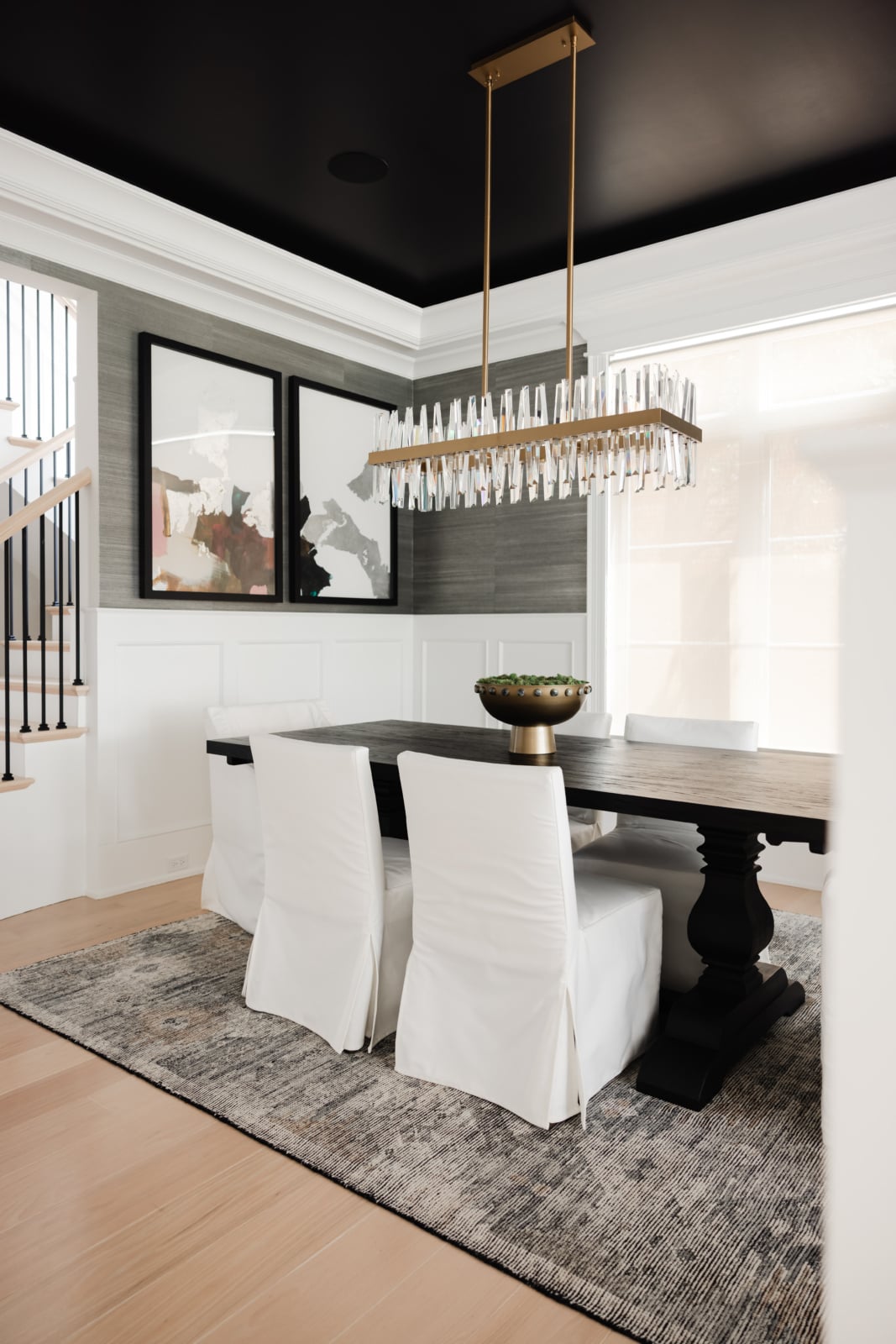
Hung above furniture, it relates to the furniture rather than the floor. Leave roughly six to twelve inches between the top of the sofa or console and the bottom of the frame. Your eye reads that gap, so a piece floating two feet above a sofa looks unrelated to it however correct its height from the floor.
Ceiling height does not change the rule as much as people expect. In a very tall room the instinct is to hang high, which puts the art above the sightline and leaves a large empty band beneath it. Hang for the people in the room, not for the wall.
Mirrors follow a different logic entirely, since they are positioned for what they reflect. That is covered in how high to hang a mirror.
When the answer is joinery
Worth considering seriously before defaulting to art, particularly in a room that is short of storage.
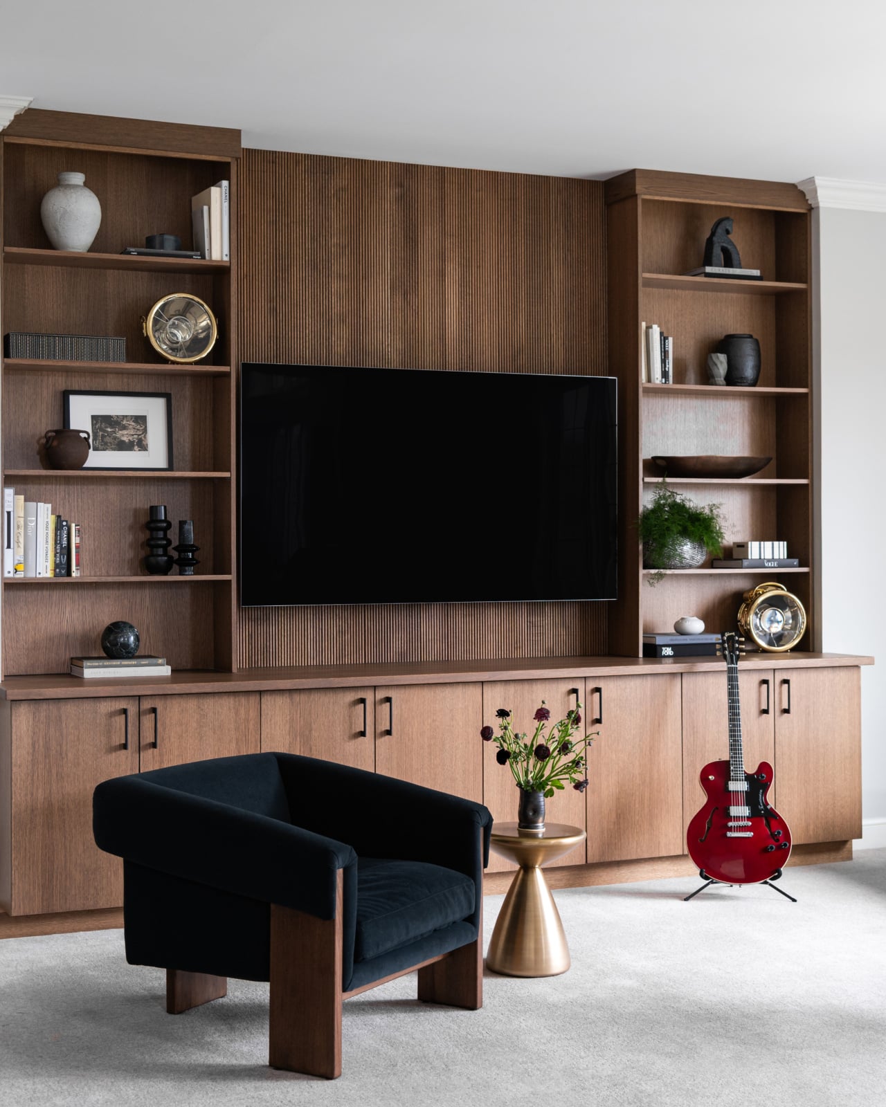
A wall of built-in shelving or cupboards uses the full height, adds real capacity, and reads as architecture rather than as furniture placed against a wall. In an alcove beside a chimney breast it also squares off a room that is otherwise awkward.
It changes the room more than a picture does, and it is permanent, which is both the advantage and the commitment. In a house you intend to stay in it is frequently the better answer, and in an older house with irregular walls it is often the only thing that fits properly.
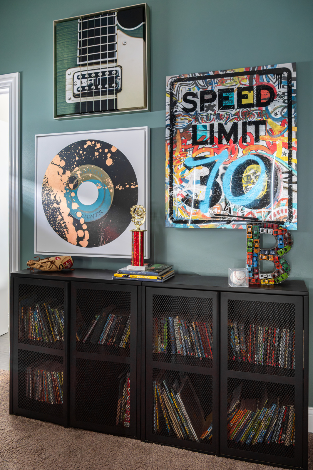
The hybrid works well too: closed storage below, open shelving above, and one good piece of art propped rather than hung.
The empty wall
The option nobody chooses and several rooms need.
A room where every wall carries something has nowhere for the eye to rest, and the effect is subtly tiring even when each individual thing is good. Negative space is what makes the things you do hang register properly.
This is most true in small rooms, where the instinct is to use every surface, and in rooms that already contain a strong focal point. A room with a substantial fireplace, a good window and a wall of books does not need art on the remaining wall. It needs the remaining wall.
Leaving it clear is also the honest answer when you have not found the right thing. A wall waiting for a piece you actually want is better than a wall carrying something bought to fill it, and the difference is legible to anybody walking in.
It should mean something
The point that outranks the rules.
A room is not finished until it is styled, and the things on the walls are a large part of what makes a room feel complete. But they are also what tells a visitor about the people who live there. Art says what somebody finds beautiful. Photographs and objects say where they have been.
Art bought to fill a wall says only that the wall needed filling, and the most common failure in beautiful, expensive homes is exactly this kind of anonymity. A home should tell your story.
Which is an argument for buying slowly, for hanging things you actually respond to rather than things that match, and for being willing to leave a wall empty until the right thing turns up. Use what you love.
Chicago rooms specifically
Two local conditions that affect what a blank wall wants.
Older city housing tends to have high ceilings and generous wall planes but also a great deal of interruption: chimney breasts, radiators under windows, doors in awkward places, sometimes picture rails still in place. Genuinely blank walls are rarer than in newer houses, and where they exist they are usually large. That argues for one substantial piece rather than a group, and picture rails are worth using rather than removing, since they allow art to be moved without touching the plaster.
Newer suburban houses have the opposite: large, uninterrupted, characterless walls, frequently double height. These are the walls where scale most often fails, because a piece that would dominate an ordinary room disappears entirely on a wall of that size. They usually need something much larger than expected, or a full-height run of joinery to give the wall a structure it does not otherwise have.
Working through it with us
Blank walls are usually a scale problem rather than a taste problem, and the answer is often something other than a picture. You can see how we work on our design process page, look through recent projects, or get in touch about your own home.
Related reading: choosing a statement piece, how high to hang a mirror, styling bookshelves, small space storage and high contrast rooms. We work across Chicago, Hinsdale and Elmhurst.
Frequently asked questions
How do I decide what to put on a blank wall?
Decide what the wall is for first. A wall seen from the doorway does a different job from one behind the sofa, a wall opposite a window may want a mirror, and a room short of storage may be better served by joinery. Working out the job usually narrows the options and often produces an answer that is not art.
What size art should go above a sofa?
Roughly two thirds to three quarters the width of the sofa, which is larger than most people buy. On a wall with no furniture below, fill somewhere between half and two thirds of the available width. If choosing between two sizes, take the larger one.
Is one large piece better than several small ones?
Almost always, and it is the quickest way to make a room look resolved. Several small pieces need to be planned as a single arrangement to work, whereas one substantial piece reads as a decision immediately.
How do you plan a gallery wall?
Treat it as one shape rather than a collection. Decide the rectangle the whole arrangement will occupy, sized by the same rule as a single piece, then arrange within it with tight even gaps of about two to three inches. Lay it out on the floor and photograph it first.
How high should art be hung?
Centre at about 57 to 60 inches when hung on its own. Above furniture it relates to the furniture rather than the floor, with roughly six to twelve inches between the top of the sofa and the bottom of the frame, because the eye reads that gap.
Should every wall have something on it?
No. A room where every wall carries something has nowhere for the eye to rest, and negative space is what makes the things you do hang register. This matters most in small rooms and in rooms that already have a strong focal point.
What if I cannot find the right piece?
Leave the wall empty. A wall waiting for something you actually want is better than one carrying something bought to fill it, and the difference is visible to anyone walking in. Art bought to fill a wall says only that the wall needed filling.
What works on a very large or double-height wall?
Something considerably larger than feels reasonable, or a full-height run of joinery. These walls are where scale most often fails, because a piece that would dominate an ordinary room disappears on a wall of that size.