
Key Takeaways
- Quiet luxury is about how a room is made, not what color it is. Construction, scale and restraint carry it. A beige palette is optional.
- The version on Instagram and Pinterest is a recipe of greige, boucle and travertine, and a house built from one recipe looks like it was ordered from a single catalog page.
- Upholstery is where it really lives. It is the one place we tell every client to prioritize quality, because it is what shows wear first.
- The material can be classic while the way it is used dates. Choose what you love and use it for this house, not for this year.
- Real homes have kids, dogs and allergies. Those change the fabric, rug and stone selections, and they should be designed in from the start.
- Chicago and the western suburbs ask for different things. Vintage city homes need the design to step back for original millwork. Large suburban rooms need scale before anything else.
Quiet luxury interior design is luxury you recognize by how a room is made and how it lives, not by a logo, a trend or a palette. In a real home it reads differently from the version on Instagram and Pinterest because it was never meant to be a color scheme: it is construction you can feel, furniture scaled to the room, and a house that tells you who lives there.
That is the part the trend gets backwards. Search the phrase and you get the same room again and again: greige walls, a curved cream sofa, a travertine coffee table, a single branch in a ceramic vase. It is a beautiful photograph. It is also a recipe, and a house built from one recipe ends up looking like it was ordered from a single catalog page, which is the exact failure a luxury home is supposed to avoid.
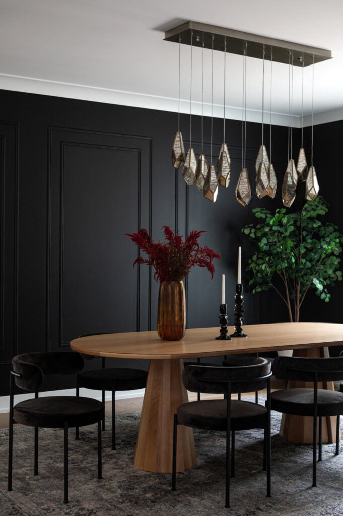
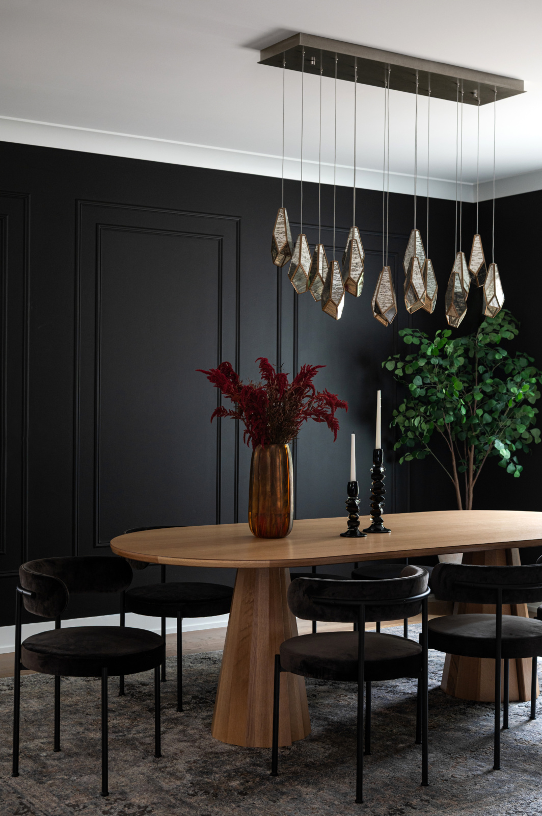
The dining room below is one of the quietest rooms in our portfolio, and it is painted black. Nothing in it is trying to prove anything. The oak table is solid, the chairs are properly upholstered, the pendants are the one moment, and the red flowers are the only loud thing in the room. That is what quiet means.
What quiet actually refers to
The phrase came from fashion, where it described clothes with no visible branding that you could only recognize as expensive by the cut and the fabric. The translation to a house is straightforward, and it has nothing to do with color. A quiet room is one where nothing is shouting for attention: no trend piece placed to prove the owner is current, no furniture chosen for how it looks in a photograph, no finish that announces the year it was installed.
What you notice instead is how it all feels once you are in it. The sofa holds its shape when you sit down. The drapery hangs from the right height and breaks where it should. The stone is used with restraint. The room is lit so that it looks as good at nine at night as it does at noon. None of that shows up in a mood board, which is why the mood board version keeps getting it wrong.
If you have ever walked into a room that looked expensive and felt like a hotel lobby, you already know the difference. The most common mistake we see in beautiful, well-finished homes is not bad taste. It is anonymity. As Dara puts it, a home should tell your story and who you are, and if it looks like someone ordered everything from a page in a catalog, the design falls flat. We wrote more about that in personalization in Chicago home design.
Chicago and the western suburbs ask for different things
In the city, a lot of the homes we work in are vintage: Chicago greystones, two-flats and courtyard buildings with original millwork, plaster walls, radiators and oak floors that have already been down for a century. In those houses the most luxurious thing in the room is often something nobody has bought in a hundred years. Quiet luxury there means the design steps back. The furniture is scaled to rooms that were laid out for a different way of living, the lighting respects the ceiling rather than fighting it, and the new materials are chosen to sit beside the old ones rather than to outshine them.
The western suburbs are a different problem. In Oak Brook, Hinsdale, Burr Ridge and Naperville we see larger houses, two-story family rooms and long open sightlines, with new construction and careful rehabs side by side. A pale, all-neutral scheme that looks serene in a city living room can simply disappear in a room with an eighteen foot ceiling. The walls go flat, the furniture floats, and the house starts to feel unfinished rather than calm. Quiet luxury in a big suburban house usually needs more weight, more contrast and more careful scale than the trend images suggest, not less.
The principle underneath is the same in both places. Start with the architecture you actually have. The trend images almost never show you the house around the room, and that is the part you live in.
The recipe versus a quietly luxurious house
Here is the difference as a chart. The middle column is the version you see repeated online. The right column is what the same decision looks like when it is made for a particular house and the people in it.
| The element | The quiet luxury recipe | Quiet luxury in a real home |
|---|---|---|
| Palette The first thing the recipe prescribes. |
Oatmeal, greige, cream and camel, in every room. | Whatever the household actually loves, including deep color. Quiet describes the handling, not the hue. |
| Upholstery What you sit on every day. |
A shape that photographs well. The inside is never discussed. | Frame, springs and cushion fill come first, because that is what still looks right years later. |
| Stone Countertops, fireplaces, tables. |
Travertine or pale marble, because it is on the mood board. | A stone chosen for the room, used in a way that suits the house rather than this year. |
| Furniture scale How big each piece is allowed to be. |
Borrowed from a photograph of a different room. | Set on a space plan for this room, its ceiling height and the way people move through it. |
| Texture Boucle, linen, plaster, wool. |
Layered on to stop a neutral room from going flat. | Chosen for how it wears, which is where kids, pets and allergies change the answer. |
| Lighting Fixtures and where the light lands. |
One sculptural pendant, lit for the photograph. | Layers you can live under at night, with one fixture allowed to be the moment. |
| Art and objects The layer that says who lives here. |
Styled with things bought to match. | Things with a history: what you read, what you find beautiful, where you have been. |
| What it signals What a visitor learns in the first minute. |
That someone followed a trend carefully. | Who lives here, and that the house was made well. |
| How it ages Five years on. |
Dated by its palette, the way every trend eventually is. | Changes gently, because it was never pinned to one moment. |
Some houses genuinely suit a pale, restrained palette, and when they do we use one. The point of the chart is that the palette is a choice made for the house, not the definition of the style.
Quiet is not the same as neutral
The single most repeated piece of quiet luxury advice is to keep everything neutral. We disagree with it, and so does our portfolio.
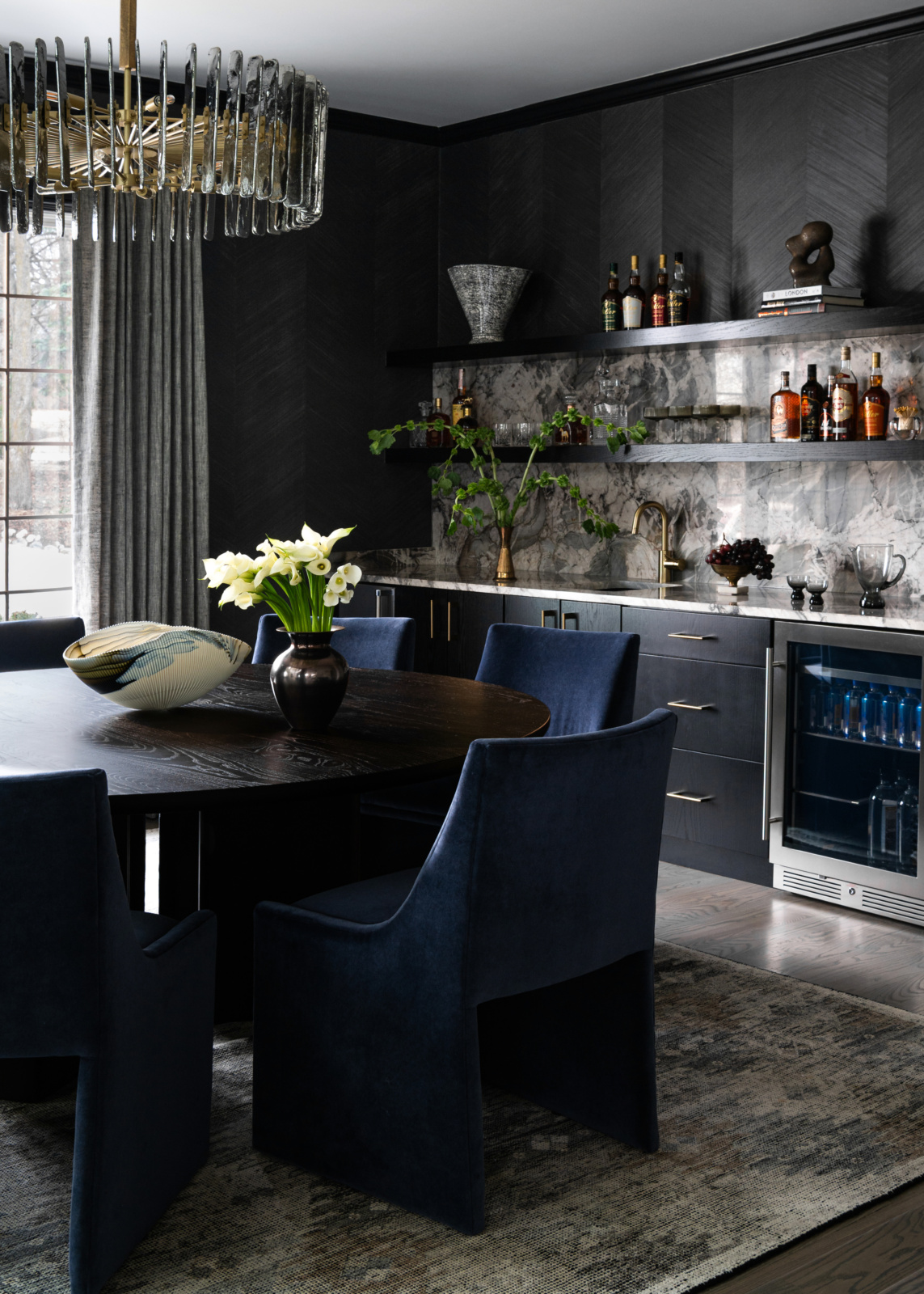
When we started on the Modern Collector in Oak Brook, the house had beautiful bones and a palette that leaned heavily neutral and gray. It looked finished and it felt like nobody in particular lived there. We introduced color to bring warmth, depth and personality into the rooms. In the dining room, an unused nook became a bar with open shelving and a veined stone backsplash, wrapped in dark walls. It is a deeply colored room and it is also a calm one, because every piece in it has a reason to be there.
There is a larger argument behind this, and it is one Dara makes plainly. Nothing is ever completely timeless. Every choice carries some trace of when it was made, the same way clothes do. If you try to design everything in your home so that it will never date, everything ends up neutral, and neutral everywhere is boring. Her advice to clients is to use what they love and worry less about it going out of style. Life is too short, you should love your home.
That is also why the beige version of quiet luxury is the one most likely to date. A beige living space can be lovely, and value contrast is usually what saves it, but a whole house painted in the colors of one moment will read as that moment in five years. A house built around what its owners love will read as theirs.
Where quiet luxury really lives: upholstery
If you want to know where quiet luxury actually sits in a house, sit down. Upholstery is the number one place we tell clients to prioritize quality, and it is the clearest example of the gap between how something photographs and how it lives.
A sofa made quickly from lesser materials looks fine on the day it arrives. Three years later it looks lumpy, because the frame, the springs and the cushion fill were never built to last. A well-made piece keeps its shape, can be reupholstered when the fabric is tired, and ends up being replaced far less often. Nobody visiting your house will know which one you have from a photograph. Everyone who sits on it will. We go into the construction in more detail in how long a sofa lasts and what goes inside a good cushion.
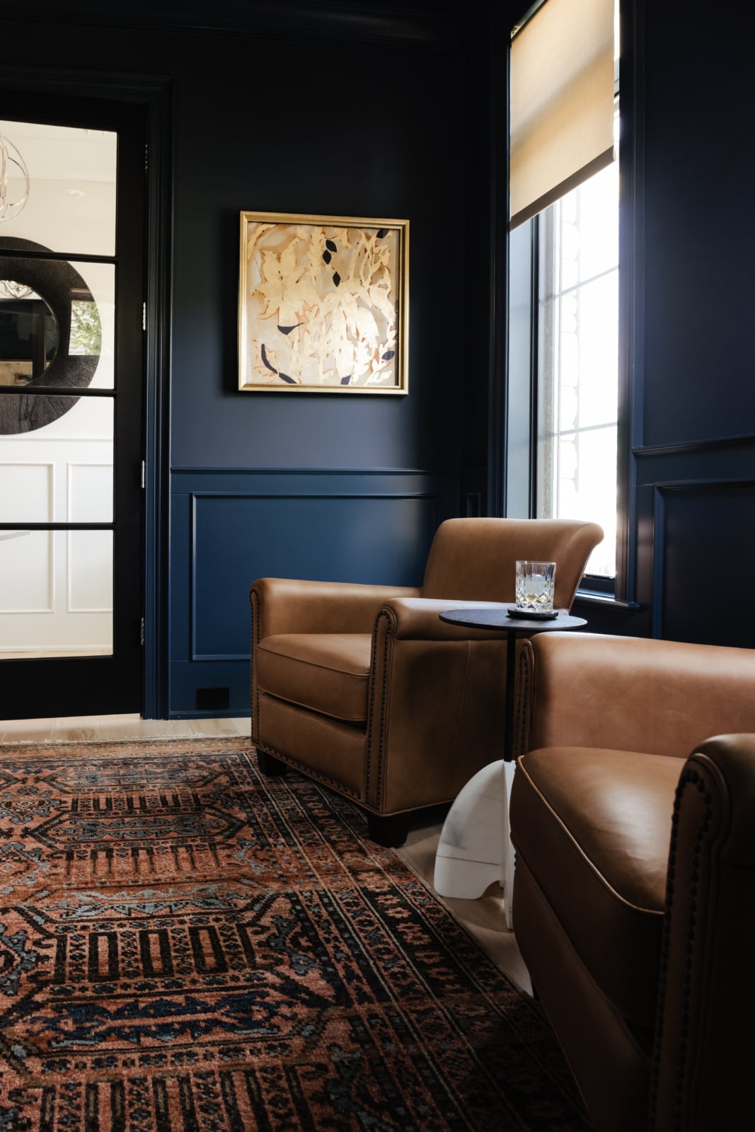
The study above is a good example of what that looks like. Two leather club chairs, deep blue walls and a richly colored rug in rust and navy that the homeowners trusted us to use. Leather is one of the few materials that looks better as it wears, and a room built around it gets more comfortable to be in every year. That is the quiet part.
The material can be classic. How you use it is what dates.
Quiet luxury leans hard on natural stone, and for good reason. But there is a distinction worth holding onto. Marble has been in use for centuries. The way it is used is what goes in and out of style: the particular cut, the edge profile, the veining everyone wanted in a given year, the rooms it was put in.
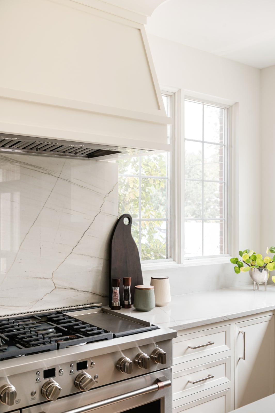
So the question is not which stone is safe. It is which stone suits this house, and how to use it in a way that belongs to the room rather than to the trend. In the kitchen below, a single slab of veined stone runs from the counter up behind the range and stops under the range hood. It is one material, one gesture, and it does not need anything else around it to prove itself.
The same thinking applies to wood and metal. We wrote about choosing types of wood and deciding whether your finishes should age, and in both cases the answer depends on the house far more than on the year.
Real homes have kids, dogs and allergies
This is the point where the trend version and a real house part company completely. The images you see online are of rooms that nobody has sat in yet. A real home has children, a dog who thinks the best chair is his, and someone with a dust allergy who needs a different rug.
A well-planned home is designed around the people who live in it, and if there are kids, pets or allergies, that changes the selections. It does not mean giving up the room you wanted. It means choosing the version of it that will survive the household.
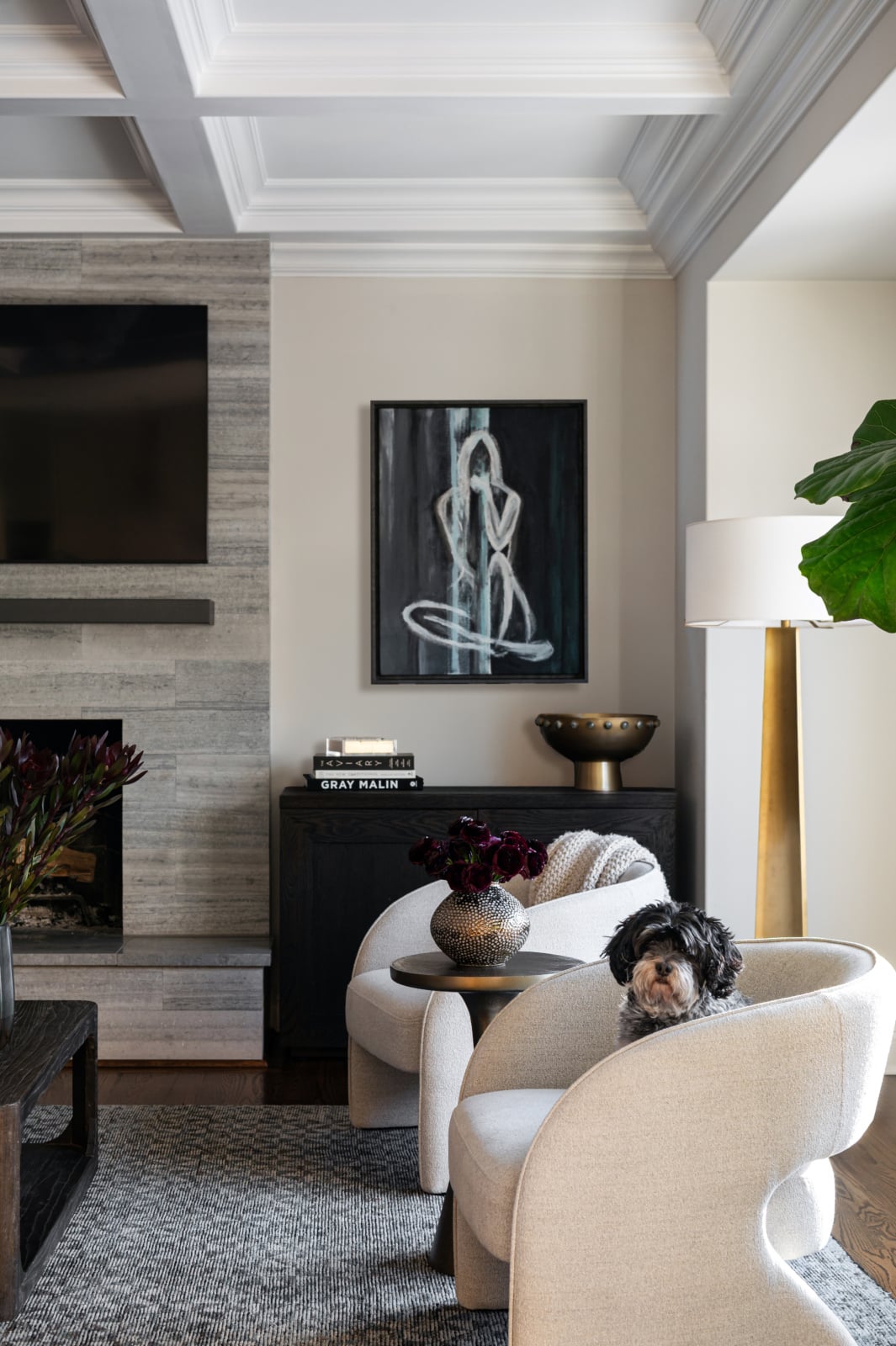
The curved cream boucle chair is the defining piece of the quiet luxury look, and here it is in a real house, with the dog already in it. That house has kids and dogs, so durability was part of the brief from the first meeting: performance fabrics, rugs that can take traffic, resilient stone. In an Oak Brook house with young children, we chose dining room textiles specifically to withstand some abuse, so the family would not have to worry about their new furniture. If you are weighing fabrics, our guide to couch fabric for dogs and cats covers what matters, and the right rug material does the same for the floor.
Scale is the failure nobody photographs
The first thing we do on any project is space plan. If the scale is off on the furniture or the lighting, everything feels unbalanced, and no amount of beautiful material fixes it. This is where quiet luxury rooms most often fail in real houses, because scale is the one thing a photograph of someone else’s room cannot tell you.
A low, deep sofa that looks relaxed in a loft reads as a dog bed in a two-story family room. A pair of delicate chairs that look refined in a city apartment disappear in a large suburban living room. In a vintage Chicago home the problem runs the other way: oversized pieces overwhelm rooms that were proportioned around a fireplace and a pair of windows. We wrote a whole post on why furniture scale matters in Chicago homes with classic architecture, and it applies here more than anywhere.
Get the scale right and a room can be almost empty and still feel generous. Get it wrong and a room full of good things still feels unsettled. That is why the plan comes before the palette on every project we take on, and why our design process starts with the layout rather than the mood board.
A quiet room still has to say who lives there
The last layer is the one the trend version most often leaves out, and it is the one that makes a room feel finished. A room is not complete until it is styled, and the styling is where the personality comes in. A coffee table book tells you about someone’s interests. Their art tells you what they find beautiful. The objects on a shelf tell you where they have traveled or where they come from.
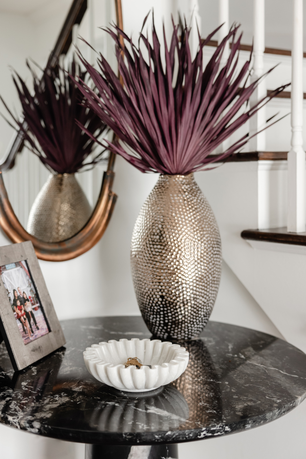
The entry in that Oak Brook house is a small space, and we wanted it to make a big impression. A petite black marble table with dramatic white veining sits in the corner by the stair. On it, a hammered metal vase, a white scalloped bowl and a framed family photograph. It is a quiet corner and it tells you something true about the family the moment you walk in. That is the whole idea in one small table.
The trend version tends to style shelves with things bought to match. We would rather see shelves full of books you have actually read, and one statement piece that is unmistakably yours.
What we will not do
We will not design a house from a single reference image, however beautiful it is. We will not paint every room the same neutral so that nothing can go wrong, because a house where nothing can go wrong is usually a house where nothing is going on. And we will not let a trend decide the palette when the people who live there already know what they love.
What we will do is make it quiet in the sense that matters: built well, scaled properly, lit for real life, and finished with the things that make it yours. If that ends up being cream and oak, wonderful. If it ends up being black paneling and red flowers, that is quiet luxury too. Working out your own style is a better starting point than any trend name.
Frequently asked questions
What is quiet luxury interior design?
Quiet luxury interior design is luxury you recognize by how a room is made and how it lives, not by a logo, a trend or a palette. It shows up in upholstery that holds its shape, stone used with restraint, furniture scaled to the room and objects that belong to the people who live there.
Does quiet luxury mean a neutral or beige home?
No. A neutral palette is one way to do it, not the definition of it. Quiet refers to nothing in the room shouting for attention, and a black paneled dining room or a deep blue study can be as quiet as a cream living room. What makes a room loud is a trend it is trying to prove, not its color.
What materials are used in quiet luxury interiors?
Natural materials that are made well and age well: solid wood, real stone, leather, wool and linen, and upholstery built properly on the inside. The material matters less than the way it is used. Marble has been around for centuries, but the way it is cut and placed is what dates a room.
Where does quiet luxury matter most in a house?
Upholstery. It is the one place we tell every client to prioritize quality, because a sofa made quickly from lesser materials looks lumpy within a few years, and one that is built well still looks right long after the rest of the room has changed around it.
Can a family home with kids and pets be quiet luxury?
Yes, and it should be designed for them from the start. Kids, pets and allergies change the fabric, the rug and the stone selections. A cream boucle chair can work in a house with a dog if the fabric was chosen with the dog in mind.
Is quiet luxury just a trend?
The name is a trend. The idea underneath it, that a home should be made well and say something about the people in it, is not. The trend version, a set recipe of beige, boucle and travertine, will date like any other look. The idea will not.
How does quiet luxury work in an older Chicago home?
It usually means letting the architecture do the talking. In a vintage Chicago home the original millwork, plaster and floors are often the richest things in the room, so the design supports them rather than competing with them, and the furniture is scaled to rooms that were laid out for a different way of living.
How do you keep a quiet luxury room from feeling boring?
Give it a point of view and a story. Use color if you love color, let one piece be the statement, and style the room with things that have a history. A room that could belong to anyone is the failure, not a room that is quiet.
Working with us
Dara Agruss Design is an interior design studio based in Elmhurst, working across Chicago and the western suburbs, including Oak Brook, Hinsdale, Naperville, Elmhurst, Glen Ellyn, Downers Grove, Western Springs, La Grange, Burr Ridge and Clarendon Hills. Furnishing and styling run through our interior furnishings service, and design and renovation through new construction and remodel. Everything we offer is under services, and the portfolio shows finished homes.
If you want a home that feels calm and expensive without looking like everyone else’s, that is the right conversation to start. Get in touch.