High contrast decor utilizes opposing shades to create a visual experience that is both bold and striking. This design approach plays with the juxtaposition of light and dark elements to define spaces and highlight architectural features. It’s not just about black and white; high contrast can include the full spectrum of color, using saturation and brightness to draw the eye and create focal points. This style commands attention and conveys a sense of drama within a space, making it a favored technique among designers looking to make a pronounced statement in interiors.
In the realm of interior design, high contrast decor is particularly effective for those desiring to inject modernity and sophistication into their living spaces. By balancing intense colors against neutral backdrops or pairing rich textures with smooth surfaces, this decorative style emphasizes dynamism and depth. The use of high contrast is not limited to walls and furniture alone; it extends to art, accessories, and textiles, allowing for a comprehensive design strategy that can transform a room from mundane to extraordinary.
Design Principles

In high contrast decor, understanding the fundamentals of design principles is crucial. These include the interplay of colors, the strategic use of contrast, and the achievement of visual balance.
Color Theory
Color theory is a cornerstone in high contrast decor. The use of complementary colors, which are opposite each other on the color wheel, often results in a vibrant look. In a high contrast setting, one might pair black and white for the starkest contrast, or dark blue with bright yellow for a strong visual impact.
Contrast in Design
Contrast in design is achieved by juxtaposing elements that have noticeable differences in qualities such as color, shape, size, and texture. Effective use of contrast can draw attention to key elements within the space. For example, a bright, textured throw pillow on a smooth, dark leather sofa creates a point of interest.
Balance and Harmony
To achieve balance and harmony in high contrast design, one should distribute visual weight evenly across the space. This does not necessarily mean symmetrical balance but rather a visual equilibrium. For instance, if a room features a large, bold artwork on one wall, one might balance it with a cluster of smaller items or furniture of equal visual weight on the opposite side.
Key Elements

High contrast decor relies on a few pivotal components that define its dynamic aesthetic. It incorporates the use of bold colors, statement pieces, and textural contrasts to achieve a visually stimulating space.
Bold Colors
Bold colors serve as the foundation of high contrast decor. They create visual impact and define the space.
- Palette Choices: High contrast spaces often feature stark color pairings such as black and white or navy and gold.
- Application: Colors can be distributed through paint on the walls, large pieces of furniture, or accent pieces.
Statement Pieces
A statement piece attracts attention and sets the tone for a room.
- Types: This could be a large, vibrant artwork, an ornate light fixture, or an oversized piece of furniture.
- Placement: It should be positioned as the focal point of the room for maximum effect.
Textural Contrast
Textural contrast adds depth and interest to high contrast interiors.
- Materials: Combining smooth materials like polished metal with rougher textures like wool or burlap can enhance the sensory experiences of the space.
- Elements: Rugs, cushions, throws, and wall hangings are all effective ways to introduce varied textures.
Room by Room Application

High contrast decor utilizes bold and striking differences in color and texture to create a dynamic space. Each room can harness these principles to achieve a distinctive look and feel.
Living Room Decor
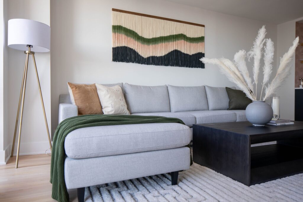
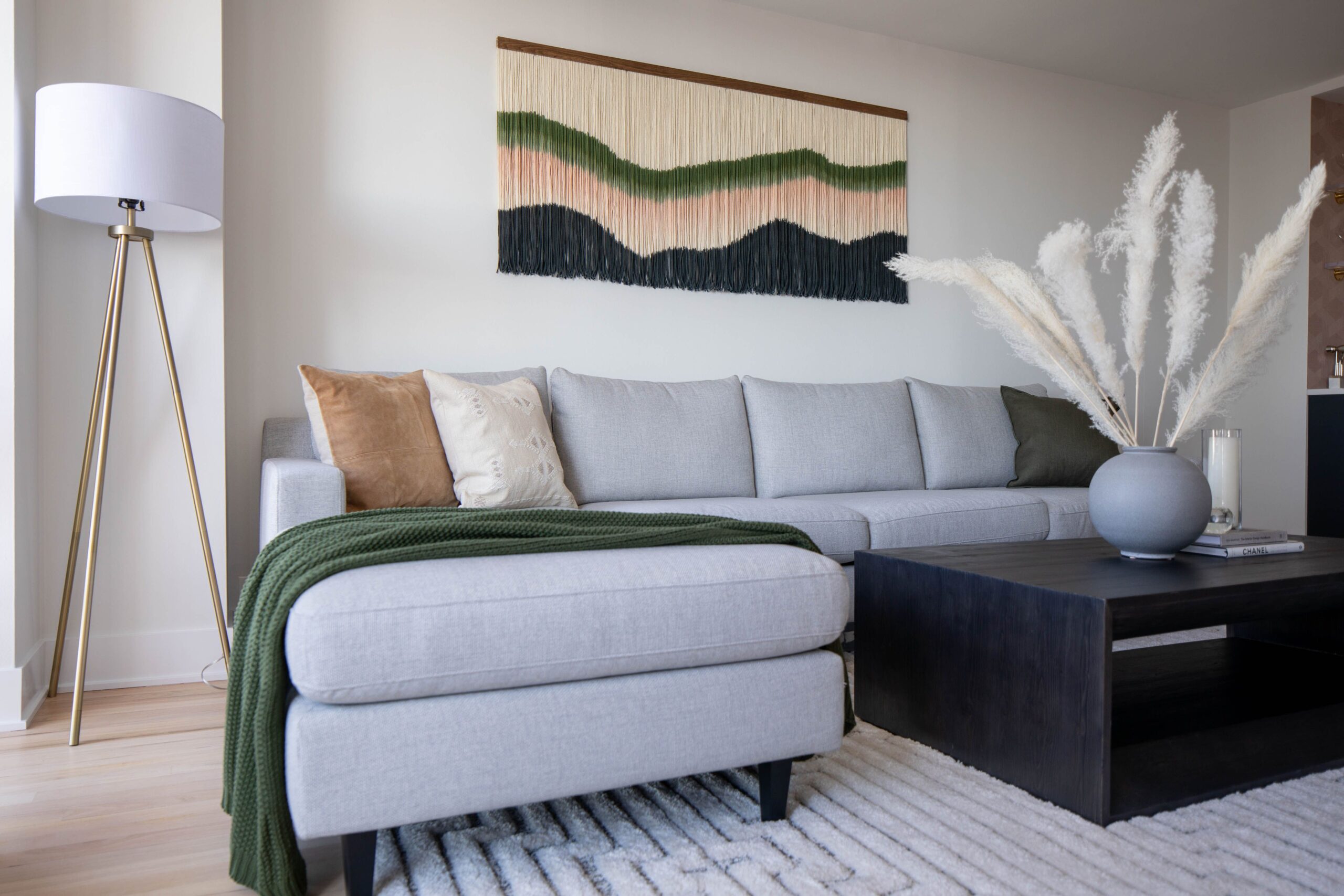
In the living room, a black velvet sofa against a white painted wall creates a dramatic focal point. Adding graphic throw pillows can infuse personality and break the monochrome monotony. Furniture pieces like glossy black coffee tables paired with matte white end tables enhance the contrasting effect.
Bedroom Aesthetics
For the bedroom, opting for crisp white bedding against a dark feature wall can provide tranquility with visual depth. An upholstered charcoal headboard with metallic accents in lighting or artwork adds layers of contrast without overwhelming the soothing nature of the room.
Kitchen Styles
Kitchens benefit from high gloss cabinets paired with a matte backsplash. Incorporating a bold colored island amid neutral tones provides a centralized burst of contrast. Use of open shelving with contrasting dishware displays can serve function and style simultaneously.
Bathroom Accents
Bathrooms achieve high contrast decor through the use of black fixtures on white subway tiles. Mirrors with substantial dark frames against lighter walls can expand the space visually. Accessories like black and white patterned towels or a statement bath mat can add playful elements of contrast.
Lighting Considerations

In high contrast decor, lighting is critical for creating the desired visual impact. Proper lighting accentuates contrast, defines spaces, and sets the mood.
Ambient Lighting
Ambient lighting provides the overall illumination of a space. High contrast decor benefits from a layered approach to ambient lighting, which can prevent harsh shadows and balance the stark differences between light and dark areas. For example:
- Ceiling-mounted fixtures: These distribute light evenly and can be dimmable LED panels or recessed lights.
- Floor lamps: Placed strategically, they soften the contrast and add warmth to rooms with bold color schemes.
Accent Lighting
Accent lighting draws attention to specific elements within the decor. Focused lighting is essential to highlight artwork, textures, and architectural features.
- Track lighting: Offers directional light that can be adjusted to emphasize contrast on wall art or sculptures.
- Table and desk lamps: Provide defined pools of light that enrich color and contrast, which can be crucial in a high-contrast setting.
Each light source should be considered for its intensity, color temperature, and the way it interacts with the surrounding decor elements to maintain a cohesive high-contrast theme.
Materials and Finishes

In high contrast decor, materials and finishes are pivotal to creating a visually striking effect. They must be carefully picked to balance each other and accentuate the aesthetics.
Natural versus Synthetic
Natural materials, like wood and stone, bring an inherent warmth and uniqueness due to their variations. Synthetic materials, such as acrylics or plastics, offer consistency and often come in a wider range of colors. Here’s a list contrasting their attributes:
- Natural Materials:
- Unique texture and grain
- Color variations inherent to the material
- Often requires sealing or treatment
- Synthetic Materials:
- Uniform appearance and color
- Greater flexibility in application
- Easier to maintain and durable
Matte and Gloss Surfaces
Matte and gloss finishes can dramatically change the look and feel of a space.
- Matte Surfaces are non-reflective and can conceal imperfections, offering a sophisticated and understated look. They are well-suited for areas where glare could be a concern.
| Room | Suggested Use |
|---|---|
| Living Room | Matte walls to reduce light reflection |
| Bedroom | Matte furniture for a soft, calming ambiance |
- Gloss Surfaces reflect light, which can make spaces feel larger and more open. They require more upkeep as they easily show smudges and fingerprints.
| Surface | Advantage |
|---|---|
| Countertops | Gloss finish for added shine and clean appearance |
| Cabinets | High gloss for visual depth and modern feel |
By integrating these materials and finishes thoughtfully, designers can create rooms that are both beautiful and dynamic.
Color Palettes

In high contrast decor, the color palette is instrumental in creating visual impact. Strategic color choice can transform a space from monotonous to vibrant.
Monochromatic Schemes
Monochromatic color schemes utilize various shades, tints, and tones of a single color. This approach creates unity and cohesiveness within a space. For example, navy blue might be paired with lighter blues like sky blue and powder blue to produce subtle contrast while maintaining a harmonious atmosphere.
Complementary Schemes
Complementary color schemes involve two colors that are opposite each other on the color wheel, such as red and green or blue and orange. This pairing brings a dynamic and energetic vibe to the room. One might choose a bold red for accent walls and pair it with emerald green decor elements to establish a high-contrast, visually stimulating environment.
Furniture Selection

When selecting furniture for high-contrast decor, one should prioritize pieces that offer a striking balance between light and dark tones. Key elements include:
- Color Palette: Furniture should alternate between bold, dark hues and crisp, light shades. A classic combination is black and white, but deep blues or greens against softer tones can also work effectively.
- Materials: A mix of materials can enhance contrast:
- Glossy materials (like lacquered wood) can make dark colors pop.
- Matte finishes help lighter pieces stand out.
| Material Type | Finish | Color Effect |
|---|---|---|
| Wood | Dark stain with high gloss | Bold, eye-catching |
| Metal | Brushed finish for subtle sheen | Modern, sleek |
| Fabric | Heavy textures in darks/light linens | Depth and interest |
- Shape and Form: Furniture with clean lines and geometric shapes tend to stand out in a high-contrast setting. They should aim to create visual interest without overwhelming the decor.
- Functionality: While aesthetics are key, furniture must also be functional. Pieces that combine both, like a striking bookcase in a dark finish with light-colored ornaments or a sleek side table, enhance both decor and utility.
By focusing on these factors, furniture can serve as strong anchoring elements in a room with high contrast decor. Each piece should contribute to a cohesive look that balances the theme without sacrificing comfort or purpose.
Accessorizing With Contrast
Incorporating high-contrast accessories can define and energize a space, creating focal points and accentuating the room’s design.
Artwork
Artwork is a powerful tool for introducing contrast. Black-and-white photography can offer a sharp dichotomy, making a bold statement on plain walls. Alternatively, a colorful abstract painting with stark color differences adds visual interest and serves as a conversation starter.
Rugs
Rugs with contrasting patterns or colors anchor the room and define areas. For example, a black rug with white geometric designs provides a striking contrast in a minimalist space, or a vibrant, multicolored rug can brighten a neutral room, drawing the eye with its myriad of contrasting hues.
Cushions
Cushions can add a quick and effective contrast pop. By using cushions that contrast with the sofa — for instance, bold, solid-colored cushions on a light-colored fabric or dramatic patterns on plain backgrounds — one elevates the aesthetics of the room. Using a mix of large and small prints or different textures can also create depth and interest.
Challenges and Solutions
High contrast decor can transform a room, but it comes with its own set of challenges. Implementing practical solutions can effectively address these issues.
Small Spaces
In small spaces, high contrast designs can sometimes make rooms feel cramped. A solution is to utilize mirrors and reflective surfaces to give the illusion of more space. Strategic placement of light and dark elements can also direct the eye and make a room appear larger. For example:
- Light walls with a dark accent piece can draw attention and create depth.
- Furniture with sleek lines minimizes visual clutter.
Overwhelming Designs
Bold contrasts can overwhelm a room when not balanced. To counteract this:
- Introduce neutral tones to soften the contrast.
- Use textures to add visual interest without overpowering the space.
- Apply repetitive patterns in moderation to unify the designs.
An effective distribution can be achieved by following a specific color ratio, such as 60% light, 30% contrasting, and 10% accent colors.
Budget Constraints
High contrast decor need not break the bank. There are cost-effective strategies to achieve this look:
- Paint: Choosing a bold paint color for one wall can be a low-cost, high-impact move.
- Accessories: Use inexpensive accents like cushions, vases, or artwork to interject contrast.
- DIY Solutions: Repurpose existing items—painting an old chair black or white can add to the contrast without a major investment.
Maintaining a clear plan and shopping smart can yield impressive results without a hefty expenditure.
Trends and Innovations
In high contrast decor, monochromatic schemes with bold blacks and crisp whites remain dominant. This classic approach offers a sense of clarity and sophistication. Recently, the trend has evolved to include pops of color, such as cobalt blue or emerald green, to add a dynamic visual element.
Geometric patterns play a significant role in today’s high contrast interiors. These patterns provide visual interest and depth when incorporated through wall art or textiles. Patterns are often in bold lines or abstract shapes, maximizing the contrast effect.
Textural contrasts are gaining traction in the design world. Designers are pairing glossy finishes with matte surfaces or combining rough textures with smooth ones. For example:
- Glossy lacquered tables with wool throws
- Velvet upholstery against sleek metal frames
Innovation has brought smart lighting to the forefront. Adjustable lighting systems can highlight the contrast within a space, creating ambiance or focus with the push of a button. The use of such technology ensures that the decor has both aesthetic and functional adaptability.
| Year | Trend | Notable Feature |
|---|---|---|
| 2023 | Color Pops | Introducing bright accents |
| 2024 | Geometric Patterns | Bold lines in wall art |
| 2025 | Textural Contrast | Combining different finishes |
Sustainability in materials is also critical. Designers are selecting eco-friendly paints and recycled materials, ensuring that high contrast doesn’t mean high environmental impact. This approach signals an important shift toward responsible design without compromising on aesthetic appeal.
The Psychology of Contrast
High contrast decor relies on the use of opposing shades, primarily black and white, to create visual interest and draw the eye. This approach can influence mood and perception within a space.
Emotional Response: Decor that features high contrast can elicit strong emotional responses. White is often associated with purity and clarity, while black can convey sophistication and strength. When these colors are juxtaposed, they create a dynamic interplay that can feel energizing and visually stimulating.
Cognitive Effects: Contrast tends to highlight features and can guide visual flow within a room. It simplifies the detection of objects and shapes, aiding in the organization of visual elements. This clarity can improve cognitive processing as the eye is naturally drawn to points of contrast, assisting in navigation and comprehension of the space.
Behavioral Impacts: Environments with high contrast decoration may influence behavior. They often encourage a more focused attention, recommended in areas requiring concentration like offices or reading nooks. On the contrary, spaces meant for relaxation may benefit from softer contrasts to promote calmness.
| Contrast Level | Psychological Effect | Suggested Use |
|---|---|---|
| High | Stimulating, Energizing | Active spaces (offices) |
| Moderate | Balance, Comfort | Transitional areas |
| Low | Calming, Soothing | Restful spaces (bedrooms) |
By understanding the psychological effects of high contrast, decorators and homeowners can intentionally design spaces that foster the desired emotional and behavioral outcomes.
Maintaining Aesthetic Cohesion
When integrating high contrast decor into a space, achieving a balanced and cohesive look is paramount. Strong contrasts, if not managed well, can create visual clutter rather than the intended striking effect. Color continuity plays a crucial role in cohesion. One can incorporate a consistent color or a range of shades that recur throughout the space to tie elements together. For instance:
- Black and white: Such a palette can be softened with varying shades of gray or punctuated with a single accent color.
- Bold colors: Use one vibrant hue in multiple areas or through accessories to create flow.
Textures offer another dimension of cohesion without compromising the contrast. A mix of smooth and tactile surfaces—like glossy finishes alongside matte textures or rough fabrics—brings depth and balance.
Patterns can be unifying elements; however, their scale must be considered. Larger patterns can be balanced with smaller, repeating motifs to maintain visual harmony without redundancy.
Furniture and accessories play a key role. Aligning with a design style or theme ensures a cohesive narrative. Furniture can be selected with common features:
| Feature | Example |
|---|---|
| Legs | Tapered legs on both tables and seating |
| Material | Glass elements in lighting and tabletops |
| Era | Mid-century lines across different pieces |
Ultimately, it’s the thoughtful repetition of certain design elements and the controlled variation within the high contrast scheme that produces a unified and aesthetically pleasing environment.
DIY Tips and Tricks
Creating a high-contrast decor theme is accessible by combining bold colors with bright whites or deep blacks. Here are some practical DIY tips to achieve this look:
Choosing Colors:
They should select a dominant color and a contrasting one. For example, if someone chooses navy blue, they should pair it with crisp white for the walls.
Painting Techniques:
- Stripes: They can use painter’s tape to create precise stripes for an accent wall.
- Stencil Designs: Homeowners might opt for stencils to add high-contrast patterns to their space.
Furniture Selection:
Selecting the right furniture can accentuate the contrast. One might:
- Paint an old piece of furniture in a glossy black or white.
- Use slipcovers for a quick and reversible change.
Accessorizing:
Small details can have a significant impact:
- Cushions and Throws: Add cushions in the accent color on a neutral sofa.
- Artwork: Hang black and white prints or artwork with vibrant hues against contrasting walls.
Textiles:
- Rugs: A bold area rug can ground the space.
- Curtains: High-contrast curtains frame the view outside and draw the eye.
Lighting:
Light fixtures should complement the contrast. They might choose a modern black lamp against a light-colored wall.
Materials and Textures:
Mixing materials adds depth:
- Combine shiny metals with matte finishes.
- Pair soft textiles with hard surfaces.
By following these simple and effective tips, one can create a dynamic and visually interesting high-contrast decor in their home.