Are you sure you want to hide the widget forever? If you need it back, please clear your cookies.
Accessibly App is committed to making sites accessible for all, including people with disabilities. We are continuously improving the service we provide through our app to comply with increased accessibility standards, guidelines, and to make the browsing experience better for everyone.
The app uses the Web Content Accessibility Guidelines (WCAG) defined requirements to improve accessibility for people with disabilities. It defines three levels of conformance: Level A, Level AA, and Level AAA. Accessibly App is following the best guidelines and is partially conformant with WCAG 2.1 level AA.
Accessibly App is an app supported in Shopify and Wordpress environments. The app relies on the following technologies:
HTML
CSS
JavaScript
NodeJs
MongoDB
When a site has Accessibly App i ac-h4 installed, the website can be adjusted with keyboard navigation using the “tab” key (WCAG 2.1/2.1.1). Additionally, see the list of all provided Accessibly App features and tools for better website experience:
This feature enables users to enhance the size of the text to up to three times the original text for better text readability.
Makes the cursor bigger and more prominent. Increases the size for better site browsing.
Invert the colors of the website content. For those with decreased vision, the high contrast greatly helps to read the site better.
This feature lets users manually select from two options: to enhance the contrast of the website or to decrease the contrast.
This feature lets users update the brightness on the site. The content can either be made brighter or darker.
Users can turn on grayscale, making the website content appear only in shades of gray. This benefits people with visual impairment.
Add a supportive reading line to the site.
Convert the fonts available on-site to one of the most easily readable fonts: Helvetica.
Ability to read alt text of images. As of now, our tool has added a feature where alt descriptions for images without them are generated using Google's Vision AI. In the event that you haven't manually written these image descriptions yourself, this greatly helps people with visual impairment browse your site.
Add labels to images that contain a written description of the image.
Highlight links to make them more prominent.
Hide images on the site. This provides better site readability for people with visual impairment.
A feature that allows a voice to read the text on your site out loud to visitors.
We always try to update our services and operate in the best possible manner to benefit all of our clients and their site visitors.
We cannot control or correct problems with third-party sites, but please let us know if you encounter difficulty with any sites we link to so we can pass the information along to the site owners. You may also want to address your concerns directly to these third parties.
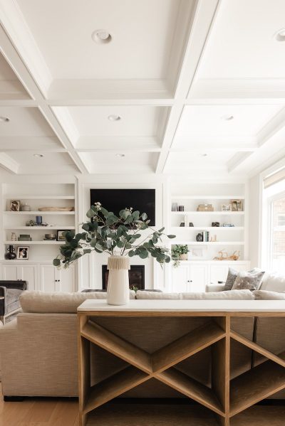
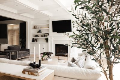
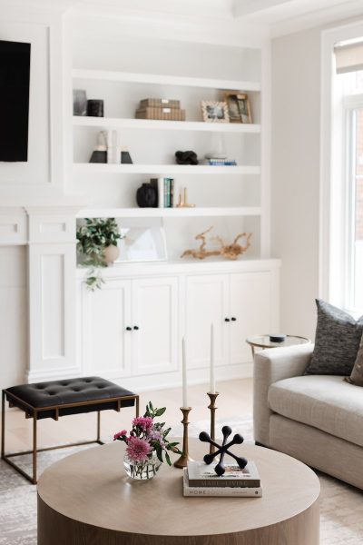
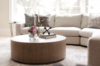
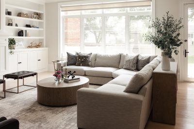
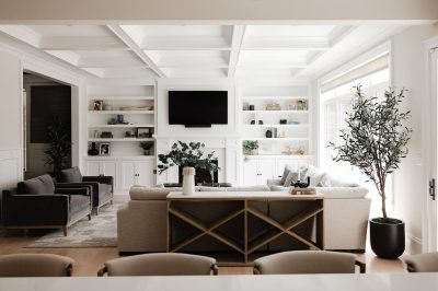
It’s not often that we get a blank slate. Furnishing this new construction home was truly a treat. The homeowners brought me into the project a few months after they had moved in. They had purchased a few of the large items such as a sectional for the family room and a dining room table and chairs, but weren’t quite sure how to finish these spaces off. In the family room, we decided to keep the color palette neutral. As always with neutrals, it’s best to layer textures and colors so the room doesn’t appear flat. We did this with a plush area rug that is both beautiful and soft, yet durable for their young family. For accent seating, we included oversized velvet chairs with sleek lines for contrast against the soft curves of the sectional. In addition to the light wood coffee table and console behind the sofa, leather and brass ottomans were used to provide extra seating and yet another layer of textures.
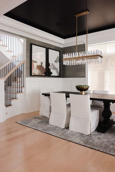
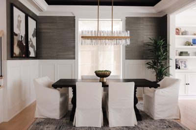
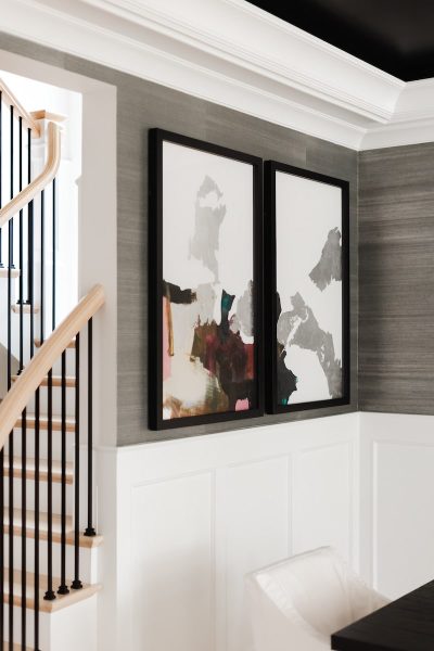
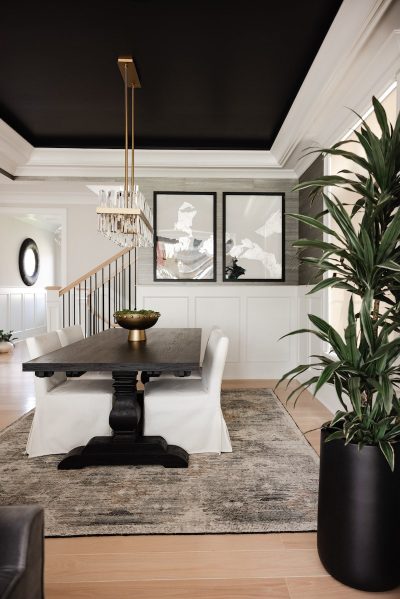
In the dining room, we used a bold grasscloth wallcovering to contrast the neutral colors of the family room. It compliments the black tray ceiling really well and the subtle sheen in the paper allows light to bounce around the room. A wool area rug was used to define the space from its nearby, connecting family room. We chose a wool rug because of its inherent resilience and resistance to stains, in addition to its luxurious texture. Lastly, we topped the room off with beautiful artwork, which adds a pop of color to the room.
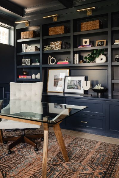
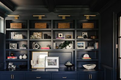
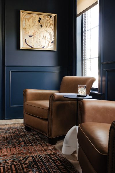
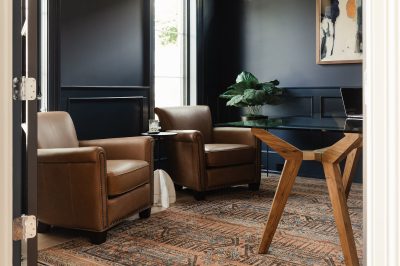
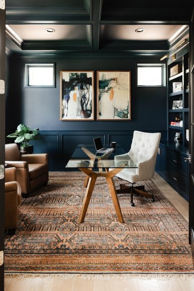
One of my favorite rooms in the home is the office. I was so excited when the homeowner trusted me to use this richly colored area rug. The rust color in the rug compliments the deep blue walls so well. We pulled those same rust and gold tones into the art. Dark blue and rusty orange are always a stunning combo.
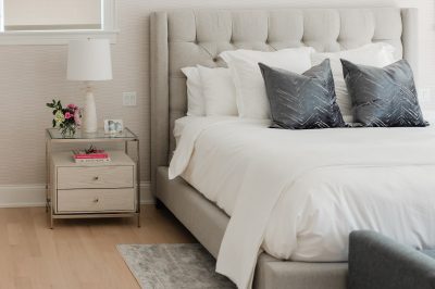
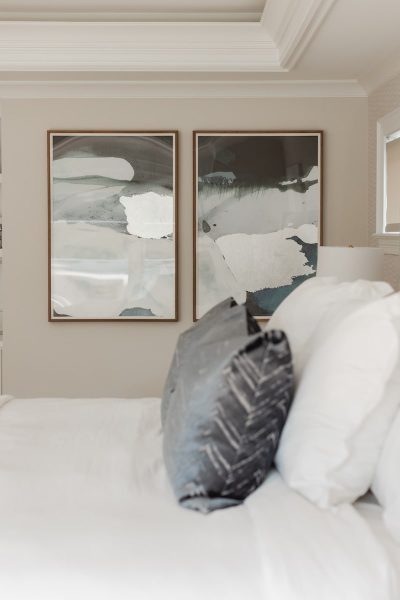
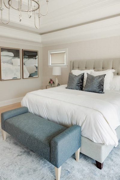
In the primary bedroom, we decided to create a spa-like sanctuary with soft, muted colors. We used soothing colors with shades of blues, grays and mixed metals. Soft, neutral tones adorn the walls, including a very subtle graphic wallpaper behind the headboard. The room’s minimalistic layout, free from clutter, makes this primary bedroom truly a sanctuary of relaxation.