
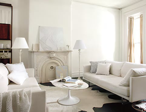
Choosing the right paint color for a north-facing room can transform an otherwise gloomy and cold space into a cozy and welcoming area. North-facing rooms often receive less direct sunlight, which can result in the space feeling cooler and the colors on the walls appearing more muted. To counteract this, selecting paint colors with specific undertones can enhance the room’s natural light and alter the overall ambiance of the space.
Paint colors in the lighter spectrum are preferable for north-facing rooms. They help to bounce the limited light around, creating a sense of spaciousness and warmth. Warm whites, soft grays, and light blues with warm undertones are particularly effective. These hues act to neutralize the cool light entering the room, ensuring that the space feels inviting at any time of the day.
In addition to lighter shades, rich and saturated colors can also be a good choice for north-facing rooms, creating a vibrant and cozy atmosphere that embraces the room’s natural shadows. Deep greens, navy blues, or warm browns and taupes can help to create a snug retreat, particularly in living areas or bedrooms where a sense of comfort is desirable. Balancing these deeper tones with the right lighting and decor can yield a sophisticated and serene environment.
The Importance of Lighting in North Facing Rooms

Source: Ideal Home
North facing rooms often receive less direct sunlight than those facing other directions, making the quality of lighting a crucial aspect to consider. Unnatural lighting in these rooms needs to be carefully balanced to create an inviting atmosphere that can mimic the warmth and clarity of natural light.
Utilizing a combination of light fixtures and light bulb temperatures can greatly enhance the ambiance. For example:
- Ceiling fixtures: They provide general lighting that can illuminate the room evenly.
- Task lighting: Such as desk lamps or under-cabinet lights, help to brighten specific areas for activities like reading or cooking.
Choosing the right paint color also plays a significant role in how light is perceived:
- Light hues: Such as blues or greens, can make a space feel more open and airy.
- Warm tones: Like creams or light yellows, can add a cozy feel to the room.
Moreover, reflective surfaces, such as mirrors or glossy furnishings, can maximize the light available by bouncing it around the room.
It is also beneficial to consider the color temperature of bulbs:
- Cool white bulbs (~4000K) can create a crisp, alert atmosphere.
- Warm bulbs (~2700K) can make the room feel more relaxed and serene.
Incorporating these elements thoughtfully will ensure north facing rooms are well-lit and comfortable, despite the potential lack of natural sunlight.
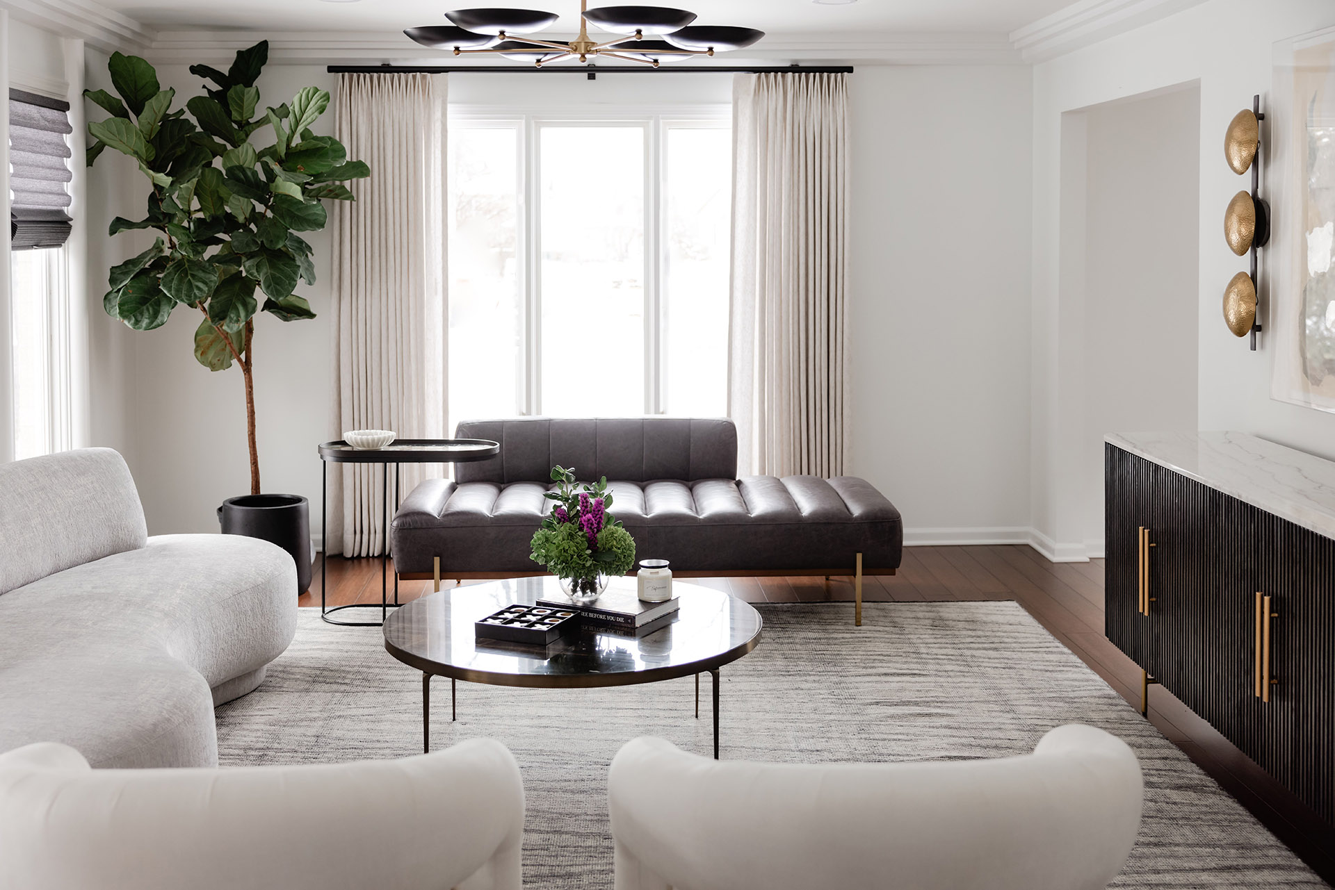
Understanding North Facing Room Dynamics

Source: The Tresana Collection
In north facing rooms, the quality and amount of natural light play a significant role in color perception. The room’s dimensions and the positioning and types of windows also affect how colors appear.
Natural Light Influences
North facing rooms receive less direct sunlight throughout the day, which can cast a cooler, softer light. Without direct sun, colors may appear more muted, and cooler paint colors can seem more pronounced, making the room feel colder. A color chart for north facing rooms would typically recommend:
- Warm Tones: To counterbalance the cool light
- Soft Neutrals: To keep the space feeling light
- Saturated Hues: For a touch of warmth and depth
Room Size and Ceiling Height
The room’s size and the height of its ceiling influence how colors are perceived. In smaller, north facing rooms or those with lower ceilings, light colors can make the space feel larger and brighter. However, in larger rooms with higher ceilings, darker colors can create a more intimate and cozy atmosphere. Remember:
- Small Rooms: Lighter colors to enhance spaciousness
- Large Rooms: Deeper colors for a snug feel
Window Placement and Types
Where windows are located and the types of windows a room has can drastically impact the lighting. For instance, larger windows allow for more natural light, which can slightly warm up the room, while smaller windows restrict light, often enhancing the natural coolness of a north facing room. The window’s type, like double-glazed or treated with a UV film, can also affect light intensity and warmth. Key considerations include:
- Larger Windows: More light, potential for warmer undertones
- Smaller Windows: Less light, cooler tones may be emphasized
- Window Treatments: Can influence light quality and room warmth
Color Psychology for North Facing Rooms
Source: Benjamin Moore
In selecting paint colors for north facing rooms, understanding color psychology is crucial, as these rooms generally receive less direct sunlight, which can influence the perceived temperature and ambience.
Optimal Choices:
- Warm Hues: Colors like peach, soft yellow, and creamy beige, often inject warmth, making the area feel more inviting.
- Light Reflective Tones: Pale blues and greens can marginally enhance natural light, subtly countering the cooler, shadowy nature of a north facing space.
Psychological Effects:
- Warm Colors: They are associated with coziness and comfort, counteracting the cold light. A person may feel an increase in energy and warmth in the presence of these shades.
- Cool Colors: Cool tones can expand a room’s sense of space and provide a serene, calm atmosphere. They are linked with concentration and tranquility.
| Color Family | Psychological Impact | Recommended Shades |
|---|---|---|
| Warm | Enhances comfort and energy | Peach, Soft Yellow |
| Cool | Emanates calmness and serenity | Pale Blue, Light Green |
When choosing a palette, individuals should consider the room’s purpose. A study may benefit from cooler shades, promoting focus, while a living area might be better with warming shades to foster a welcoming environment. Light reflection properties enhance brightness and can significantly influence a room’s ambiance and perceived spaciousness.
Best Paint Colors for North Facing Rooms

Source: Decorilla
Choosing the right paint color for a north-facing room is crucial as these rooms often receive less direct sunlight, which can make them appear cooler and darker. The following paint colors can help to brighten and warm these spaces effectively.
Warm Neutrals
Warm neutrals are a reliable choice for north-facing rooms, imparting a cozy and inviting ambiance. They counteract the cooler light with their subtle warmth.
- Creamy White: A creamy white, such as ivory or off-white, can create a soft backdrop that reflects light without feeling stark.
- Beige Tones: Beige tones offer a hint of warmth while maintaining a neutral palette.
Soft Blues and Greens
Soft blues and greens with warm undertones can bring a sense of calmness to north-facing rooms without making them feel cold.
- Sky Blue: A light sky blue with a touch of warm gray can mimic natural light and enhance the room’s luminosity.
- Sage Green: Sage, with its earthy yet light presence, adds a touch of nature and serenity.
Vibrant Yellows and Reds
Vibrant yellows and reds can introduce energy and warmth, making the space feel more inviting and offsetting the lack of sunlight.
- Sunshine Yellow: A muted sunshine yellow can brighten up the room without overwhelming it.
- Warm Red: A subdued, warm red, like terracotta, brings in a cozy glow.
Paint Finishes and Their Effects

Source: The Living House
The finish of paint can significantly impact both the appearance and durability of a north-facing room. Different levels of sheen can affect how light interacts with the color and can either absorb or reflect natural light.
Matte and Flat Finishes
Matte and flat finishes provide a non-reflective surface that helps to hide imperfections on walls. They are ideal for ceilings and low-traffic areas, as they are less resistant to washing and can be difficult to clean.
- Pros: Hides wall blemishes; non-reflective
- Cons: Difficult to clean; less durable
Satin and Eggshell Finishes
Satin and eggshell finishes offer a balance between matte and glossy, characterized by a slight sheen. They are more durable and easier to clean, making them suitable for higher-traffic areas.
- Pros: Easy to clean; moderately reflective
- Cons: Shows application flaws more than matte
Gloss and Semi-Gloss Finishes
Gloss and semi-gloss finishes are highly reflective, brightening up a north-facing room significantly. They are very easy to clean, which makes them perfect for areas of high usage or spaces with moisture, like kitchens and bathrooms.
- Pros: Highly durable; moisture-resistant
- Cons: Highlights imperfections; bold sheen
Color Coordinating With Furniture and Decor

Source: The Splat Decorating Supplies
When selecting paint colors for a north-facing room, complementing the furniture and decor is essential for a cohesive look. Lighter hues can balance dark, heavy furniture, while richer tones can add warmth to rooms with lighter furnishings.
Matching Wood Tones:
- Light Woods: Consider soft beiges or pastel colors.
- Dark Woods: Opt for cooler shades like blues or greens to create contrast.
Fabric Coordination:
- Solid Fabrics: Pair with textured paint finishes or layered color schemes.
- Patterned Fabrics: Choose one dominant color from the pattern for the walls.
Metallic Elements:
- Gold or Brass: Warm hues like peach or yellow highlight these metals.
- Silver or Chrome: Cooler colors, such as light gray, complement these tones.
Artwork and Accent Pieces:
Mixing neutrals with a few select wall colors can make artwork and decorative accents stand out. Here are combinations that work well:
- Neutral Furniture: Sage green or dusty blue to add a subtle hint of color.
- Vibrant Decor: Walls in soft gray or creamy white serve as a backdrop to bold accents.
Utilizing Light:
Natural light in north-facing rooms is cooler, so choosing paint colors that counteract this can make the space feel warmer. Deep, saturated colors can absorb light, making a room feel smaller. In contrast, light and reflective wall colors can make the space feel larger and brighter.
Practical Tips:
- Use paint swatches against furniture and decor to test compatibility.
- Consider the room’s purpose and time of day it’s most used when selecting colors.
- Remember that paint can appear different in natural versus artificial light.
Professional Tips for Painting North Facing Rooms

Source: Ecos Paints
Choose the Right Hue
For north facing rooms, which often receive less direct sunlight, selecting lighter hues can help brighten the space. Shades like soft blue, gentle gray, or creamy white can reflect the available light and make the room feel more inviting.
Embrace Warm Tones
To counter the cooler light in north facing rooms, it’s recommended to incorporate warm-toned paints. Colors such as peach, buttery yellow, or soft pink can create a cozy atmosphere by adding a perceived warmth to the room.
Test Paint Samples
Before making a final decision, it’s best to test paint colors on large sections of the wall at different times of the day. This approach enables observation of how the paint interacts with the natural light, ensuring the chosen color provides the desired effect all day.
Finish Matters
The finish of the paint can greatly affect the overall feel of the room. A matte finish can soften the walls, while a satin or eggshell finish will reflect more light and add a subtle glow to the space.
Consider the Room’s Purpose
When choosing a paint color, one should also consider the function of the room. For example, a bedroom might benefit from calming colors such as light lavenders or silky greens, while a study might suit more saturated tones that inspire focus and creativity.
| Room Function | Suggested Colors |
|---|---|
| Bedroom | Light Lavender |
| Study | Saturated Blue |
| Living Room | Creamy White |
| Dining Area | Buttery Yellow |
Reflective Accessories
In addition to paint, incorporating reflective accessories like mirrors or metallic finishes can help bounce light around the room, further enhancing the chosen paint color’s effect.
Frequently Asked Questions
Q: What is the best paint color for a north-facing room?
A: Light, warm-toned hues like soft yellows, creams, and light beiges work well in north-facing rooms to combat the cooler light.
Q: Can I use cool colors in a north-facing room?
A: Yes, one can, but it’s advisable to choose brighter shades to avoid the room looking too shadowy.
Q: Are there specific colors to avoid in a north-facing room?
A: Dark colors tend to make the room feel smaller and dimmer due to the limited natural light.
Q: How does the size of the room affect color choice?
A: Smaller north-facing rooms benefit from lighter colors to make the space feel larger and more open.
Q: Is lighting important when considering paint color in a north-facing room?
A: Absolutely. It’s beneficial to have good artificial lighting to complement the natural light and enhance the wall color.
Q: Should the paint finish be considered for a north-facing room?
A: Yes, a satin or semi-gloss finish can help reflect light around the room, making it brighter.
| Tips for Choosing North-Facing Room Colors |
|---|
| – Sample colors on walls to see them in varying lights |
| – Use warm-toned lighting fixtures for added warmth |
| – Incorporate reflective surfaces to bounce light around |
| – Contrast your paint with furnishings for a balanced look |
Conclusion
Selecting the ideal color for a north-facing room is essential for creating the desired ambiance and maximizing the natural light available. Light, reflective hues are traditionally favored to counteract the cooler light and give the illusion of brightness. Colors such as:
- soft grays
- warm whites
- muted blues
are all excellent choices. They can make a space feel more inviting and expansive.
Alternatively, embracing the natural coolness of a north-facing room with richer and deeper tones can create a cozy, enveloping feel. Colors like navy, forest green, or a deep plum can transform the room into a tranquil retreat.
To create balance and visual interest, it is recommended to incorporate accents or furniture in contrasting colors. For example, a light gray wall can be complemented with rich burgundy pillows or a golden oak bookshelf.
Select a paint finish that complements the chosen color. Matte finishes can help hide imperfections, while satin or semi-gloss finishes can reflect light, adding brightness to the room.
One should remember that personal preference plays a significant role in interior design. The suggested colors are a starting point; they should be adapted to fit the individual’s taste and the room’s function. The goal is to create a space where one feels comfortable and at ease.