
Last updated August 27, 2026
Key Takeaways
- Count what is already patterned before adding anything. Wood grain, stone veining, a rug, books, a coffered ceiling and a view through a window are all pattern, and most rooms are near their limit before a single cushion arrives.
- Vary the density, not just the size. Three patterns at the same visual busyness read as noise whatever the motifs are.
- One colour running through everything is what makes a mix look deliberate rather than accidental. Matching is not required and usually looks worse.
- Pattern needs plain areas around it. Without somewhere for the eye to rest, nothing in the room is legible.
- Use a pattern more than once in a room. A single appearance reads as a mistake rather than a decision.
- The rules are a diagnostic for a room that feels wrong, not a permission system. If you love something, that is a real reason to use it.
Most guidance on mixing patterns starts with how many you are allowed and what proportions to use. That is the wrong end of the problem, because it assumes you are starting from nothing.
You are not. Almost every room already contains several patterns before anyone chooses a fabric, and the reason pattern mixes go wrong is usually that the ones already present were never counted. Start by looking at what is there.
Count what is already patterned
The step that changes the answer, and the one nobody takes.
Pattern is not only fabric. A wood floor has a strong repeating grain. Marble has movement. A coffered or beamed ceiling is a grid. A wall of books is one of the busiest surfaces in any house. Panelling is a pattern. A window with glazing bars is a pattern, and so is the view through it. A bookcase full of objects, a stair balustrade, a tiled hearth, all of it registers.
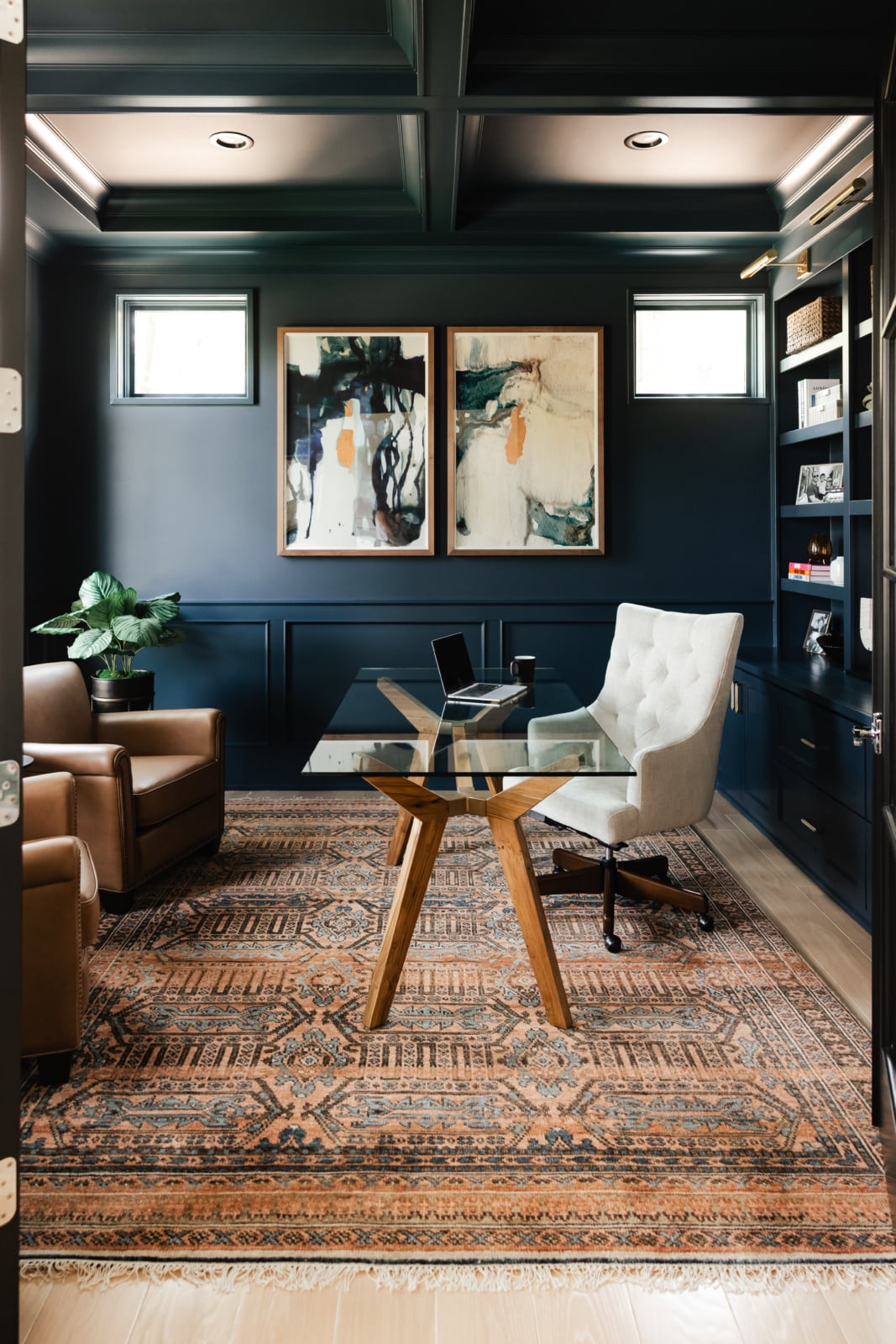
Stand in the room and count honestly. A panelled study with a timber floor, a fully glazed window and shelves of books is already carrying four patterns, and it will not take a bold rug and a printed curtain on top without becoming exhausting.
The rooms that take a lot of pattern well are usually the plainest ones structurally. A simple room with painted walls and a quiet floor has capacity. A richly detailed room has already spent most of it, which is why the same fabric can look wonderful in one house and frantic in another.
Density matters more than size
The rule people half know, stated correctly.
The usual advice is to vary the scale: one large pattern, one medium, one small. That is nearly right, but scale is not the actual variable. Density is. A large-scale print can be visually busy if the motifs are packed, and a small print can read as almost plain if there is space between the motifs.
What you want is a genuine difference in how much the eye has to do. One pattern that is bold and open, one that is quieter and more regular, and one that reads at a distance as texture rather than as a motif. Three patterns at the same density will fight regardless of their scale.
The practical test is to stand back and half close your eyes. If everything dissolves into the same level of activity, the mix will not work, and changing the motifs will not fix it.
One colour through everything
What separates a considered mix from a collection of nice things.
Patterns hold together when a single colour runs through all of them, even at different strengths. It does not have to be the dominant colour in any of them. A thread of the same warm red in a rug, a cushion and a print will do more work than three fabrics chosen to co-ordinate.
Matching is a different thing and usually a worse one. Fabrics that match exactly tend to flatten a room, because the eye reads them as a set rather than as a composition. The interest lives in the near miss.
The related point is that the shared colour is easier to find in patterns from different sources than in a co-ordinated range, which is why a room assembled over time frequently looks better than one bought at once.
Pattern needs somewhere to rest
The omission behind most rooms that feel busy.
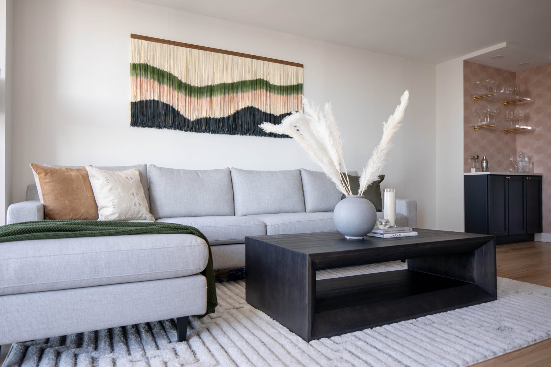
Plain areas are not empty areas, they are what makes the pattern readable. A bold rug needs a quiet sofa. A papered wall needs the other walls to hold still. Curtains carrying a large print want a plain roman blind or nothing at all beneath them.
A useful proportion to work to is that the majority of the room’s visible surface should be quiet. Not beige, not bland, simply not competing. The pattern then reads as a decision rather than as a condition.
This is also the answer when a room has good things in it and still feels wrong. Frequently nothing needs to be removed permanently. Something needs to become plain.
Where each kind of pattern behaves
What each type does in a room, and what it struggles alongside.
| Pattern | Sits well with | Fights with |
|---|---|---|
| Large open floral | Stripes, small geometrics, plain texture | Another floral at similar density, busy paisley |
| Stripe | Almost everything. The most forgiving pattern there is | Very little. Two stripes at similar width can feel restless |
| Check or plaid | Floral, solid texture, a large geometric | Another grid, including panelling and coffered ceilings |
| Small repeating print | A large statement pattern that gives it something to sit against | Other small prints, which turn into visual mush together |
| Geometric | Organic patterns, florals, anything with a curve | Architecture that is already gridded, such as glazing bars |
| Antique or tribal rug | Plain upholstery, a stripe, solid texture | Competing floor to wall pattern. It wants to be the main event |
| Texture without motif | Everything. It adds interest without adding activity | Nothing, which is why it is the safest way to add depth |
| Animal print | Used as a small accent against plain, it behaves like a neutral | Being used at scale alongside other strong patterns |
Texture is the underrated row. It gives a room depth without spending any of its capacity for activity, and it is what most rooms described as flat are actually missing.
Use it more than once
The distribution rule, which matters more than the selection.
A pattern that appears once in a room reads as an anomaly. The same pattern appearing two or three times, in different sizes and at different heights, reads as intent. A fabric on a chair, picked up in a cushion across the room and again in a lampshade, ties the space together in a way that a single bold gesture never does.
Height matters as much as position. Pattern only at floor level makes a room feel bottom heavy, and pattern only at eye level makes the lower half feel unfinished. Something at the floor, something at seat height, something at eye level.
The exception is a genuine single statement: one papered wall, one extraordinary rug, one pair of curtains. Those work precisely because everything else has been left quiet, which is the resting rule again.
Two florals is the hard version
Not forbidden, but the case that needs the most care.
The eye sorts patterns into organic and structured before it registers anything else. A floral and a geometric are read as two different kinds of thing, so they sit together easily. Two florals are read as the same kind of thing, and they have to be clearly different in density, scale and colour weight or they compete.
Where two florals do work, it is usually because one is a large open sprig on a light ground and the other is a small dense print in a related colour, so one reads as pattern and the other reads almost as texture.
The same is true of two geometrics, and it is the reason a check can be difficult in a room with a coffered ceiling or a strongly glazed window. Those are geometrics too, even though nobody thinks of them that way.
Rooms are used differently, so treat them differently
How much a room can carry depends on how long people sit in it.
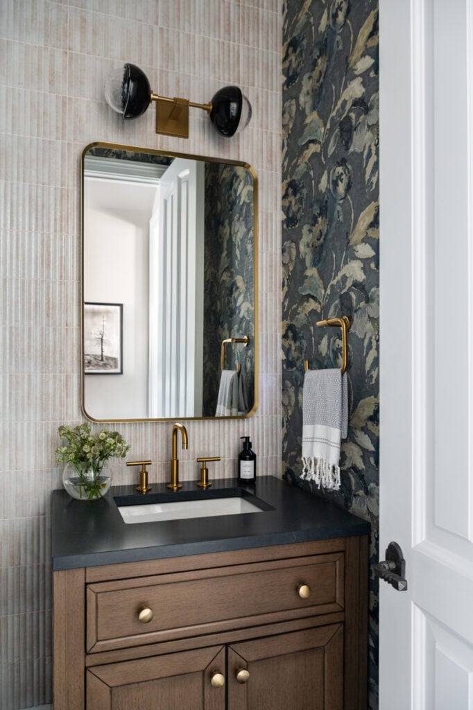
A powder room, a landing, a back hall or a boot room can take far more than seems reasonable, because nobody spends an hour in them. Those are the places to use the paper you love and cannot justify elsewhere, and they are frequently the most memorable rooms in a house.
A room where people sit for long stretches, a sitting room or a bedroom, needs more restraint, because a pattern that delights on the first encounter can become tiring on the hundredth.
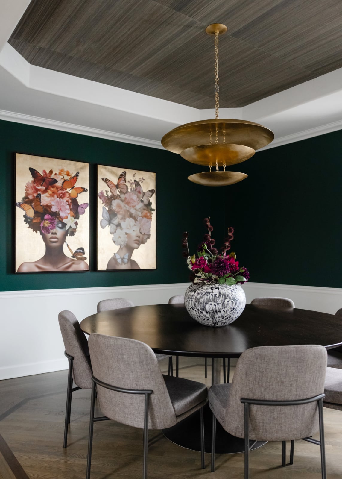
Dining rooms sit in between. They are used intensely for a few hours at a time, usually in the evening and often under low light, which is where texture and depth do more than motif.
Personal taste is a real reason
Worth ending on, because rules read as permission systems and they are not.
What we are describing here is a diagnostic. When a room feels busy or flat and you cannot say why, these are the things to check: how much pattern is already built in, whether the densities differ, whether one colour runs through, whether anything is plain, and whether each pattern appears more than once.
What they are not is a set of conditions a room has to satisfy before you are allowed to use something you love. Dara’s view on this is straightforward: use what you love, because life is too short to live with a room chosen to be defensible. A pattern you are drawn to has a reason behind it, usually a memory or an association, and that is a better starting point than a formula.
The rules are most useful in service of that. They are how you make the thing you love work in the room, rather than a reason to choose something else.
Working through it with us
Pattern is one of the things that is much easier to resolve in a room than on a screen, with the actual light and the actual floor in front of you. You can read about our design process, look through recent projects, or get in touch about your own home.
Related reading: choosing a rug material, mixing and matching dining chairs, the art of transitional design, what sets apart a curated living room and using wood in a scheme. We work across Naperville, Hinsdale and Oak Brook.
Frequently asked questions
What are the rules for mixing patterns in decorating?
Count the pattern already in the room, vary the density rather than only the scale, run one colour through everything, leave plain areas for the eye to rest, and use each pattern more than once. The first of those is the one most often skipped and it changes the answer.
How many patterns can go in one room?
It depends entirely on how much pattern the room already contains. A plain room with painted walls and a quiet floor has capacity for several. A panelled study with a timber floor, glazing bars and shelves of books is already carrying four before anything is added.
Is it about scale or density?
Density. A large print can be visually busy if the motifs are packed, and a small print can read almost as texture if they are spaced. What matters is a genuine difference in how much work the eye has to do, which you can test by standing back and half closing your eyes.
Do patterns have to match?
No, and matching usually looks worse. What holds a mix together is one colour running through all of them at different strengths. Fabrics that match exactly tend to read as a set rather than a composition, and the interest lives in the near miss.
Can you mix two florals?
Yes, but it is the hard version. The eye sorts patterns into organic and structured, so a floral and a geometric read as different things and sit together easily, while two florals read as the same thing and must differ clearly in density, scale and colour weight.
Why does my room feel busy when I like everything in it?
Usually because nothing is plain. Pattern is only readable against rest, so a room where every surface is doing something has no legibility. Frequently nothing needs removing permanently, something needs to become quiet.
Does texture count as pattern?
It behaves as the useful kind. Texture adds depth without adding activity, so it is the safest way to enrich a room that feels flat, and it is what most rooms described as lacking something are actually missing.
Where can I be bolder with pattern?
Rooms nobody lingers in. A powder room, a landing or a back hall can carry far more than seems reasonable, and those are frequently the most memorable rooms in a house. Rooms where people sit for hours need more restraint.