
Last updated August 27, 2026
Key Takeaways
- Start with what you cannot change: the floor, the stone, the fireplace, the view. Those are already in the palette whether you chose them or not.
- Undertone matters more than colour. Keep every element on the same side of warm or cool and unrelated colours will still agree.
- Get the value range right. A palette needs something genuinely light and something genuinely dark, not five mid-tones.
- Work at the scale you will see it. A palette that works on small chips can fail across four walls and a sofa.
- Let one colour dominate. Roughly two thirds one thing, and the rest supporting.
- Test in the room, in daylight and lamplight, over several days.
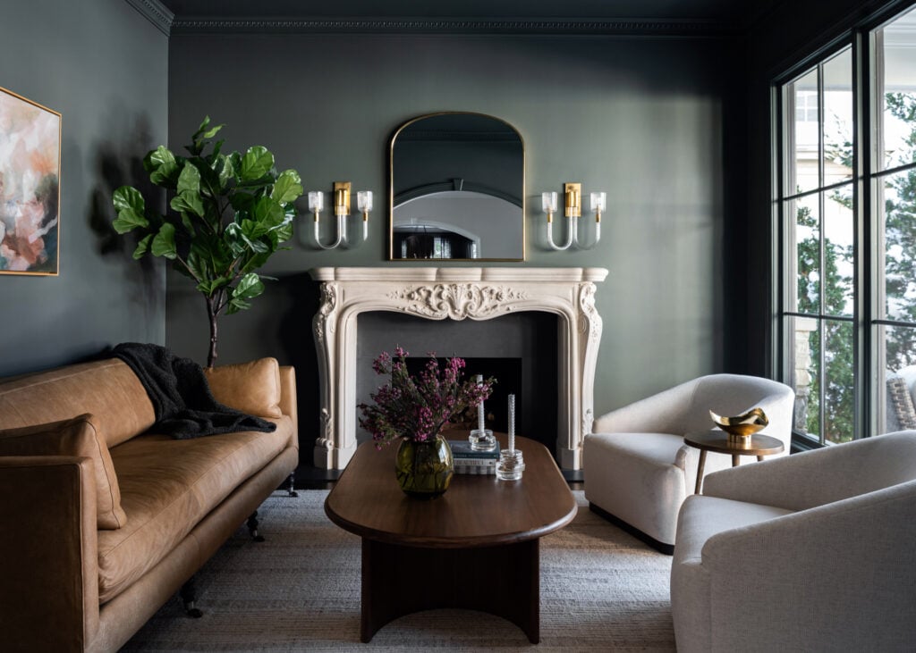
Build a decorating palette outward from the things you are not going to change. The floor, the stone, a fireplace surround, the kitchen worktops, a large piece of art, the view out of the window: these are already in the palette. Choosing colours without accounting for them is how schemes end up fighting the room they are in.
Once those are identified, the work is matching undertone, setting a value range from genuinely light to genuinely dark, and deciding which single colour dominates.
List what is fixed
The first step is an inventory rather than a decision, and it usually takes ten minutes.
Walk the room and write down everything that is staying: the flooring and its undertone, any stone or tile, the fireplace surround, built-in joinery, the trim if it is not being repainted, large furniture you are keeping, art you will hang. Then look out of the window, because a garden in summer puts a great deal of green into a room and a neighbouring brick wall puts in orange.
That list is the beginning of your palette. Everything you choose afterwards has to live with it.
This is why palettes assembled from images fail so often. The scheme was built for somebody else’s fixed elements, and dropped into a room with a different floor and a different outlook it stops making sense.
Undertone is the connective tissue
The single most useful concept here, and the reason some rooms feel coherent while others feel assembled.
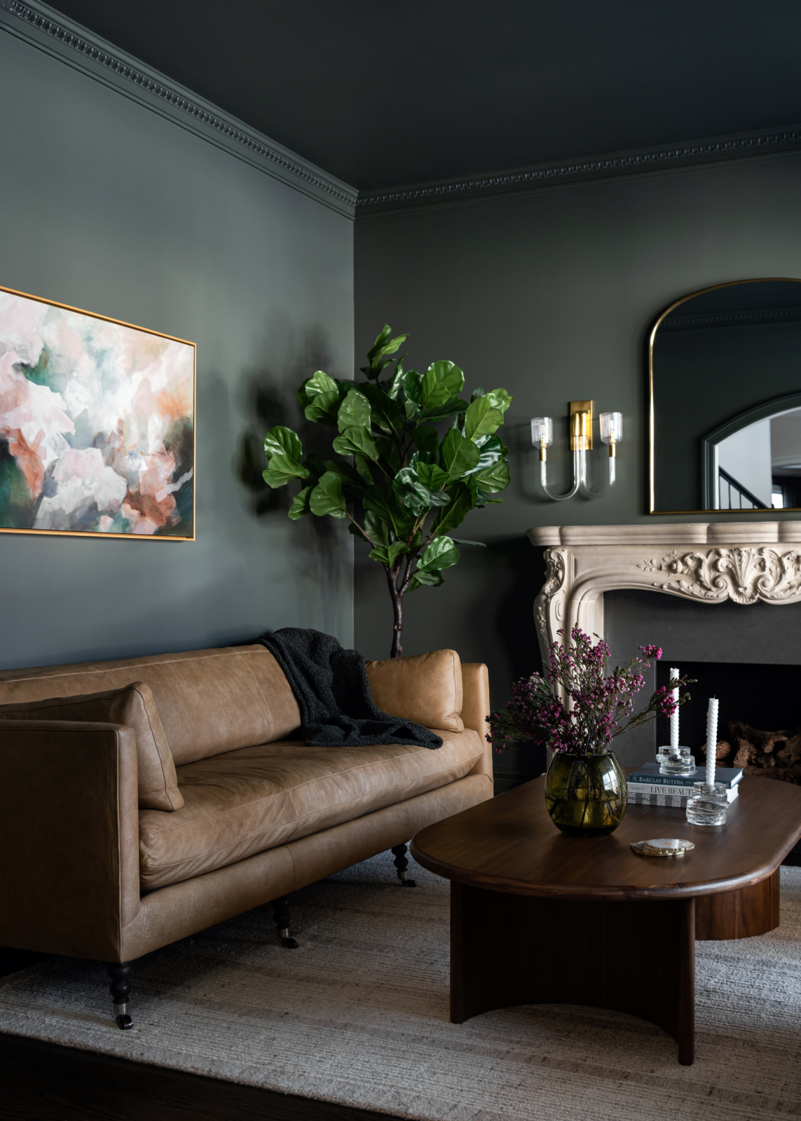
Every colour leans warm or cool. A grey can have blue in it or brown. A white can have yellow, pink or green. A timber can be honey or ash. Individually these leanings are almost invisible. Across a whole room they are what your eye is actually reading.
Keep every element on the same side and colours that have nothing else in common will still agree. Mix them, a cool grey wall against a warm honey floor against a pink-based white trim, and the room feels subtly wrong in a way that is genuinely hard to name.
The fixed elements decide which side you are on. A warm oak floor and a cream limestone hearth mean you are building a warm palette, whatever colours you had in mind. Fighting that is possible and it is the hardest version of the job.
The value range
Value is how light or dark something is, independent of its colour, and it is the thing missing from most amateur palettes.
A palette of five mid-tones has no range. Every surface sits in a similar band, the eye has nowhere to travel, and the room reads flat regardless of how pleasant the individual colours are. Adding another colour does not fix it, because the problem is not variety of hue.
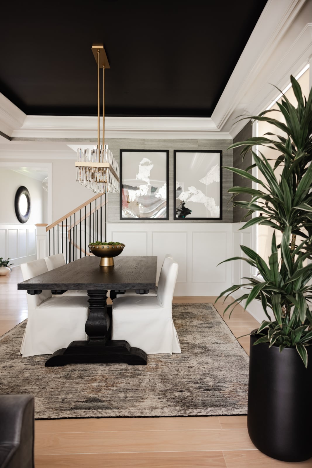
A working palette has something genuinely light, something in the middle, and something properly dark. The dark element is the one people leave out and the one that makes the rest look intentional.
The test costs nothing: photograph the room or the sample board and look at it in black and white. If it turns into one flat grey, you have found the problem before spending anything.
Building it, step by step
The order matters, because each step constrains the next.
| Step | What you are deciding | How | Common error |
|---|---|---|---|
| 1. Inventory the fixed elements What is already in the room and staying. |
Floor, stone, joinery, trim, large furniture, the view | Write them down and note their undertones | Choosing colours before looking at the floor |
| 2. Pick a side, warm or cool The undertone the whole scheme sits on. |
Usually decided for you by the fixed elements | Follow the largest fixed surface, normally the floor | Mixing sides, which reads as subtly wrong |
| 3. Choose the dominant colour The one that will cover most of the room. |
Roughly two thirds of what you see | Usually the walls, or the walls plus the largest upholstery | Giving equal weight to three colours |
| 4. Add the value anchors Something genuinely light and genuinely dark. |
The dark one is the one people omit | Architecture, joinery, a timber piece, metalwork | Five mid-tones and no range |
| 5. Add one accent The colour that appears in small amounts. |
Textiles, art, ceramics, books | Keep it to a small share and repeat it two or three times | Scattering several accents evenly, which reads as noise |
| 6. Test at full scale Whether it survives the actual room. |
Large samples on the wall, over several days | Daylight and lamplight both | Deciding from chips on a table |
Steps one and two do most of the work. If a palette is not coming together, the fault is almost always in the first two rather than in the accent colour.
Let one thing dominate
A palette is not an equal division. It is a hierarchy, and the proportions matter more than the selections.
Roughly two thirds of what you see should be the dominant colour, the walls or the walls plus the biggest piece of upholstery. Something like a quarter is the secondary, and a small remainder is the accent. Those are not rules to measure, but they describe how successful rooms actually break down.
Three colours in equal amounts is the most common failure. Nothing leads, so the eye has no order to read the room in, and it feels busy even when the colours are quiet.
The accent works by repetition rather than volume. The same red appearing in a painting, a book spine and a ceramic reads as deliberate. One red cushion reads as an afterthought.
Scale changes everything
The practical reason palettes fail between the sample board and the room.
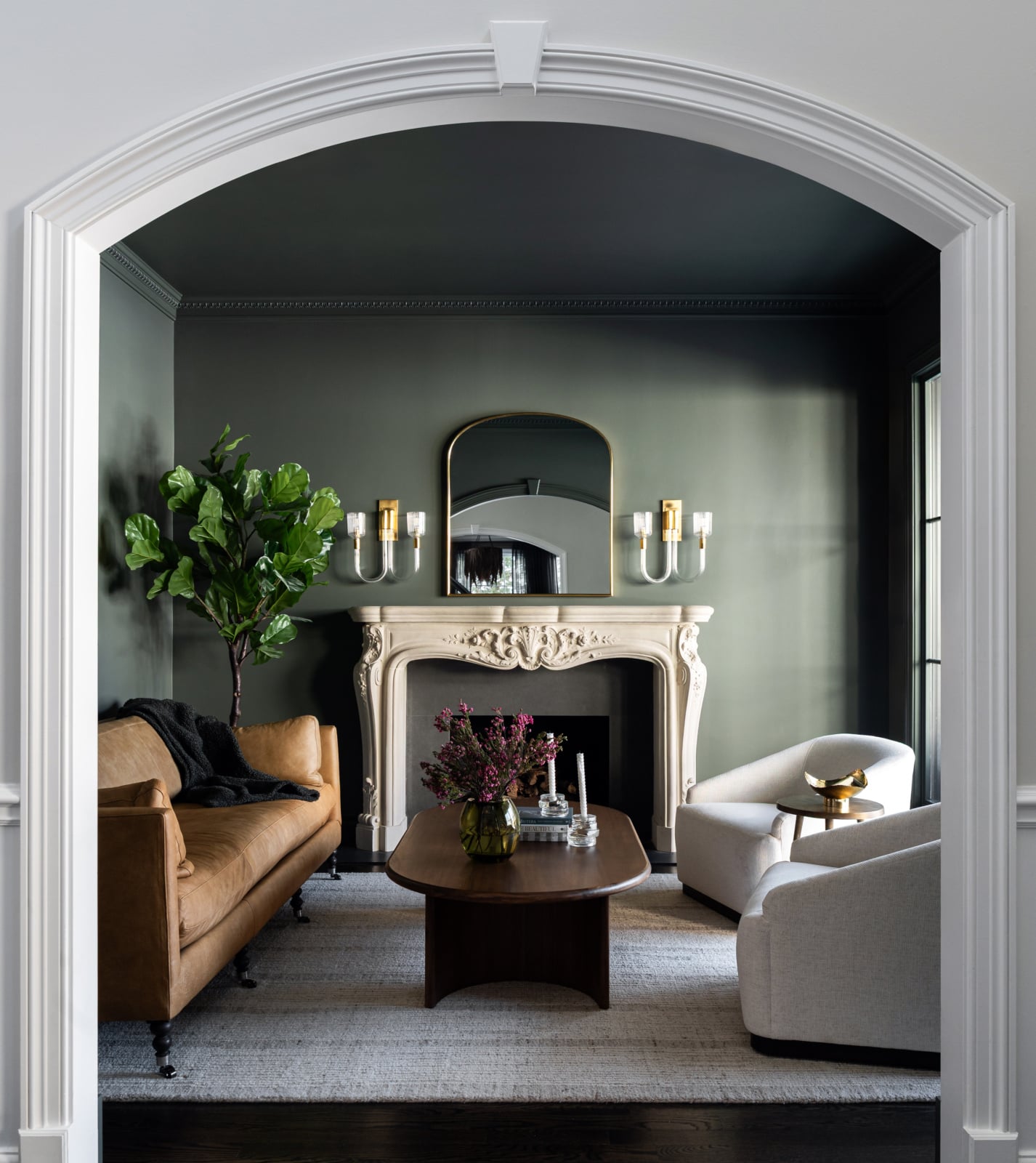
Colour intensifies with area. A green that looks muted on a two-inch chip becomes emphatically green across four walls. A pattern that reads as texture on a swatch becomes a strong statement on a sofa. Almost everyone chooses colours a shade or two stronger than they actually want, because the sample was too small to reveal it.
Look at samples at something like the proportion they will occupy. Large paint samples on the wall, a yard of fabric rather than a swatch, a piece of the actual stone rather than a photograph.
And look at them together, arranged roughly as they will be in the room, rather than side by side in a row. Colours judged against each other behave differently from colours judged in position, which is why sample boards can mislead even when every element on them is right.
Building around a fixed element you did not choose
The most common real situation: something in the room is staying and it was not your decision.
A stone or brick fireplace, a floor you are not replacing, kitchen worktops with strong veining, inherited joinery. The instinct is to work against it, choosing colours that will make it recede. That rarely succeeds, because the element is large and permanent and the paint is neither.
The better approach is to take the undertone from it. Pull a colour out of the thing you cannot change and use it, and the room resolves. Something with strong pattern or variation, stone or brick particularly, contains several colours, and the useful ones are frequently the quiet background tones rather than the obvious dominant one.
With masonry specifically, the mortar is often a better source than the material itself, since it runs continuously through the field and your eye reads it as the background.
Whatever it is, treat it as an asset rather than an obstacle. A permanent feature with real character is more than most rooms have.
Testing properly
Three habits that prevent repainting.
Paint large samples directly on the wall rather than on card, and on more than one wall, since a colour facing the window and the same colour beside it will look like two different colours.
Look at three times of day: mid-morning, late afternoon and after dark with the lamps on. Colours shift more between daylight and lamplight than people expect, and in a house that is used in the evening the lamplight reading is the one that counts.
Leave them up for several days. First impressions of a colour are unreliable, and the shade you stop noticing is usually the right one.
It should still be yours
A palette assembled correctly can still be a poor scheme, and it is worth saying why.
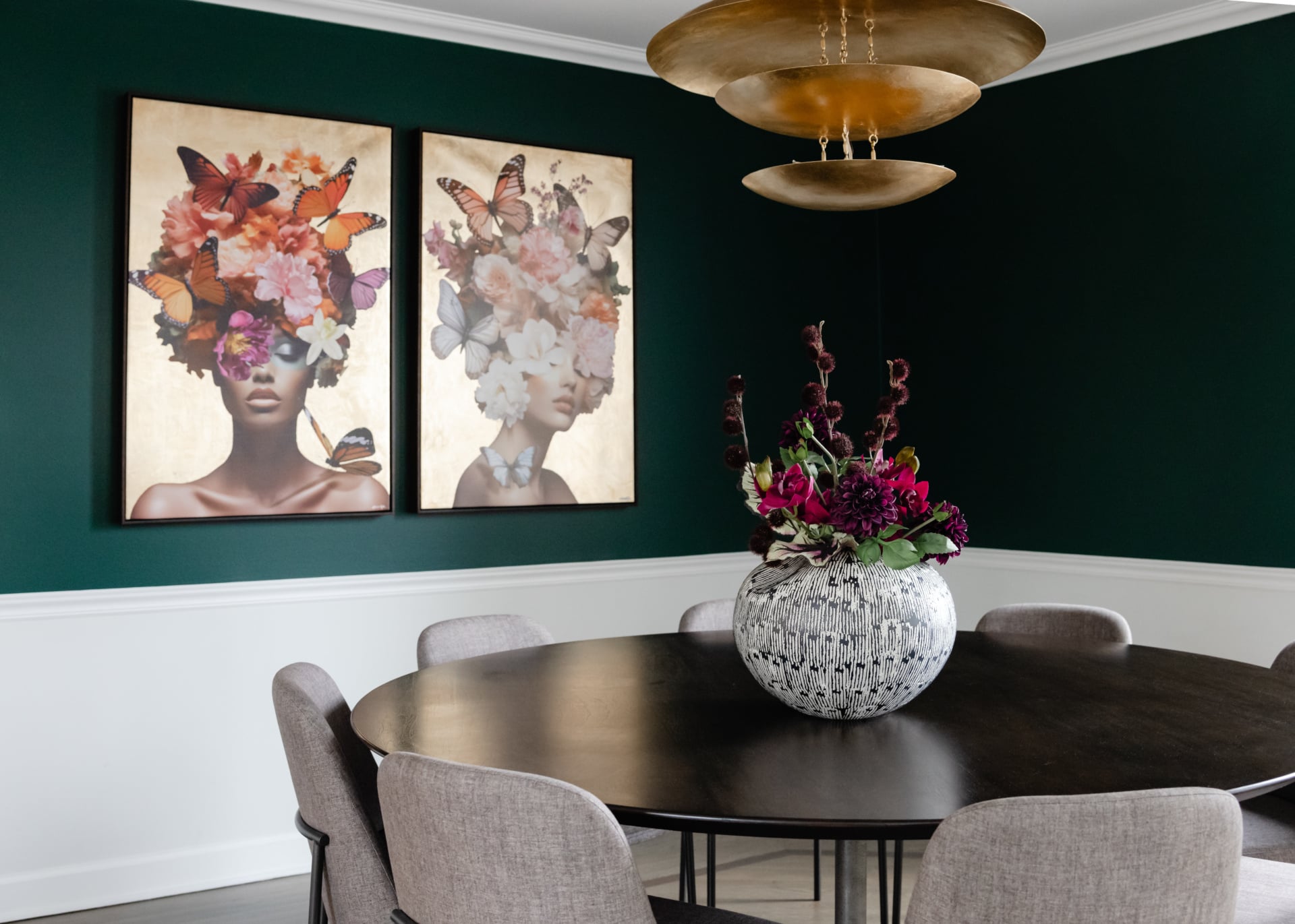
All of the above is method. None of it tells you what to like. A room built entirely from rules will be coherent and will not tell anybody anything about the people living in it, and the most common failure in beautiful, expensive homes is exactly that: they do not reflect the personality of the owners. A home should tell your story.
Which means the palette should start from something you actually love, a painting, a rug, a colour you have always been drawn to, and use the method to make the rest agree with it. That is a much better order than assembling a technically sound scheme and looking for somewhere to put your own taste.
And do not build it to be timeless. Nothing is. Use what you love and worry less about whether it dates, because a room designed to be safe will be neutral and, honestly, boring.
Chicago rooms specifically
Two local conditions that affect the palette more than people expect.
The light. Winters here are long and heavily overcast, and rooms run under artificial light for a large share of the year. A palette chosen in July can feel bleak in February, so it is worth testing in the dullest light you get and keeping undertones warmer than the same scheme would need in a sunnier climate.
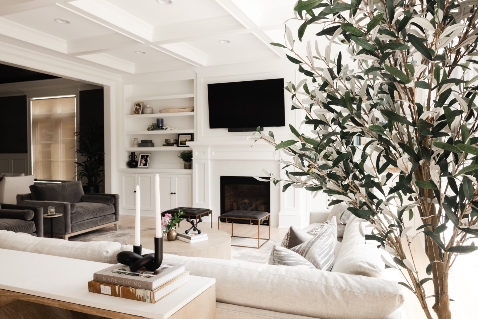
The fixed elements. Older city housing brings a great deal into the palette before you start: original millwork, timber floors with real colour, stone or brick fireplaces, sometimes leaded glass. Those rooms have more constraints and better bones, and the schemes that work take their cue from what is already there. Newer suburban rooms have almost no fixed elements beyond the floor, which is freedom and also means nothing is helping you decide.
Working through it with us
Palettes are easier to resolve in a room than on a board, and most of the difficulty is in the first two steps rather than the colour choices themselves. You can see how we work on our design process page, look through recent projects, or get in touch about your own home.
Related reading: choosing a white that works, paint colors for north facing rooms, warm neutrals in a living space, high contrast rooms and identifying your design style. We work across Chicago, Hinsdale and Elmhurst.
Frequently asked questions
How do you create a decorating palette?
Start with what you cannot change: the floor, any stone, the fireplace, joinery, large furniture you are keeping and the view outside. Note their undertones, pick warm or cool accordingly, choose one dominant colour, add genuinely light and dark anchors, then one accent.
What is an undertone and why does it matter?
It is whether a colour leans warm or cool. A grey can have blue in it or brown, a white can have yellow, pink or green. Individually these are almost invisible; across a whole room they are what the eye reads. Keeping everything on the same side is what makes unrelated colours agree.
Why does my colour scheme feel flat?
Usually no value range. A palette of five mid-tones gives the eye nowhere to travel, and adding another colour does not help because the problem is not hue. Photograph the room in black and white: if it turns into one flat grey, you need something genuinely dark.
How many colours should a palette have?
Three, in unequal amounts. Roughly two thirds dominant, about a quarter secondary, and a small remainder as accent. Three colours in equal proportion is the most common failure, because nothing leads and the room feels busy even when the colours are quiet.
Why do colours look different on the wall than on the sample?
Colour intensifies with area, so a green that looks muted on a small chip becomes emphatically green across four walls. Most people choose colours a shade or two stronger than they actually want because the sample was too small to reveal it.
How do I build a palette around something I cannot change?
Take the undertone from it rather than working against it. Pull a colour out of the fixed element and use it. With stone or brick the useful colours are often the quiet background tones rather than the obvious one, and the mortar is frequently a better source than the material itself.
How should I test a palette?
Large samples directly on the wall, on more than one wall, looked at mid-morning, late afternoon and after dark under lamplight. Leave them up for several days, because first impressions are unreliable and the colour you stop noticing is usually the right one.
Should a palette be neutral so it does not date?
No. Nothing is genuinely timeless, and a scheme designed to be safe ends up neutral and dull. Start the palette from something you actually love, a painting or a colour you have always been drawn to, and use the method to make everything else agree with it.